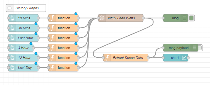
This queries the system load for the last hour (collected from a Telegraf agent). The response from the DB is processed in the function node "Conversion":
// helper
// used to get all distinct values from an array
const distinct = (value, index, self) => {
    return self.indexOf(value) === index;
}


// main code

// first, get all fields of the query result
const fields = msg.payload.map(x => x._field);
// get all distinct fields
const distinctfields = fields.filter(distinct);

// get all timestamps
const timestamps = msg.payload.map(x => Date.parse(x._time));
// get all values
const values = msg.payload.map(x => x._value);


// loop over all distinct fields
var ind;
var data = [];
var arr = []
for (var n = 0; n < distinctfields.length; n++) {
    // get indices of matching entries for current field
    ind = [];
    for (var m = 0; m < fields.length; m++) {
        if (fields[m] === distinctfields[n]) {
            ind.push(m);
        }
    }

    // get matching timestamps
    var matchingtimestamps = ind.map(x => timestamps[x])
    // get matching values
    var matchingvalues = ind.map(x => values[x])

    // compose array
    arr = [];
    for (m = 0; m < matchingtimestamps.length; m++) {
        arr.push({'x': matchingtimestamps[m], 'y': matchingvalues[m]});
    }

    // save array
    data.push(arr);
}

const payload = [{"series": distinctfields, "data": data, "labels": distinctfields}];

msg.payload = payload;

return msg;
The most important thing (for me) is: it doesn't matter how many fields you have in your querry, each field will be extracted from the response and shown as a separate line.
Thanks for this Function I would like to use it but have some problems
I read this Post about data manupilation and also read the Documentation from the Chart Element.
If I try to use your function with CopyPaste Node Red sad that it didn't no the Function Map
As the title says it is for Influx v2. As I see from your screenshot you are using v1.8. It seems the msg.payload is different from the one the function expects...
THe time shift may come from the difference between local time and UTC, but I don't know if you store the wrong time in the DB or if something goes wrong with your query. You should check that.
If you configure a debug node to fire on startup and make that trigger a sequence of messages, one for each topic that there will be, then that will decide the order so it will always be the same. Then you can set the colours up in the chart node.
Thanks for that Colin... when i do that I only get the last series on the graph
I also use the buttons to select different time frames by altering the _start in the query
I have no idea what you mean by that, and I don't see an inject node sending the initial values in.
However, if you are only using this for historical data then all you have to do is make sure that the channels are always ordered the same when you load the data into the chart.
I use the buttons to get different timeframes and the same happens. Order is the same in all the queries but graph draws in different order every time. From same button of from diff button...
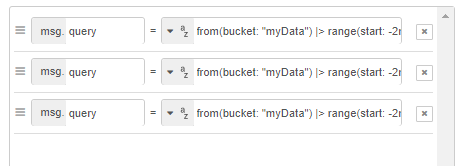
msg.query = 'from(bucket: "myData")'+
' |> range(start: -2m)' +
' |> filter(fn: (r) => r._measurement == "power_watts" and (r._field == "PV_Watts" or r._field =="Battery_Watts" or r._field == "Load_Watts" or r._field == "SOC" or r._field == "Utility_Watts"))';
return msg;
If I add the injector
with three queries in order PV_watts, Battery_Watts and Load_Watts only the
The important thing is what is being passed to the chart node. You need to put a debug node showing that. Then make sure that each button has the lines in the same order.
I think it is the way that the Extract series data interoperate the data... it scrambles it every time
I can see what goes in and then what come out...
The data coming from influx is a javascript object. You can't rely on the order of properties in an object. In the function that converts that to the chart data you will have to sort them in some way. The best way to do that will depend on how you have structured the function. If you are using Object.Entries() (which is good way of doing it) then you could sort the entries as shown in this link before using them to extract the data. Object.entries() - JavaScript | MDN
It is javascript, not java. I thought I should mention it as if you start looking at java docs you will get very confused. The two languages are not related and whoever decided to give them similar names has got a lot to answer for.
Thanks for clearing that up.
I was getting confused with the java and javascript. No wonder nothing worked...
I read up on the javascript programming on w3school website last night and just added a
sort in the extract node.
Problem solved.
I don't mind in what order the series came back as long as it was consistent.
I can now set legend colours and it consistent over the time frames.
great to see you have it sorted and using the node-red dashboard. I understand using the dashboard to visualise the data but have you looked at using Grafana as well. It is awesome for visualising time series data