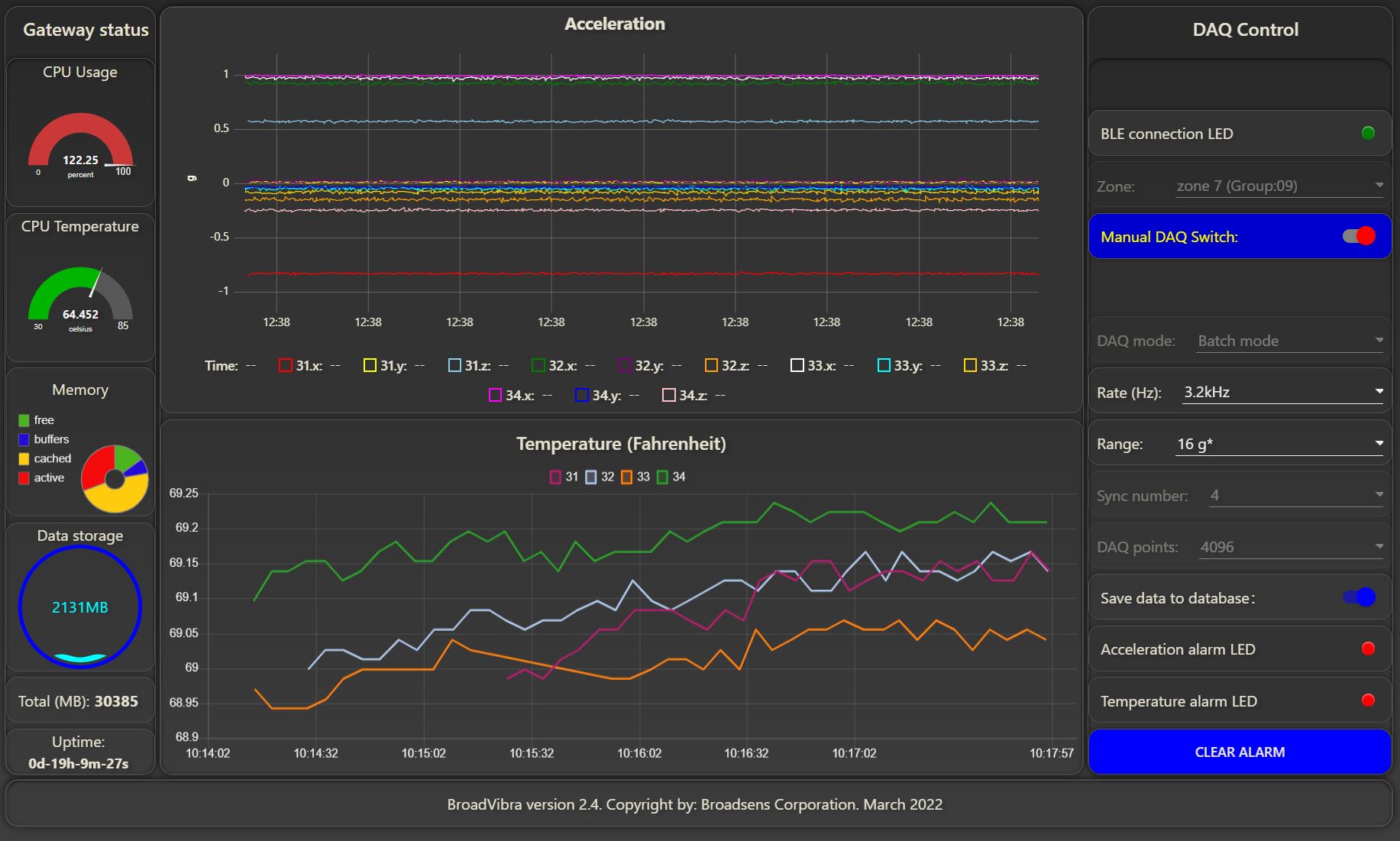
For folks who want to have a fast live-time line chart, there is an option of Uplot (see examples here and beta ui version here), which provides excellent performance to show a lot more live data than the current dashboard line chart. Recently, we found that Echarts is also a good option. We did a quick comparison of their performance with our application (wireless vibration monitoring). They are tested under exactly the same condition. Please look at the CPU usage at the top left corner. Uplot has about 122% CPU usage, and Echarts has about 121% CPU usage.
- Uplot for four wireless vibration sensors in parallel sampling at 3.2kHz
- Echarts for four wireless vibration sensors in parallel sampling at 3.2kHz
In the end, we decided to go with Echarts since we can arrange its legends similar to the current dashboard. But you can't go wrong with either. Both provide excellent performance for fast live-time line charts.
BTW, if the current dashboard upgrades the line chart to Chart.js's 3.0 or above engine, the live-time line chart should be in the same level as Uplot and Echarts.
hey @davidz author of uPlot here, so take everything i say with more than a few grains of salt 
i was actually curious to do a perf comparison myself between ECharts5 and uPlot for live updates, since they're now very close in initial render time. i actually expected them to also be close in streaming cases and in fact they were, until i toggled some GPU flags in Chrome. once the rasterization is offloaded to another thread there is a huge perf difference, with uPlot using ~13% cpu and ECharts using 99% cpu. it's rather bizzare, and it would be intersting to see if others can reproduce this difference on other hardware.
all that being said, performance isn't everything, and ECharts5 is a great, fast choice that has many more batteries included for all kinds of charts, whereas uPlot is a 1-trick pony without a lot of extra hand-holding. ECharts4 is quite slow, though!
Discourse limited me to only 2 links per post (as a new user), so...
here's my best-effort comparison, (corrections/improvements welcome!)
https://leeoniya.github.io/uPlot/demos/sine-stream.html
https://leeoniya.github.io/uPlot/bench/ECharts5-sine-stream.html
Thanks much Leon. We are a fan of uPlot too. We used Echarts since the Legend of Echarts can be formatted similar to the legend of the current NodeRED dashboard quickly (both on top with tight spacing). We could have up to 24 series, so that spacing between legends can not be too big.
Yes uPlot uses much less memory and space, which is amazing. We may use it in other cases.