I'd call node's current state - it works on my computer ![]()
Let me know if you have similar experiences ..
@hotNipi I'm rushing so maybe something I have/have not done, but...
It isn't displaying the gauge in the group that I've selected for some reason.
If I look at Chrome's developer console, I see the following -
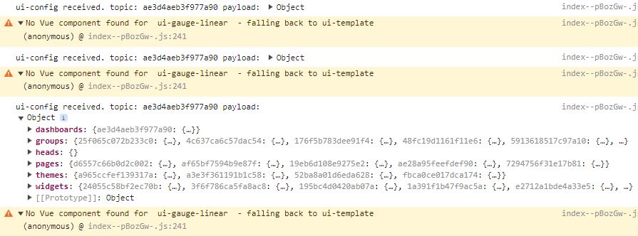
Very true sadly. And I dont understand what is going on. Digging in deep.
Suddenly it reveals itself after adding - nothing, removing, restart node-red and add again. But couldn't see any clues what causes the issue.
I think the issue is noted but not fixed yet. A node red restart is necessary after installing third party ui nodes · Issue #938 · FlowFuse/node-red-dashboard · GitHub
Yes, a restart fixed it!
Strange...
Lucky I filed for copyright on that name last week. Expecting my royalty cheque very soon now. ![]()

You are on charge to choose the colors to ensure the readability. Yellow on white is bad choice. Not that it is impossible to figure out some other behaviors but I don't see that as good and clear value in your proposal.

The full bar option does something like this. It changes all cells to the color of the current region and leaves dimmed above current value
Yes it do it single color, not with multiple colors...
With multiple colors I find it confusing thus I don't like the idea.
Your options are:
Contribute and if done well, I include it as an option.
Fork and make your own version to achieve your goals.
I dont know what those mean so better that I forget this ![]()
A couple of observations, questions:
Sometimes one might wish to specify a border around each coloured rectangle but because you dim the unlit values using "opacity" the border fades out too. Setting the background-color and opacity using rgba would allow the border to show on all rectangles.

If I open the browser inspector or (rearrange the widgets?), the size of the text changes:

°C is a smaller font size than the value 52.00. Is this deliberate?
Can the current value be positioned at the RHS of the illuminated bar rather than the RHS of the widget? Also intermediate values between min and max.

An option to round the value to the nearest full rectangle (while still showing it unaltered in the text) would be great.
i.e. no semi-dimmed rectangle at the right.
To have border separated from cell it makes double amount of elements. Thus definitely not an option for regular usage.
Rgba is more expensive than opacity.
This is subject of CSS override. Make it as you like.
All font sizes are made to respect the dashboard layout even for different options it provides for row heights. The widget does not push rows height.
What browser does that?
It will make layout shift on any input. Against of all good design rules.
Possible. Confusing also.
Thanks for your reply @hotNipi
I use Firefox.
Good point.
A better way to relate the current value text to a partly invisible bar is probably to put a border around the bar, which is available for anyone who wants it through CSS

I'll check for firefox. Strange anyway.
Border aound is also achievabe with CSS override. Not considering to apply as option.
You do dim as for minimum to make it behave as a bar which changes width. If that is your target, than you defenetely don't need that complex widget.
That's what I said!
The configuration got slight update.

With version 0.0.6 if you use the color picker there's now list of currently used colors presented so if you just wanted to change te positions for colors, the colors are now easy to pick.
