Hello, in a somewhat OCD way, I wish to style/resize my node red gauges. I have done a lot of research but to little avail.
Some help has come from:
- node-red-dashboard/config-fields.md at master · node-red/node-red-dashboard (github.com)
- justgage/justgage.js at master · toorshia/justgage (github.com)
- F12 element discovery within the browser
However very little progress.
Goal = increase size of a gauge node type "gauge" so that I can make it fill up more of its allotted real estate within the ui-card where it resides.
So far = Using a function node which receives the message then feeds to the gauge:

Without any function, these gauges leave a border within the card equal on both sides:

With the following code within the function node:

I can achieve a resize like this (greatly oversized to show the challange)
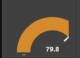
But as you can see even though I can influence the actual size of the dial...I am unable (so far) to center it, or adjust top margin etc. to get it into the card centered. I have attempted UI nodes to influence the actual card...but got nowhere.
Any ideas or points to other resources greatly appreciated!
I don't think you are doing it the right way.
Open the node's edit screen and change the size there.
Indeed...that changes to overall size of the UI widget, and can further be altered by using the dashboard and altering within the layout function. The method you are showing is baseline stuff. What I am attempting to do is leave my widget size alone, and alter the actual graphic within the set widget size, which requires going beyond the node-red built in alterations.
The widgets, created for Node-RED dashboard try to do the best to fit into provided container and preserve the art and readability. This requires a lot of compromise decisions and the outcome can't be perfect for everyone.
Gauges are kind of not very standard html elements. A round thing is pretty opposite what the html likes. That requires more than standard and simple padding margins structure can provide. Thus to preserve the look the internal calculations made to fight for best look and many times that makes regular html - CSS treatment hard or may be even impossible.
And for the gauge it is near to impossible.
You may look for the https://flows.nodered.org/node/node-red-contrib-ui-artless-gauge, it does use the available space a bit more wisely so to say, but it is graphically very different.
@hotNipi , good suggestion. I had that installed but did not give it a test run. Indeed it does a better job of filling the card. I will leave this thread open as (again OCD) would like to bang my head against the core gauge UI node to see what I can do to influence it. Perhaps a solution will be collaborated upon that may be of use not only to me, but also to others. Cheers!
As @hotNipi says the gauges are their own library that we have incorporated. We try to make it fit into as many different sizes as possible and that necessitates trying to use fair compromises to attain a sensible fit across both small, large, wide and tall layouts. Personally I think jamming the gauge up to the border makes it look cramped and less readable especially when you have more than 1 next to each other.
@dceejay , Indeed the included UI gauges are awesome, flexible, and very configurable. I am thankful to have them at my disposal. I guess what is driving me here is that I am using the "Level" gauge next to the "Gauge" gauge...and to my eye the space discrepancy utilized between the two are visually inconsistent. I am not complaining...just looking to see if I can influence a little more visual consistency in how the graphics consume the real estate within the card.

Technically those are 2 different libraries even if for user they are provided via one widget. But balancing those out makes one or other look bad or affect readability.
@hotNipi Your Artless gauges are excellent! Again my OCD nature, but thought I would ask. The card containing the Artless gauge has a different card background color and if I can make it consistent with the standard UI gauge background, I would like to. I have gone through the documentation but am unable to see if/how I could influence this. Any guidance?

The artistic part of design is hard to place in forward to wide usage support.
Compromise decisions will just eat up all the possibilities.
If anyone wants to dig in the source the card-size for the gauge is set in node-red-dashboard/src/components/ui-component/templates/gauge.html and then the gauge in /node-red-dashboard/src/components/ui-gauge/ui-gauge.html
but then as we said the library itself has some things inside it - which we try to configure in node-red-dashboard/src/components/ui-gauge/ui-gauge.js
You have overrides for your dashboard CSS. Latest dashboard does make difference between ui_template and regular widget so you'll need to do some adjustments of that CSS.
Also the artless gauge seems to be not latest, judged by icon placement
@hotNipi I do not see any upgrade available for Artless in my pallet, where are you expecting to see the icon?
Also FYI I am unable to influence the size of the in use "fa-thermometer-half" icon by using the standard append of "fa-4x" or the such. This may indeed be by design, just thought I would mention it.
A bit higher, not touching the bottom edge.
It is mentioned at the widget readme page but maybe having not too clear wording.
Icon field does not support any html or CSS for icon appearance adjustments.
For me it says that it is what it is ad you cant change anything via the input field.
As English is not my native language I'm always open to the improvements on documents.
Interesting...tried a different fa icon but it also stays at the bottom edge.
The icon placement change will come with update of the widget.
OK, data is constantly updating the UI...if that is what you mean. And again, I do not show any update available for the artless nodes in my pallet

OK. Then may be you have dashboard sizes set up far away from standard. (unit size 48x48)
And if not, the I think I should shift it up a bit.
with some next release.
I am at 36x36 as I am configuring the overall UI to work for the screen that I am using. But icon placement is fine for me. Thank you for your guidance.
Do you have any ideas about changing the background color? I did not follow your reply to that question at all...sorry.

