I saw a few posts about horizontal bar graphs, and read about Plotly. I'd prefer to avoid an external dependency if I can.
The dashboard Chart node supports a horizontal bar graph, but it lacks two things I'm looking for:
- overlaying text on the bar
- a different scale than the bar min and max values
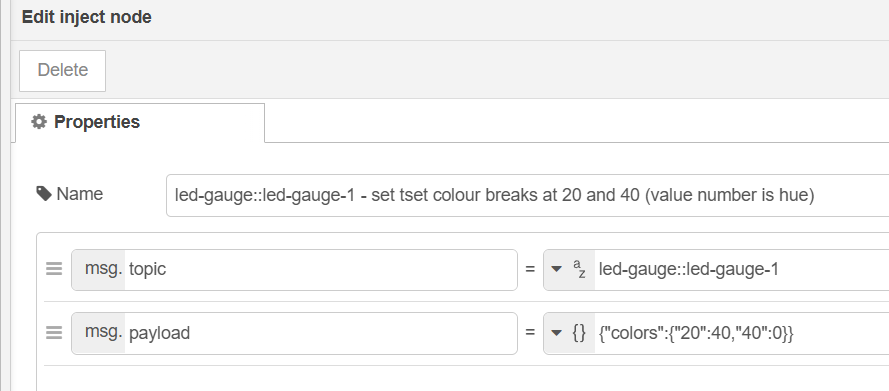
I have data that varies between -140 and -40. I'd like to plot that. When I plot a negative range like that, the Bar extends from right to left. It's easy enough to convert the value to a positive number, but I'd still like to display the scale from -140 to -40.
Am I overlooking something here? I know a little about html, and have used the UI template for a few really simple displays, just for formatted text.
rpi 3b+, NR ver 4.0.5
Thanks,
Don