How to make dashboard deploy to different size screen without layout changes
The original Node-RED Dashboard is not responsive. Items are fixed size, and will re-position beneath each other on smaller devices.
Dashboard 2.0 is responsive however, and has multiple breakpoints to manage content if you use the "Grid" or "Notebook" layouts.
My issue is that if I try to open the dashboard on different system with same size then also all the dashboard is looking scattered on the other system so what to do in that case so it appears to be same on any screen.
Are you able to share screenshots to delonstrate this please?
This is the image I have opened in another system-
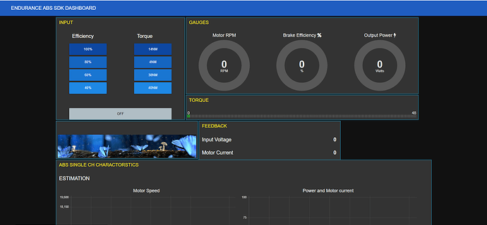
This image is the original dashboard seen in my screen-
So I want that the view to be as the default system in any screen I open the dashboard (i.e - different laptop, desktop, mobile, tab) so is there any provision that we can do such kindly guide me for the same.
For me it seems to be DB1
As there isn't enough space on a smaller resolution screen it will always look different, as some objects will move to another row.
DB1 isn't too smart when it comes to different hight groups, so in the top image the 3rd row is aligned with the smaller group above, which results in the overlapping.
The best option is to try and make sure all your groups have the same hight. You might also combine some of the groups e.g. the image and the feedback group, and the gauges and torque group. That way they cannot be split up.
I have tried the way you told but it is not happening.
This doesn't give people much information to help further ?


