Hi all,
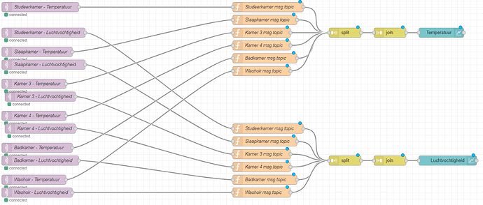
I am a complete noob at Node-red and could use a little help with tweaking two graphs on my Homey MQTT Node-red Dashboard. I managed to obtain the temperature and humidity values from my sensors and to display them as lines in two graphs. One graph displays the temperature in 6 rooms and the other the humidity in those same 6 rooms. However, I am unable to set the same colour of the lines for the temperature and humidity of the same room in the two graphs (i.e. the legends of the graphs do not match). Please see the screenshots of my Node-red flow and the dashboard. Could someone please explain to me how I can get this done? Thanks in advance!
Hi - yes, the colours get assigned in the order that message topics arrive.... so the way to fix it is a dodgy hack  - you need to add an inject node - set to inject at start - that sends a null payload to each topic in turn in the correct order you want them in - that will then "pre-assign" the topics to that order so when live data then appears all should be well.
Hi dceejay,
Thank you so much for your quick response! That did the trick!
On https://cookbook.nodered.org/basic/trigger-on-start I found a inject node that triggers at start. I still don't know how to configure such a thing myself (how does one configure an ordinary inject node to trigger at startup?), but by copying and importing the code, I now have a decent legend in two graphs.
However, if I am not asking too much and just for my learning purposes: could you explain to me how to manually make a startup inject node? Thanks again!
Hi
if you open up the inject config (double click the node) - you should see an option

which if selected fires 0.1 secs (in this case) after the flow starts;
Thanks! I saw that option, but thought it was just a delay. Now I understand. Thank you.


 - you need to add an inject node - set to inject at start - that sends a null payload to each topic in turn in the correct order you want them in - that will then "pre-assign" the topics to that order so when live data then appears all should be well.
