From the questions on the forum, I see that lots of people are struggling to show there camera images in the dashboard. So I started developing a UI camera viewer node, which was almost ready for alpha testing. But at the last moment I got a security problem, which forces me to rewrite the damn thing But not sure how to continue from here on, so would be nice to get some feedback ...
The user can select from a number of widgets (led lights, texts, pan/tilt control, preset buttons, ...) and specify where those widgets have to be displayed. For example:
So the camera images will be played in the background, and the widgets will be drawn in the foreground. This can be achieved in a number of ways:
I started by using a simple canvas element, in which I could draw both the image and the widgets on top of it:
But it became rather complex to detect where the user had clicked, since there the image had been transformed multiple times (for aspect ratio, ...). So I rewrote the node to use the second mechanism based on SVG:
By using an SVG image (which is an image inside an SVG), everything was nicely integrated into SVG. And handling mouse clicks became very easy, since the widgets are simple SVG elements (like e.g. circle):
To decode the video, I created a invisible video element (i.e. not added to the DOM tree). That video element decodes the video (from the URL), and via Javascript code the images are drawn into the SVG image. This works fine, but when the URL refers to another domain (i.e. not referring to my Node-RED) then I get a security exception: the video data is protected, so the browser can display it (via the video or image elements) but there is no way to get the data via Javascript from the video/image elements... I tried to apply the crossOrigin attribute, but you cannot get around CORS unless the video source (e.g. camera server) adds a access-control-allow-origin http header. However I cannot expect that to happen in every video source...
And I also cannot expect all my users to install a proxy server to workaround the cross domain url's.
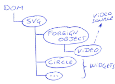
Since I cannot get a copy of such protected image data, I need to use the video element itself to display the video. But the video element isn't an SVG element. So to put the video element inside an SVG, you will need to use a SVG foreignobject element:
Did some tests and now the video element can display the video stream (even from the other domain). And in Firefox and Edge the widgets are drawn nicely on top of the video. But in Chrome the widgets are drawn behind the video, so they where not visible. Didn't find a solution, so that is again a no-go for me ... [EDIT] As described on StackOverflow, there is currently a bug in Chrome: when a video tag is used inside a foreignobject, the z-index is not taken into account (so the drawing sequence is incorrect). Grrrr....
So I tried to use independent video and SVG elements, but use CSS to draw the SVG on top of the video. By changing the z-order, it should be possible to do this:
Did a few tests with following demo, which shows a text "SVG" on top of video. It works fine on Edge/Chrome/Firefox (on windows10 portable) and also my Android smartphone. But asked some people if they could test it on their iPhones: on an older device the SVG text was on top of the video, but it disappeared behind the video as soon as the video started playing. And on a recent device the text was visible, but the video was a still image. The CSS (see demo page source) is very compact, but I don't know enough about CSS to figure out why it doesn't work on iPhone And I also don't have a clue whether this kind of CSS could work together with the current dashboard styling ...
Any suggestions to get this node back on track ???
Have you looked at mediaelement.js?
The player is designed for external media streams and has controls that overlay it. It looks as if you can also position custom controls on it.
I mention that as I guess when you say...
You mean footage not image?
I ask because as you know, it is perfectly possible to take an image and use it as a background with elements overlayed - where node-red is the source of the image (by this I mean node-red has acquired the image and passes the buffer or base64 to dashboard).
If you are already acquiring individual images and sending them as updates and this is your issue, then you could draw (image manipulation) onto the image before transferring to dashboard & use click coordinates. I have seen (and played with in a jsfiddle or jsbin demo) some code that demonstrates this, taking into account scaling and scrolling (so i know it's is doable).
Hey Steve (@Steve-Mcl),
So glad to hear a voice from the community
Nope. Have been looking yesterday evening at video.js, which also has to possibility to put custom controls on top of it. But stopped reading, since (at first sight) it seemed somehow a bit too far away from my goal ...
My node has two modes:
Push mode: you can send messages to the input of my node, which contain images in the payload. Then those messages are pushed (via websocket) to the dashboard, where I show them in the SVG image element. At that works fine already! But if you have multiple camera's or higher resolution, this is not the way to go. You will overload the websocket channel and your dashboard will become unresponsive. In that case you need the next mode ...
Fetch mode: you can specify an URL, and the (client side of) my node will fetch the video stream from that URL. That works fine when the video stream is published by my Node-RED flow (using my node-red-contrib-multipart-stream-encoder node), but not when it is from a CORS protected domain. There is no way to capture image data from such a cross-domain video stream.
Indeed, but my 'push mode' already works fine and I cannot do this for the 'fetch mode' ...
I think the only possible (cross-browser) solution is option 4, i.e. use CSS to draw the SVG element on top of the video element. Did a small test by creating my first jsfiddle, where I draw a simple SVG text on top of a video. Due to my lack of CSS knowledge I don't get it looking good, and I have no clue at the moment how to implement something like that in the dashboard
So I really hope somebody with CSS experience can help me out with that fiddle. Tomorrow evening I have the follow the first cooking workshop in my entire life ( ), so will try to continue with it on saturday evening. And I'm afraid that taking a cooking course with my lovely wife is still much more complex compared to CSS
Well I'm wasting LOTS of free time currently with the styling stuff, so the Onvif indeed is becoming a never ending story. Now my time is up again for today ...
After some lots of experiments in multiple browsers, I conclude that option 4 is the only solution that 'could' work across different browsers. So I have to use CSS to draw SVG shapes on top of the image/video. I have updated the title of this discussion, so hopefully I now get some help because I'm a real CSS dummy .
I did some CSS homework, which resulted in this test code (which you can paste in a template node):
I have a div container that fits the space that is allocated for me by the dashboard. The height is set to auto, because when I use 100% I get a vertical scrollbar. I read here that the percentage based heights are calculated at the start, and at that moment the margins and borders are not taken into account yet. And afterwards those margins and borders cause the scrollbar to appear...
The first child is an image element which fills the div element.
The second child is an SVG element which will be drawn on top of the image element. Based on (chapter 3 of) this article: the image needs to have a relative position and z-index 1, while the SVG needs to have an absolute position (at 0,0) with z-index 2.
And then the circle is indeed drawn on top of the image (in Chrome):
But it is NOT drawn in the middle as I had specified(via cx="50%" cy="50%").
Using the inspector I see these dimensions for the 3 elements:
So it seems to me that the SVG fills the entire space (supplied by the dashboard), but the image is smaller: perhaps to keep the aspect ratio? And I had expected that the div would be a bit larger than the SVG, but now it feels like the div has gotten the dimesions of the image (instead of the other way around)? I had expected the div to be about the size of the SVG and that I could somehow choose whether the image could be stretched to fill that larger div, or fill it partially (to maintian the aspect ratio)....
Hey @hotNipi, @dceejay,
I used the preserveAspectRatio in my previous version, where I used the SVG images (so images inside the svg). That worked indeed veery well. But now my SVG is on top of an normal (non-SVG) image. The main problem is now that the image doesn't fill the DIV for some reason... Don't know if the CSS overflow can solve that. This CSS stuff is a bit too mysterious for me...
So I position the image element at 50% from the top of it's parent DIV, then I translate it up 50% of its height. This seems to be working fine on Windows 10 (Chrome, Firefox, Edge) an my Android smartphone (Chrome).
Would appreciate if anybody could test this on an iPhone (by pasting the code in a template node) or some other device. If everything is ok, the result should be the same as in this screenshot... Don't know anybody personally, who is wealthy enough to buy stuff from Apple
Hey @kilbamoo, @dceejay,
Thanks a lot for testing!!! Now I'm at least sure that it works on most setups.
So I can start rewriting my camera-viewer node to use this new mechanism.
To be continued in the near future in another discussion...
 But not sure how to continue from here on, so would be nice to get some feedback ...


 ), so will try to continue with it on saturday evening. And I'm afraid that taking a cooking course with my lovely wife is still much more complex compared to CSS
 .
.


