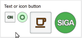
Standard Buttons
In Dashboard 2 a widget height is specified in the page theme but the width varies according to the browser window size. Therefore a standard button perhaps loses some of the label as it overflows at different widths.
Button CSS Tweeked
The buttons presented here are the standard ui-button widget with CSS adjustments to maintain their width (and position within the widget) regardless of the widget display width, thus they remain round or square. Button height (and font size) can be configured as a proportion of the theme's row height. Note that there is still one button per widget, so you couldn't have eg three buttons side by side in a single 3x1 widget.(In this pic showing different browser window sizes, ui-button widgets are outlined in red.)

Action on button press
A default button does not change the label or colour when pressed. I've used a function node for each button to toggle between "active" and "inactive" states to allow changes to the background/foreground colour and text/icon value.Usage
There is a CSS template which can be applied to a single page or all. A button must be 1x1 or 2x2 grid units and have custom class: `mybutton large round`, `mybutton small square` etc. The function node for each button is identical except for the settings at the top egconst foregroundcolor = { "active": "#6d3b07", "inactive": "#6d3b07" }
const backgroundcolor = { "active": "whitesmoke", "inactive": "whitesmoke" }
const icon = { "active": "coffee-outline", "inactive": "coffee-off-outline" }
const label = { "active": "", "inactive": "" }
Unfortunately the function nodes for the buttons on a page can't easily be combined since they use a context variable to store the button state.
Other customisations such as the button height and placement within the widget can be applied via the CSS file.
If you use the buttons to control a real world device such as a smart switch, there has to be a way to sychronise the button with the real world. For this you can pass "ON" or "OFF" into the button's function node.
Best practise is for the displayed button colour and content to represent the result of pressing it. ie if the coffee machine is switched on, the button should show red "OFF" not green "ON".
Example Flow


[{"id":"9f9f6bd43bb10890","type":"tab","label":"Buttons minimal","disabled":false,"info":"","env":[]},{"id":"92ad9b7a93d606fc","type":"junction","z":"9f9f6bd43bb10890","x":280,"y":120,"wires":[["882083c1881f21ff","3d89bd567a8d4b0a","dbebd50383aed279","56cc1637f21593ca"]]},{"id":"a9c48dc172ca860c","type":"junction","z":"9f9f6bd43bb10890","x":280,"y":135,"wires":[["882083c1881f21ff","3d89bd567a8d4b0a","dbebd50383aed279","56cc1637f21593ca"]]},{"id":"e4e0c59f2abcf432","type":"ui-button","z":"9f9f6bd43bb10890","group":"a10c2b1bf4418866","name":"On/Off","label":"","order":1,"width":"1","height":"1","emulateClick":false,"tooltip":"","color":"","bgcolor":"","className":"mybutton small square","icon":"","iconPosition":"left","payload":"toggle","payloadType":"str","topic":"Button 1 ON OFF","topicType":"str","buttonColor":"","textColor":"","iconColor":"","enableClick":true,"enablePointerdown":false,"pointerdownPayload":"","pointerdownPayloadType":"str","enablePointerup":false,"pointerupPayload":"","pointerupPayloadType":"str","x":265,"y":30,"wires":[["882083c1881f21ff"]]},{"id":"7abd9ff982b9d648","type":"ui-button","z":"9f9f6bd43bb10890","group":"a10c2b1bf4418866","name":"Pare","label":"","order":4,"width":"2","height":"2","emulateClick":false,"tooltip":"","color":"","bgcolor":"","className":"mybutton large round","icon":"","iconPosition":"left","payload":"toggle","payloadType":"str","topic":"Button 4 Pare","topicType":"str","buttonColor":"","textColor":"","iconColor":"","enableClick":true,"enablePointerdown":false,"pointerdownPayload":"","pointerdownPayloadType":"str","enablePointerup":false,"pointerupPayload":"","pointerupPayloadType":"str","x":260,"y":210,"wires":[["56cc1637f21593ca"]]},{"id":"78b98bbae7d221c4","type":"ui-template","z":"9f9f6bd43bb10890","group":"","page":"dcb042e7ae65cbcd","ui":"","name":"mybutton CSS","order":0,"width":0,"height":0,"head":"","format":":root { \n--heightfraction: 1; /* Proportion of widget height for the button */\n--vertical: center; /* Vertical justification self-start (top), center or self-end (bottom) */\n--horizontal: center; /* Horizontal justification left, center or right */\n\n--borderscale: 0.04; /* Proportion of widget height for border (0 - 0.1?) */\n--bordercolor: #888; /* Border color */\n--borderradius: 5%; /* For 'square' buttons. */\n\n--fontscale: 0.35; /* Proportion of button height for the text/icon (0.2 to 0.5?) */\n}\n\n/* Align buttons inside widget */\n.nrdb-ui-button.mybutton {\n display: flex !important;\n align-items: var(--vertical);\n justify-content: var(--horizontal);\n}\n\n.nrdb-ui-button.mybutton button { \n background-color: whitesmoke; /* get rid of theme button colour */\n font-family: arial, sans-serif;\n text-shadow: -1px -1px 1px #444, 1px -1px 1px #444, -1px 1px 1px #444, 1px 1px 1px #444;\n border-radius: var(--borderradius) ; \n border: calc(var(--borderscale) * var(--widget-row-height)) solid var(--bordercolor); \n}\n.nrdb-ui-button.mybutton button i { /* outline icon */\n text-shadow: -1px -1px 1px #444, 1px -1px 1px #444, -1px 1px 1px #444, 1px 1px 1px #444;\n}\n.nrdb-ui-button.mybutton.round button { /* round button border radius */\n border-radius: 5em ;\n}\n\n/* Widget height for 1x1 buttons */\n.nrdb-ui-button.mybutton, .nrdb-ui-button.mybutton.small {\n max-height: var(--widget-row-height);\n min-height: var(--widget-row-height);\n}\n/* 1x1 button size */\n.nrdb-ui-button.mybutton.small button {\n max-height: calc(var(--heightfraction) * var(--widget-row-height));\n max-width: calc(var(--heightfraction) * var(--widget-row-height));\n min-height: calc(var(--heightfraction) * var(--widget-row-height));\n min-width: calc(var(--heightfraction) * var(--widget-row-height));\n font-size: calc(var(--heightfraction) * var(--fontscale) * var(--widget-row-height));\n font-weight: normal;\n letter-spacing: normal;\n box-shadow: inset rgba(20, 70, 85, 0.8) 0px 0px 5px -3px;\n}\n\n/* Widget height for 2x2 buttons */\n.nrdb-ui-button.mybutton.large {\n max-height: calc(2 * var(--widget-row-height) + var(--widget-gap)) ;\n min-height: calc(2 * var(--widget-row-height) + var(--widget-gap));\n}\n\n/* 2x2 button size */\n.nrdb-ui-button.mybutton.large button {\n max-height: calc(var(--heightfraction) * 2 * var(--widget-row-height) + var(--widget-gap));\n max-width: calc(var(--heightfraction) * 2 * var(--widget-row-height) + var(--widget-gap));\n min-height: calc(var(--heightfraction) * 2 * var(--widget-row-height) + var(--widget-gap));\n min-width: calc(var(--heightfraction) * 2 * var(--widget-row-height) + var(--widget-gap));\n font-size: calc(2 * var(--heightfraction) * var(--fontscale) * var(--widget-row-height) + var(--widget-gap));\n font-size: calc(var(--heightfraction) * var(--fontscale) * (( 2 * var(--widget-row-height)) + var(--widget-gap)));\n font-weight: bold;\n letter-spacing: -2px;\n box-shadow: inset rgba(20, 70, 85, 0.8) 0px 0px 10px -5px;\n}\n","storeOutMessages":true,"passthru":false,"resendOnRefresh":true,"templateScope":"page:style","className":"","x":100,"y":30,"wires":[[]]},{"id":"e232bb9f0d24571e","type":"ui-button","z":"9f9f6bd43bb10890","group":"a10c2b1bf4418866","name":"I/O","label":"","order":2,"width":"1","height":"1","emulateClick":false,"tooltip":"","color":"","bgcolor":"","className":"mybutton small round","icon":"","iconPosition":"left","payload":"toggle","payloadType":"str","topic":"Button 2 I O","topicType":"str","buttonColor":"","textColor":"","iconColor":"","enableClick":true,"enablePointerdown":false,"pointerdownPayload":"","pointerdownPayloadType":"str","enablePointerup":false,"pointerupPayload":"","pointerupPayloadType":"str","x":265,"y":75,"wires":[["dbebd50383aed279"]]},{"id":"1372e8fb3ded30f1","type":"ui-button","z":"9f9f6bd43bb10890","group":"a10c2b1bf4418866","name":"Coffee","label":"","order":3,"width":"2","height":"2","emulateClick":false,"tooltip":"","color":"","bgcolor":"","className":"mybutton large square","icon":"","iconPosition":"left","payload":"toggle","payloadType":"str","topic":"Button 3 Coffee","topicType":"str","buttonColor":"","textColor":"","iconColor":"","enableClick":true,"enablePointerdown":false,"pointerdownPayload":"","pointerdownPayloadType":"str","enablePointerup":false,"pointerupPayload":"","pointerupPayloadType":"str","x":260,"y":165,"wires":[["3d89bd567a8d4b0a"]]},{"id":"03e28259adf8680b","type":"ui-template","z":"9f9f6bd43bb10890","group":"","page":"dcb042e7ae65cbcd","ui":"","name":"Outline buttons","order":0,"width":0,"height":0,"head":"","format":"<template>\n</template>\n\n<script>\n export default {\n watch: {\n msg: function () {\n if (this.msg?.topic === 'add' || this.msg?.topic === 'remove') {\n const fn = this[this.msg?.topic] // add or remove\n const selector = this.msg.selector || 'div.nrdb-ui-page'\n const className = this.msg.payload\n fn(selector, className)\n }\n }\n },\n methods: {\n add: function (selector, className) {\n const el = document.querySelector(selector)\n el.classList.add(className)\n },\n remove: function (selector, className) {\n const el = document.querySelector(selector)\n el.classList.remove(className)\n }\n }\n }\n</script>\n\n<style>\n.widgetoutlines .mybutton {\n outline: 1px solid red;\n}\n</style>","storeOutMessages":true,"passthru":true,"resendOnRefresh":true,"templateScope":"widget:page","className":"","x":485,"y":270,"wires":[[]]},{"id":"896c5144335a8d2d","type":"ui-button","z":"9f9f6bd43bb10890","group":"eb678fc84115e36b","name":"Outline","label":"Outline Widgets","order":3,"width":"2","height":"1","emulateClick":false,"tooltip":"","color":"","bgcolor":"","className":"","icon":"","iconPosition":"left","payload":"widgetoutlines","payloadType":"str","topic":"add","topicType":"str","buttonColor":"","textColor":"","iconColor":"","enableClick":true,"enablePointerdown":false,"pointerdownPayload":"","pointerdownPayloadType":"str","enablePointerup":false,"pointerupPayload":"","pointerupPayloadType":"str","x":90,"y":270,"wires":[["f1dbfe6c870d27be"]]},{"id":"f1dbfe6c870d27be","type":"function","z":"9f9f6bd43bb10890","name":"Toggle","func":"let state = context.get (\"state\") ?? \"on\"\nlet ctrlmsg = {}\nif (state === \"off\") {\n ctrlmsg = {\"payload\": \"widgetoutlines\", \"topic\": \"remove\"}\n state = \"on\"\n}\nelse {\n ctrlmsg = { \"payload\": \"widgetoutlines\", \"topic\": \"add\" }\n state = \"off\"\n}\ncontext.set (\"state\", state)\nreturn ctrlmsg;","outputs":1,"timeout":0,"noerr":0,"initialize":"","finalize":"","libs":[],"x":260,"y":270,"wires":[["03e28259adf8680b"]]},{"id":"862a6cab6e2af5d2","type":"ui-button","z":"9f9f6bd43bb10890","group":"eb678fc84115e36b","name":"Activate","label":"Activate all buttons","order":1,"width":"2","height":"1","emulateClick":false,"tooltip":"","color":"","bgcolor":"","className":"","icon":"","iconPosition":"left","payload":"ON","payloadType":"str","topic":"","topicType":"str","buttonColor":"","textColor":"","iconColor":"","enableClick":true,"enablePointerdown":false,"pointerdownPayload":"","pointerdownPayloadType":"str","enablePointerup":false,"pointerupPayload":"","pointerupPayloadType":"str","x":90,"y":105,"wires":[["92ad9b7a93d606fc"]]},{"id":"dc70d76497ea21dc","type":"ui-button","z":"9f9f6bd43bb10890","group":"eb678fc84115e36b","name":"Deactivate","label":"Deactivate all buttons","order":2,"width":"2","height":"1","emulateClick":false,"tooltip":"","color":"","bgcolor":"","className":"","icon":"","iconPosition":"left","payload":"OFF","payloadType":"str","topic":"add","topicType":"str","buttonColor":"","textColor":"","iconColor":"","enableClick":true,"enablePointerdown":false,"pointerdownPayload":"","pointerdownPayloadType":"str","enablePointerup":false,"pointerupPayload":"","pointerupPayloadType":"str","x":85,"y":150,"wires":[["a9c48dc172ca860c"]]},{"id":"56cc1637f21593ca","type":"function","z":"9f9f6bd43bb10890","name":"Control","func":"const foregroundcolor = { \"active\": \"whitesmoke\", \"inactive\": \"whitesmoke\" }\nconst backgroundcolor = { \"active\": \"green\", \"inactive\": \"red\" }\nconst icon = { }\nconst label = { \"active\": \"SIGA\", \"inactive\": \"PARE\" }\n\nlet state = context.get(\"state\") ?? \"active\" // if context doesnt exist, this will result in inactive\n\nif (msg.payload === \"ON\") state = \"inactive\" // explicit commands to sync button and real state \nif (msg.payload === \"OFF\") state = \"active\"\n\nmsg.ui_update = {}\n\nif (state === \"active\") {\n //msg.ui_update = {\"iconColor\": inactivefgcolor, \"icon\": inactiveicon, \"buttonColor\": inactivebgcolor }\n state = \"inactive\"\n} \nelse if (state === \"inactive\") {\n //msg.ui_update = {\"iconColor\": activefgcolor, \"icon\": activeicon, \"buttonColor\": activebgcolor }\n state = \"active\"\n}\ncontext.set(\"state\", state)\n\nmsg.ui_update.label = label[state]\nmsg.ui_update.icon = icon[state]\nmsg.ui_update.textColor = foregroundcolor[state]\nmsg.ui_update.iconColor = foregroundcolor[state]\nmsg.ui_update.buttonColor = backgroundcolor[state]\n\nmsg.payload = state\nreturn msg;","outputs":1,"timeout":0,"noerr":0,"initialize":"","finalize":"","libs":[],"x":465,"y":210,"wires":[["7abd9ff982b9d648","7f9449343fbb889f"]]},{"id":"dbebd50383aed279","type":"function","z":"9f9f6bd43bb10890","name":"Control","func":"const foregroundcolor = { \"active\": \"green\", \"inactive\": \"red\" }\nconst backgroundcolor = { \"active\": \"hsl(125, 100%, 90%)\", \"inactive\": \"hsl(0, 100%, 90%)\"}\nconst icon = { \"active\": \"power-off\", \"inactive\": \"power-on\" }\nconst label = { \"active\": \"\", \"inactive\": \"\" }\n\nlet state = context.get(\"state\") ?? \"active\" // if context doesnt exist, this will result in inactive\n\nif (msg.payload === \"ON\") state = \"inactive\" // explicit commands to sync button and real state \nif (msg.payload === \"OFF\") state = \"active\"\n\nmsg.ui_update = {}\n\nif (state === \"active\") {\n //msg.ui_update = {\"iconColor\": inactivefgcolor, \"icon\": inactiveicon, \"buttonColor\": inactivebgcolor }\n state = \"inactive\"\n} \nelse if (state === \"inactive\") {\n //msg.ui_update = {\"iconColor\": activefgcolor, \"icon\": activeicon, \"buttonColor\": activebgcolor }\n state = \"active\"\n}\ncontext.set(\"state\", state)\n\nmsg.ui_update.label = label[state]\nmsg.ui_update.icon = icon[state]\nmsg.ui_update.textColor = foregroundcolor[state]\nmsg.ui_update.iconColor = foregroundcolor[state]\nmsg.ui_update.buttonColor = backgroundcolor[state]\n\nmsg.payload = state\nreturn msg;","outputs":1,"timeout":0,"noerr":0,"initialize":"","finalize":"","libs":[],"x":465,"y":75,"wires":[["3bf837c96da753a5","e232bb9f0d24571e"]]},{"id":"882083c1881f21ff","type":"function","z":"9f9f6bd43bb10890","name":"Control","func":"const foregroundcolor = { \"active\": \"green\", \"inactive\": \"red\" }\nconst backgroundcolor = { \"active\": \"whitesmoke\", \"inactive\": \"whitesmoke\" }\nconst icon = { }\nconst label = { \"active\": \"ON\", \"inactive\": \"OFF\" }\n\nlet state = context.get(\"state\") ?? \"active\" // if context doesnt exist, this will result in inactive\n\nif (msg.payload === \"ON\") state = \"inactive\" // explicit commands to sync button and real state \nif (msg.payload === \"OFF\") state = \"active\"\n\nmsg.ui_update = {}\n\nif (state === \"active\") {\n //msg.ui_update = {\"iconColor\": inactivefgcolor, \"icon\": inactiveicon, \"buttonColor\": inactivebgcolor }\n state = \"inactive\"\n} \nelse if (state === \"inactive\") {\n //msg.ui_update = {\"iconColor\": activefgcolor, \"icon\": activeicon, \"buttonColor\": activebgcolor }\n state = \"active\"\n}\ncontext.set(\"state\", state)\n\nmsg.ui_update.label = label[state]\nmsg.ui_update.icon = icon[state]\nmsg.ui_update.textColor = foregroundcolor[state]\nmsg.ui_update.iconColor = foregroundcolor[state]\nmsg.ui_update.buttonColor = backgroundcolor[state]\n\nmsg.payload = state\nreturn msg;","outputs":1,"timeout":0,"noerr":0,"initialize":"","finalize":"","libs":[],"x":465,"y":30,"wires":[["e4e0c59f2abcf432","329e147d0f4bd32e"]]},{"id":"3d89bd567a8d4b0a","type":"function","z":"9f9f6bd43bb10890","name":"Control","func":"const foregroundcolor = { \"active\": \"#6d3b07\", \"inactive\": \"#6d3b07\" }\nconst backgroundcolor = { \"active\": \"whitesmoke\", \"inactive\": \"whitesmoke\" }\nconst icon = { \"active\": \"coffee-outline\", \"inactive\": \"coffee-off-outline\" }\nconst label = { \"active\": \"\", \"inactive\": \"\" }\n\nlet state = context.get(\"state\") ?? \"active\" // if context doesnt exist, this will result in inactive\n\nif (msg.payload === \"ON\") state = \"inactive\" // explicit commands to sync button and real state \nif (msg.payload === \"OFF\") state = \"active\"\n\nmsg.ui_update = {}\n\nif (state === \"active\") {\n //msg.ui_update = {\"iconColor\": inactivefgcolor, \"icon\": inactiveicon, \"buttonColor\": inactivebgcolor }\n state = \"inactive\"\n} \nelse if (state === \"inactive\") {\n //msg.ui_update = {\"iconColor\": activefgcolor, \"icon\": activeicon, \"buttonColor\": activebgcolor }\n state = \"active\"\n}\ncontext.set(\"state\", state)\n\nmsg.ui_update.label = label[state]\nmsg.ui_update.icon = icon[state]\nmsg.ui_update.textColor = foregroundcolor[state]\nmsg.ui_update.iconColor = foregroundcolor[state]\nmsg.ui_update.buttonColor = backgroundcolor[state]\n\nmsg.payload = state\nreturn msg;","outputs":1,"timeout":0,"noerr":0,"initialize":"","finalize":"","libs":[],"x":465,"y":165,"wires":[["dc86a1b81266644b","1372e8fb3ded30f1"]]},{"id":"3bf837c96da753a5","type":"debug","z":"9f9f6bd43bb10890","name":"Payload","active":false,"tosidebar":true,"console":false,"tostatus":false,"complete":"payload","targetType":"msg","statusVal":"","statusType":"auto","x":630,"y":75,"wires":[]},{"id":"329e147d0f4bd32e","type":"debug","z":"9f9f6bd43bb10890","name":"Payload","active":false,"tosidebar":true,"console":false,"tostatus":false,"complete":"payload","targetType":"msg","statusVal":"","statusType":"auto","x":625,"y":30,"wires":[]},{"id":"dc86a1b81266644b","type":"debug","z":"9f9f6bd43bb10890","name":"Payload","active":false,"tosidebar":true,"console":false,"tostatus":false,"complete":"payload","targetType":"msg","statusVal":"","statusType":"auto","x":630,"y":165,"wires":[]},{"id":"7f9449343fbb889f","type":"debug","z":"9f9f6bd43bb10890","name":"Payload","active":false,"tosidebar":true,"console":false,"tostatus":false,"complete":"payload","targetType":"msg","statusVal":"","statusType":"auto","x":625,"y":210,"wires":[]},{"id":"a10c2b1bf4418866","type":"ui-group","name":"Text or icon button","page":"dcb042e7ae65cbcd","width":6,"height":1,"order":1,"showTitle":true,"className":"","visible":"true","disabled":"false","groupType":"default"},{"id":"dcb042e7ae65cbcd","type":"ui-page","name":"Text button","ui":"e9c974f7c1d080d1","path":"/textbutton","icon":"home","layout":"grid","theme":"0d92c765bfad87e6","breakpoints":[{"name":"Default","px":"0","cols":"3"},{"name":"Tablet","px":"576","cols":"6"},{"name":"Small Desktop","px":"768","cols":"9"},{"name":"Desktop","px":"1024","cols":"12"}],"order":2,"className":"","visible":true,"disabled":false},{"id":"eb678fc84115e36b","type":"ui-group","name":"Actions","page":"dcb042e7ae65cbcd","width":6,"height":1,"order":2,"showTitle":true,"className":"","visible":"true","disabled":"false","groupType":"default"},{"id":"e9c974f7c1d080d1","type":"ui-base","name":"My Dashboard","path":"/dashboard","appIcon":"","includeClientData":true,"acceptsClientConfig":["ui-notification","ui-control"],"showPathInSidebar":false,"headerContent":"page","navigationStyle":"default","titleBarStyle":"default","showReconnectNotification":true,"notificationDisplayTime":1,"showDisconnectNotification":true,"allowInstall":true},{"id":"0d92c765bfad87e6","type":"ui-theme","name":"Basic Blue Theme","colors":{"surface":"#4d58ff","primary":"#0094ce","bgPage":"#eeeeee","groupBg":"#ffffff","groupOutline":"#cccccc"},"sizes":{"pagePadding":"12px","groupGap":"12px","groupBorderRadius":"4px","widgetGap":"2px","density":"default"}},{"id":"d531269ebdf73a91","type":"global-config","env":[],"modules":{"@flowfuse/node-red-dashboard":"1.29.0"}}]


