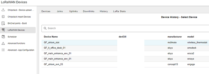
Apologies if this has been asked. Has anyone worked out how to apply a custom CSS to show the currently selected tab in a v2 tab layout? Currently there is no way to no what tab your on.
That is not correct and you can see that in your screenshot. The current tab is highlighted, the underlying HTML looks like this:
<a data-v-dd700828="" class="v-list-item v-list-item--active v-list-item--link v-list-item--nav v-theme--nrdb v-list-item--density-default v-list-item--one-line v-list-item--rounded v-list-item--variant-text" tabindex="-2" href="/nr/dashboard/p1" aria-current="page" data-nav="a6c08cd025d0c2bd"><span class="v-list-item__overlay"></span><span class="v-list-item__underlay"></span><div class="v-list-item__prepend"><!----><i class="mdi-home mdi v-icon notranslate v-theme--nrdb v-icon--size-default" aria-hidden="true" density="default"></i><div class="v-list-item__spacer"></div></div><div class="v-list-item__content" data-no-activator=""><div class="v-list-item-title">P1 (/p1)</div><!----><!----></div><div class="v-list-item__append"><!----><div class="v-list-item__spacer"></div></div></a>
Urm, yes, not terribly helpful! ![]()
The key class seems to be v-list-item--active - so you perhaps simply need to override that if you want to customise the look?
Ah, I was looking at the wrong "tabs" ![]()
<button data-v-5f213885="" type="button" class="v-btn v-tab-item--selected v-tab--selected v-theme--nrdb v-btn--density-default v-btn--size-default v-btn--variant-text v-tab" tabindex="0" role="tab" aria-selected="true" value="a9c7595384727d2e"><span class="v-btn__overlay"></span><span class="v-btn__underlay"></span><!----><span class="v-btn__content" data-no-activator="">P2G1<div class="v-tab__slider"></div></span><!----><!----></button>
There seem to be 2 possible CSS classes then: v-tab-item--selected and v-tab--selected.
Thanks to you both for taking the time look at this ..
@TotallyInformation I can see why I missed that my zoom was 90% !!
@jbudd that works a treat.
That’s a bug, not a feature. I’ll take a look


