Here is the dashboard for my home control. Most of my items have states on, off or auto, some have colour change.In order to show the current state which may have ben set by a button touch in the dashboard or may have been set by a timer, I have a coloured icon on the left next to the description. Tehe colour depicts ON, OFF, auto-on or auto off. I'd rather the actual buttons or at least the button icon actually changed colour when the state changes. Any ideas for a simple way to do that?

You can use a msg property to set it. Eg. {{some_property}} in the Colour field to set the text/icon colour
SORTED - Thanks Dave - I set {{msg.payload}} and now the buttons change colour on demand.
My buttons use fa-icons - all I need now is to change the icon size in the button.
In a template - setting the button radius was easy - setting the icon sizea is proving more challenging.
.md-button { border-radius: 25%; }
With fa its easy. Just add fa-2x. 3x etc. So the icon is like. fa-flame fa-3x etc. fa-spin also works (if required)
Figured out fa-2x etc all by myself yesterday but didn't know about fa-spin, Just tested - it seems you need to make the field dynamic to make use of the latter. Not much point in a constantly-rotating button 
If you are still there - erm, I never did crack haptic feedback on those buttons - it's nice that they now change buton on selection but a short (on mobile phones obviously) "brrp" on touch would finish them off nicely. I've always preferred real-button TV remotes as the LCD ones you have to look at in case you missed the button

The 3 middle buttons have the new icon change (larger and prettier) and the one on the right is the active button (BigTimer, blue means auto off, would be green if on). Manual ON turns red when active.... still experimenting.

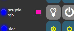
In case its not obvious that purple square is the colour control - opens up when touched - not pretty but works..

You can style it a bit. I don't know of course how do you like it but ..

<style>
.color-picker-input-wrapper.input-group > span{
    border-radius:20%;
    width: 24px !important;
    height:24px !important;

}
.color-picker-wrapper.color-picker-swatch-only.color-picker-open {
    width: unset;
    border-width: 0px;
}
</style>
hotNipi
Am I being thick here? I just added your great suggestion to the template that is already rounding the buttons - and no change to the colour picker square,
.md-button { border-radius: 25%; }.color-picker-input-wrapper.input-group > span{
border-radius:20%;
width: 24px !important;
height:24px !important;
}
.color-picker-wrapper.color-picker-swatch-only.color-picker-open {
width: unset;
border-width: 0px;
}
Aah, you are using text input color picker maybe?
Back to the msg.payload that Dave first suggested - works a treat and I'm using it to programatically change the background colour depending on which button was last pressed or the state of auto. LOVELY.
My next innovation would be to reduce down to one button and have it's ICON change depending on state... FAIL
All I've tried to change here is, instead of the PERGOLA AUTO icon being a fixed timer as above, I made it a variable (msg.myIcon" and in the preceeding function, set msg.myIcon to the same fixed value (for now) that the button originally had. Instead I'm seeing a question mark as the icon. Anyone wiser than me care to comment?

Yes, the original colour picker with round picker (with grey in the middle) is AWFUL - I abandoned that ages ago, with the grey colour picker etc, so I'm using the text one on lots of lights - not pretty but eorks just fine... but msking thst little square (with strange underline underneath it) round would be GREAT. Got any idea how to mod your suggestion to make it work?? My colour picker says "mode: color picker" and at the top "text mode"

It can be tweaked for sure. Takes a little more than the color picker version but doable. Ill try a bit ..
Edit: I cant see any mistake in the "msg.myIcon" stuff you tried. Works for me seamlessly ..
As long as you are on last weeks dashboard update... 2.24.1
I just realised it was DAVE who responded about 2.24.0 - right - I'm NOW on 2.24.1 and indeed the icon changes. WHEEE. Getting there.
All right as I'm pushing my luck here..

the button payload - instead of on, off or auto on press I need it to change depending on the feedback as to what mode I'm already in - ie. cycle auto, on, off without disappearing in a loop. I must be missing something here - you have to send msg.payload which cant seem to be msg.state but has to be literal?
For textinput colorpicker, it is of course totally different element and not so friendly.
But something can be done.
/*
The selector which selects only element in one tab and one group
Starts with # followed by tab name
then group name
then "cards"
All connected with underscore

#Tabname_Groupname_cards
*/

#Home_TEST_cards > md-card > md-input-container {
   padding:0 !important;
   margin:0 !important;
}

.nr-dashboard-theme .nr-dashboard-textinput input[type="color"]{
    border: none !important;
    width: 48px;
    height: 48px;
    margin: 0 !important;
    padding: 0 !important;
}
Let the button be dummy. The only smartness the button should have is that it can represent the states. (backgeound color, icon color, label)
Button gets input which bases on the current state of something. (if state == "on" then backgound color shouldbe green ....)
The output of button can be anything. What you'll need is the event that button was cliked. That's all.
Next after button make function which asks for current state for that same something. Then based on this state, figure out what kind of payload should be sent out to the following flow. Also if you are sure that at this point the state of that something can be also changed, change the state and store it. I'd be happy if the state changes are changed and stored somewhere else where actual state is received from the device or what ever is the thing you are controlling.
If everything went OK the "before button function" gets an input and you can figure out the look for the button by (may be) changed state.


Getting there.

Only need one button now and the colour picker fits ehere one of the other buttons went originally.
I could almost fit 2 devices on one line on the phone now....
A little bit can be done better for color picker

#Home_Default_cards > md-card > md-input-container {
   padding:0 !important;
   margin:0 !important;
   border-radius:25%;
   background-color:var(--nr-dashboard-widgetColor);
}

.nr-dashboard-theme .nr-dashboard-textinput input[type="color"]{
    border: none !important;
    width: 48px;
    height: 48px;
    margin: 0 !important;
    padding: 10% !important;
}
Just don’t try it on safari