v1.2.0
Just updated and tried the changes to the Gauge widget.
Could the MD icon be larger? there appears to be lots of white space below the value, and currently the icon (& text) is disproportionately small compared to the payload value
Also, the gap between the label & the gauge appears excessive, as previously suggested
I realize that everyone will have their own opinion on 'sizes', and although they could be changed using CSS overide, it would be good to start from a happy medium.
Yeah, agree. Not much to celebrate with gauge widget with this update. By looking into it I still can't understand how it should work. For me it's in the sate of "back to drawing board" .. But this is me... I don't know everything ..
It will get sorted, but its on a very long list of things for me to address, and I now only get 2 days a week (at best) on Dashboard development at the moment
If I get enough time to take deep dive into it, I'll do it. I have some doubts, nothing for sure. Definitely no dates to promise and don't count on me in that matter.
I wouldn't call it that way, it is not gap problem but whole layout should be considered to behave in all possible layout configurations and that's a bit bigger thing. That's why I cant give "ten minute solution". It takes to dive in deep.
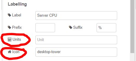
I see an additional config input box has been added to change the sub-labels - now 'units' & 'icons'.
I thought the original plan was;
check if props.unit has mdi- at start, if so, show an icon in place of the text.
so that there was only one input box, for either text or a MD icon, which sounded a cleaner approach, and makes things easier for new users.
Especially, if the icon/text size is increased, there would probably not be enough room for both an icon & text anyway.
Thanks for following this up. I got the e-mail to say you'd replied on Github, then I opened the issue and your comment wasn't there? Hadn't seen it come in here!
It wasn't me that implemented it, but I was happy with the direction taken as it does offer more flexibility - i.e. both icon and text.
I agree though that improvements are required on the general icon/payload value sizings. My loose thinkings here are:
icon only: larger font size
icon and text: as is now
text only: as is now
Sanity check - I'm not going insane, I definitely received it as a GH notification, not Discourse:
I had not seen the change of thought until your latest version was published, and I commented on the git issue.
However, I then noted that the issue had already been closed earlier, and wasn't therefore sure if you would get an alert, so I deleted it, and posted in the forum thread instead.
I just feel that having 2 input config boxes to update 1 field is not a good approach, and which is not seen elsewhere in node-Red, whilst your original suggestion seemed logical, a good all-round solution, and fulfilling the issue that I had raised.