Dynamically toggle between dashboard themes

I found an example to toggle the theme from light to dark. It works however it is using the Vuetify light and dark themes. Is there a way to call the theme defined in the dashboard theming panel

<template>
 <v-card>
    <v-btn
      @click="toggleTheme" 
      variant="tonal" 
    > Toggle Theme
  </v-btn>
  </v-card>
</template>

<script>
export default {
  methods: {
    toggleTheme() {
      this.$vuetify.theme.global.name = this.$vuetify.theme.global.name === 'dark' ? 'light' : 'dark';
    }
  }
}
</script>

Also when I refresh the page the page resets to the default theming settings.

Here is the current theme..

Toggling the button gives me...

or

Thx in advance

Hmmm...No response. I get the feeling I have been banished from the site.

I am interested to discover that there is such a thing as a Vuetify theme.
Are "dark" and "light" themes predefined or can you modify them?

The page theme and dashboard UI setting look to me like stubs which never got developed and judging by progress to date, never will.*
With regards to the page theme, it's a few settings which would be better implemented as a custom CSS class and it's definitions.

Since a page is allowed to have a custom class, and (I believe) there is a mechanism to dynamically change the class, can't you use that to achieve your light and dark look?

* I have seen the argument that a dialog with selected parameters and colour pickers/text input fields are more beginner-friendly than CSS custom classes.
It could have been implemented to be much more widely applicable and informative than this curated set of page customisations.

The problem is, as I understand it, that there isn't any manpower at the moment to work on the dashboard, even on sorting out some significant deficiencies.

The disadvantage of having a very complex Dashboard core.

1 Like

@Colin ,

I did not know the team was short handed. I appreciate the update.

@TotallyInformation ,

I might have to bite the bullet can give UiBuilder a closer look. I just started to make progress with Vue. They have a lot of things I like but I get the feeling if your going to make the best use of it you need to do it in another framework as it does have some issues in the Node-RED frame work.

@jbudd

Apparently you can change the themes. I found this online. Issue is I don't think this code will work with the Vue Options framework that Node-Red uses. Maybe some one can correct me at some point convenient. Here is the code I found online...

import { createVuetify } from 'vuetify';
import * as colors from 'vuetify/util/colors'; // For using color names

export default createVuetify({
  theme: {
    defaultTheme: 'dark', // 'light', 'dark', or 'system'
    themes: {
      light: {
        colors: { primary: '#4CAF50', secondary: '#FF9800' }, // Example custom colors
      },
      dark: {
        colors: { primary: '#2196F3', accent: '#FF5722' },
      },
    },
  },
});

I have not had luck with the import statements.

Regards and thanks for the quick replies.

Mick

You absolutely can use Vue with or without Vuetify along with UIBUILDER. :slight_smile:

As always, Dashboard is great if you just want to do what it does for you. But most frameworks have a cliff-edge of complexity. The more you push them, the harder they tend to get. This is one of several reasons I stopped using frameworks. Vanilla HTML/CSS along with some simple JavaScript is generally more than capable now.

BTW, UIBUILDER comes with some CSS that is already light/dark aware and to switch, you just need to add a class to the html tag. Not saying that it is brilliant CSS but it should provide a simple starting point.

Tell us [a small subset of] the customisations you want for your dark and light theme?

@jbudd

What would be nice is to define your theme in the theming dashboard editor. Give it a unique name then be able to call it with a widget or a ui-template icon in the navbar to switch between your defined theme. If you wanted to get crazy you could have a drop down in the nav bar to select the theme. I personally like to keep it simple and just have a dark/light icon that would switch between my defined themes that I set to dark/light

The code I posted initially will switch but it uses the $veutify.theme.global.name. I was hoping you could just call the dashboard themes from a global as well. The only downside was when you refresh the page it will default back to the theming editor default.

The dark theme I was using in the screen shots was

Primary (r,g,b) 33,150,243 and Header,Backgrounds, and Outline were (rgb), 33,50,56.

Regards

Even if I knew how, I have no interest in modifying the dashboard page theme editor.
It seems to me the wrong approach to simple customisation of dashboard pages.

Yes. Quite a significant drawback I think.

Sorry, seems like I am unable to help.
Switch to Uibuilder.

@jbudd

Wow that is not a ringing endorsement for Vue... Also it is not some crazy idea out of the blue. If you go to the Vue website they show this icon in the upper right hand corner...

.

Change it to light or dark , close your DOM and open a new one and it remembers your selection. Maybe at some point when the rest of the team gets caught up they can revisit this.

Regards

I am simply a user of Node-red not part of any team.
And I don't know my DOM from my elbow, sorry.

It would be fair to say I am not a huge fan of the new dashboard, but it is gradually becoming more usable.

1 Like

@jbudd, @TotallyInformation

I found some code one line to create your own dark/light themes.

// src/plugins/vuetify.js (or main.js)
import Vue from 'vue';
import Vuetify from 'vuetify/lib/framework';
import colors from 'vuetify/lib/util/colors'; // Optional: for predefined Material colors

Vue.use(Vuetify);

export default new Vuetify({
  theme: {
    themes: {
      light: {
        primary: colors.blue.darken2, // Example: custom primary color for light theme
        secondary: colors.grey.darken1,
        accent: colors.pink.accent3,
        error: colors.red.accent3,
        background: colors.white, // Custom background color
      },
      dark: {
        primary: colors.blue.lighten3, // Example: custom primary color for dark theme
        secondary: colors.grey.lighten1,
        accent: colors.pink.lighten3,
        error: colors.red.lighten3,
        background: colors.grey.darken4, // Custom background color
      },
    },
  },
});

I tried to integrate it into the ui-template but it failed. I then googled how to integrate it and it came back and said...

To integrate Vuetify into Node-RED Dashboard:

The provided Vuetify configuration code snippet is intended for a standard Vue.js project setup where Vuetify is integrated as a plugin.

This Node-RED node provides a more robust environment for building custom UIs with Vue.js (and other frameworks) within Node-RED, offering better support for integrating external libraries like Vuetify.

You can't make this up...

I'm not here to knock D2, it serves a purpose. I don't use it in anger and I am not very familiar with Vuetify anyway. Modern CSS has some really useful features for doing light/dark swaps, which I've tried to use in UIBUILDER's default CSS (which you are, of course, more than welcome to borrow from or learn from). Again, this is why I favour, as do ever more people, avoiding front-end frameworks. The initial higher learning curve is easily outweighed by the long-term gains and stability. One of UIBUILDER's goals is to help reduce that initial learning curve. But mostly, its purpose is to connect your front- and back-ends and then let you use standard HTML, CSS and JavaScript to build dynamic, data-driven UI's.

@TotallyInformation

Julian Thanks for the advice. One of the things I do like about Vue is the Vuetify components. For example they have a window component that essentially is a card that has arrows to switch to forward or backward cards. I will take a look at UiBuilder. I am a novice at this craft. My head explodes every day. Today was no different.

Regards

Is that the standard Vuetify card component?

If so, UIBUILDER's standard CSS defines the <article> HTML tag as a card and allows an <hx> heading. Adding buttons to rotate cards probably wouldn't be hard.

You can, of course, also use standard HTML web components with UIBUILDER. I have a small collection of my own in another repo, some of which have additional UIBUILDER integrations where it makes sense. But you can also use any components from other people as they are a W3C standard.

Alternatively, use Vue/Vuetify with UIBUILDER and any other support for those frameworks. I expect someone has done light/dark themes.

@TotallyInformation

Julian,

The window component is a standard Vuetify component. Thanks for your insights.

Ah, a Window component rather than a card. The basics should be easy enough to reproduce using vanilla HTML/CSS. There are quite a few options though and it is usually those that take the time.

An AI may well be able to reproduce that Vue component in HTML/CSS though.

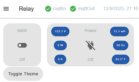
Im building my dashboard based on set of colour that I programme in ui template to be use as theme change in future

.v-theme--nrdb {
    color-scheme: dark;
    --v-theme-background: 9, 21, 26;
/*    --v-theme-background-overlay-multiplier: 2; */
//    --v-theme-surface: 19, 31, 36;
//    --v-theme-surface-overlay-multiplier: 2;
//    --v-theme-surface-bright: 255, 255, 255;
//    --v-theme-surface-bright-overlay-multiplier: 1;
//    --v-theme-surface-light: 238, 238, 238;
//    --v-theme-surface-light-overlay-multiplier: 1;
//    --v-theme-surface-variant: 66, 66, 66;
//    --v-theme-surface-variant-overlay-multiplier: 2;
//    --v-theme-on-surface-variant: 238, 238, 238;
    --v-theme-primary: 22, 164, 184;
//    --v-theme-primary-overlay-multiplier: 1;
    --v-theme-primary-darken-1: 12, 64, 84;
//    --v-theme-primary-darken-1-overlay-multiplier: 2;
    --v-theme-secondary: 52, 78, 83;
//    --v-theme-secondary-overlay-multiplier: 1;
    --v-theme-secondary-darken-1: 12, 45, 50;
//    --v-theme-secondary-darken-1-overlay-multiplier: 1;
//    --v-theme-error: 255, 82, 82;
//    --v-theme-error-overlay-multiplier: 1;
//    --v-theme-info: 255, 83, 208;
//    --v-theme-info-overlay-multiplier: 1;
//    --v-theme-success: 165, 214, 76;
//    --v-theme-success-overlay-multiplier: 1;
//    --v-theme-warning: 255, 142, 0;
//    --v-theme-warning-overlay-multiplier: 1;
    --v-theme-navigation-background: 19, 31, 36;
//    --v-theme-navigation-background-overlay-multiplier: 2;
   --v-theme-group-background: 19, 31, 36;
//    --v-theme-group-background-overlay-multiplier: 2;
    --v-theme-group-outline: 38, 51, 55;
//    --v-theme-group-outline-overlay-multiplier: 2;
//    --v-theme-accent: 255, 107, 153;
//    --v-theme-accent-overlay-multiplier: 1;
    --v-theme-on-primary: 248, 248, 248;
    --v-theme-on-background: 188, 188, 188;
    --v-theme-on-surface: 248, 248, 248;
//    --v-theme-on-surface-bright: 0, 0, 0;
//    --v-theme-on-surface-light: 0, 0, 0;
//    --v-theme-on-primary-darken-1: 255, 255, 255;
//    --v-theme-on-secondary: 0, 0, 0;
//    --v-theme-on-secondary-darken-1: 255, 255, 255;
//    --v-theme-on-error: 255, 255, 255;
//    --v-theme-on-info: 255, 255, 255;
//    --v-theme-on-success: 0, 0, 0;
//    --v-theme-on-warning: 0, 0, 0;
//    --v-theme-on-navigation-background: 255, 255, 255;
//   --v-theme-on-group-background: 255, 255, 255;
//    --v-theme-on-group-outline: 255, 255, 255;
//    --v-theme-on-accent: 255, 255, 255;
//    --v-border-color: 0, 0, 0;
//    --v-border-opacity: 0.12;
//    --v-high-emphasis-opacity: 0.87;
//    --v-medium-emphasis-opacity: 0.6;
//    --v-disabled-opacity: 0.38;
//    --v-idle-opacity: 0.04;
//    --v-hover-opacity: 0.04;
//    --v-focus-opacity: 0.12;
//    --v-selected-opacity: 0.08;
//    --v-activated-opacity: 0.12;
//    --v-pressed-opacity: 0.12;
//    --v-dragged-opacity: 0.08;
//    --v-theme-kbd: 33, 37, 41;
//    --v-theme-on-kbd: 255, 255, 255;
//    --v-theme-code: 245, 245, 245;
//    --v-theme-on-code: 0, 0, 0;
}

@amhaziq

Thanks I don't see why you can't take your css code and modify it with the theme colors from the flows.json file. See below.

1 Like