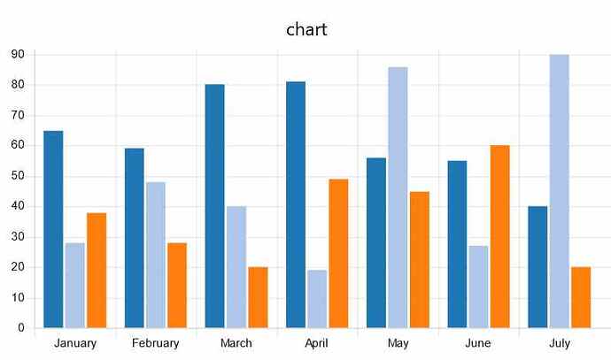
I have an SQL query which produces this output:
[{"id":1,"month":"january","temperature":65},{"id":2,"month":"january","temperature":28},{"id":3,"month":"january","temperature":38},{"id":4,"month":"february","temperature":59},{"id":5,"month":"february","temperature":48},{"id":6,"month":"february","temperature":38},{"id":7,"month":"march","temperature":80},{"id":8,"month":"march","temperature":40},{"id":9,"month":"march","temperature":20},{"id":10,"month":"april","temperature":81},{"id":11,"month":"april","temperature":19},{"id":12,"month":"april","temperature":49},{"id":13,"month":"may","temperature":56},{"id":14,"month":"may","temperature":86},{"id":15,"month":"may","temperature":45},{"id":16,"month":"june","temperature":55},{"id":17,"month":"june","temperature":27},{"id":18,"month":"june","temperature":40},{"id":19,"month":"july","temperature":40},{"id":20,"month":"july","temperature":90},{"id":21,"month":"july","temperature":20}]
I want to display it as this chart (data and chart form one of the examples at the library flow Populate full dashboard chart )
So it has to be converted to this format
var m={};
m.labels = ["January", "February", "March", "April", "May", "June", "July"];
m.series = ['Series A', 'Series B', 'Series C'];
m.data = [
    [65, 59, 80, 81, 56, 55, 40],
    [28, 48, 40, 19, 86, 27, 90],
    [38, 28, 20, 49, 45, 60, 20]
  ];
return {payload:[m]};
I can't work out how to transform the SQL output into the chart input arrays, can anyone help?
Edit - I can change the SQL to also output "Series A" etc, not sure if that helps.

