Hi, sir
I found that there is no message access for me to change the line series color in UI_CHART?
Do you have any idea how to change the line color by message dynamically ?
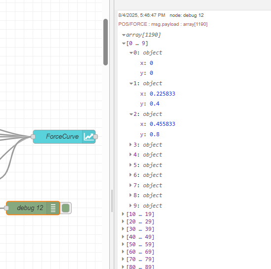
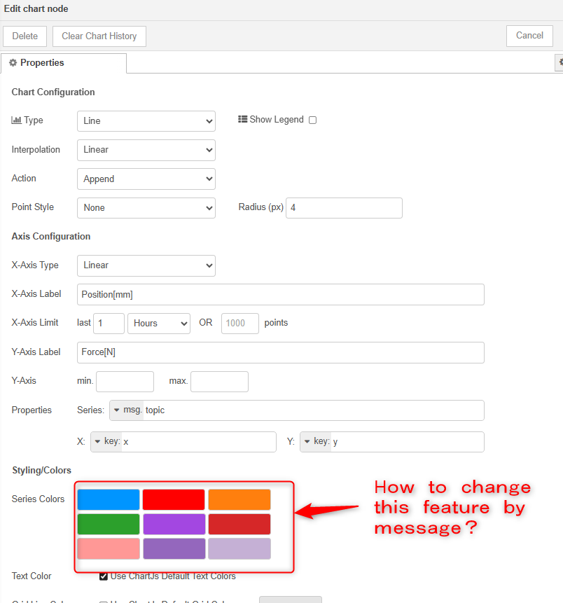
Here is my message payload and UI_CHART setting.
Does this help? (I searched "Line chart colour change"
https://discourse.nodered.org/t/old-topic-now-new-chart-line-colorization/64315/6
Hi, it is kind of different.
I also searched the posted topic regarding the chart line color changing.
Most of the method is to fix the series color in UI chart setting manually, and send the message in certain order to keep the series line to be the color they want.
What I want to achieve is
to change the series color of UI chart directly due to my series line message is not always at the same order;
I also want several series lines have the same color, like all green or all red, but not in one line, several separated line
And what if my series line is over 9? How can I set the color after 9th series line?
I'm afraid I don't really understand your first point, or in what circumstances you might want to change a line colour.
The 9 line colours in the node config can be modified, just click inside the inner box.
In the original dashboard the colours for the next 24 lines are specified in .node-red/node_modules/node-red-dashboard/dist/js/app-min.js
There is a discussion about these colours at https://discourse.nodered.org/t/how-to-specify-colours-for-bar-chart/52536
The simplest way to get multiple lines the same colour is to use the same topic. Null x,y coordinates at the end of each line segment should prevent the line being drawn between the old and new data.
Do you want to change the line colour, or just set it for each topic so that it is always the same?
I have a single dynamic chart that displays different sensor reading for over thirty different device types. So having the option to choose one of the 9 colours per serries would be very useful. I’ve created a set of colours that work across most but being able to say specify Blue for Humidity and Orange for over temperature would help me for sure.
Are you using Dashboard 2 @iiLaw ?
I think that in db v1 the colour of a chart line (ie a topic) is set on a first come, first served basis.
So when you refresh the chart you have to a) send an empty array to clear it and b) control the order in which datasets are passed to the node.
As far as I know there is no way to dynamically change the colour of (say) the top left block in the config. Clearly you could modify wherever they are stored (flows.json?). I suspect you have to deploy the changed node to see any change though.
The dashboard widgets are designed to provide a basic set of widgets. For your use case you might need to consider using a charting library in a dashboard template, possibly Grafana.
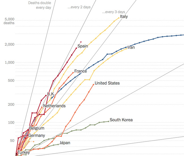
A chart with too many lines is not easy to extract information from:
As @jbudd said, the colours are set by the order of data originally received. If you trigger a flow on startup that sends null values to each of the lines in turn then that will set the colours.
Unfortunately there is a bug, that after the chart becomes fully populated, if the page is refreshed in the browser then the colours are re-allocated, apparently randomly, so this is not a particularly helpful solution at the moment.
Hi, Colin, jbudd
I already understand the rule that the colours are set by the order of data originally received, actually I want to set the specific color for a topic, because it is not known in which order the topic arrive.
And I see the link you posted(UI Chart - Ensure consistency in mapping chart series to colours), this feature is exactly what I want.
However, there is a bug you when page is refreshed, right?
So there is no way to set the color for specific topic in UI chart for now. I have to make sure the topic arrival order to let them have a color I want.
That is correct, whichever dashboard you are using.
The issue linked to is however specific to @flowfuse/node-red-dashboard.
Thanks I’ve change the chart colours to work with a range of sensor types.
I use series and not topics but assignment seems to work the same way e.g. 1st/2nd/3rd series get 1st/2nd/3rd of chart colours.
[
{"series": "sensorTemperature", "x": "2025-08-05T06:56:41.686Z", "y": 21.2 },
{"series": "targetTemperature", "x": "2025-08-05T06:56:41.686Z", "y": 17 },
{"series": "relativeHumidity", "x": "2025-08-05T06:56:41.686Z", "y": 60.16}
]
Copyright OpenJS Foundation and Node-RED contributors. All rights reserved. The OpenJS Foundation has registered trademarks and uses trademarks. For a list of trademarks of the OpenJS Foundation, please see our Trademark Policy and Trademark List. Trademarks and logos not indicated on the list of OpenJS Foundation trademarks are trademarks™ or registered® trademarks of their respective holders. Use of them does not imply any affiliation with or endorsement by them.
The OpenJS Foundation | Terms of Use | Privacy Policy | OpenJS Foundation Bylaws | Trademark Policy | Trademark List | Cookie Policy