Hello,
i am trying to do my first steps with dashboard 2.0.
I need different icons shown with different inputs.
All i could find are icons with switches or buttons.
Next thing is to change the size of the icons.
Thx in advance
Olmuk
Hello,
i am trying to do my first steps with dashboard 2.0.
I need different icons shown with different inputs.
All i could find are icons with switches or buttons.
Next thing is to change the size of the icons.
Thx in advance
Olmuk
What dashboard widgets do you want to use icons with?
Do you need the icon size to change dynamically or do you just want to change the default size?
You will probably have to think about jbudds' question but here is a simple example of an icon. If you change iconLarge to iconSmall the size and position of the icon will change. (the icon is just displayed in the Group backdrop)
<template>
    <div class="iconLarge">
        <span class="mdi mdi-weather-sunny"></span>
    </div>
</template>

<script>
    export default {
        data() {
            // define variables available component-wide
            // (in <template> and component functions)
            return {

            }
        },
        watch: {
            // watch for any changes of "count"

        },
        computed: {
            // automatically compute this variable
            // whenever VueJS deems appropriate

        },
        methods: {
            // expose a method to our <template> and Vue Application

        },
        mounted() {
            // code here when the component is first loaded
        },
        unmounted() {
            // code here when the component is removed from the Dashboard
            // i.e. when the user navigates away from the page
        }
    }
</script>
<style>
    /* define any styles here - supports raw CSS */
    .iconLarge {
        font-size: 100px;
        justify-content: right;
        align-items: center;
        text-align: center;
    }

	.iconSmall {
		font-size: 45px;

	}
</style>
Thanks for your answers.
That is my problem because i don‘t really know where to put im the code.
I guess the template ?
Is it possible to show me that with the flows ?
Nowadays in Dashboard 2 im using VUE features, you can use their website even for live-testing of your code in their Vue-Playground. It helped me a lot to learn the capabilites of Node-red ui-Templates.
you will not need a flow to test the in Node-Red.... just an UI-Template and copy-paste the code.... there are good examples/demos in the Node-Red-Tutorials
@jbudd : i am trying to change the icon dynamically with a value.
I can't find / understand the way to show the icon without the node button or switch, because
my change of the value will come from outside ( opc ua ).
If i am useing a template node to set the icon apperance i don#t know whcih node to use for
the showing at the dasboard.
Sorry about my missing knowledge but i watched many videos and books, but ??
Thanks for your reply.
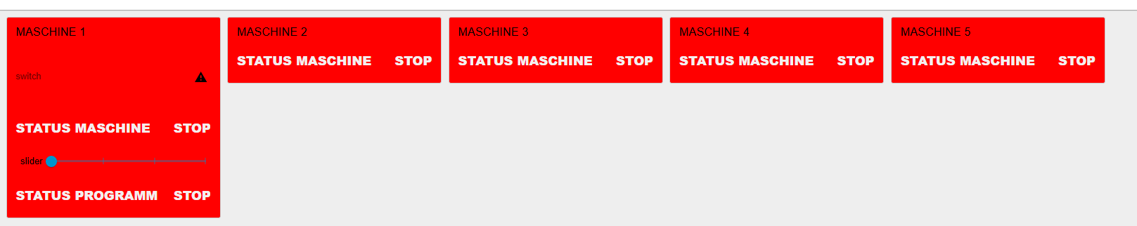
It would help us understand what you are trying to achieve if you can show us a picture of the dashboard (a screen capture or even a sketch of the data to display)
Also more detail of precisely what you want to change when your OPC-UA message arrives (for example, you might want to change to a different icon, it's size, color, or a combination of any of those)
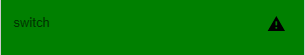
With a switch node i can change a icon ( too small ) :
You can dynamically change the icon size with two CSS classes: bigicon and smallicon. Pass the class at runtime using msg.ui_update.
[{"id":"dbe4c79ba931c832","type":"ui-switch","z":"8cc56a713c443848","name":"","label":"switch","group":"ecd866dc62e442ac","order":0,"width":"3","height":"1","passthru":false,"decouple":false,"topic":"topic","topicType":"msg","style":"","className":"","layout":"row-spread","clickableArea":"line","onvalue":"true","onvalueType":"bool","onicon":"alert","oncolor":"red","offvalue":"false","offvalueType":"bool","officon":"trumpet","offcolor":"blue","x":400,"y":150,"wires":[[]]},{"id":"e545d0392e213a66","type":"ui-template","z":"8cc56a713c443848","group":"","page":"33031fffa5689f5e","ui":"","name":"","order":0,"width":0,"height":0,"head":"","format":".bigicon i.v-icon {\n font-size: 48px;\n}\n.smallicon i.v-icon {\n font-size: 24px;\n}","storeOutMessages":true,"passthru":true,"resendOnRefresh":true,"templateScope":"page:style","className":"","x":425,"y":105,"wires":[[]]},{"id":"48a9a003be080733","type":"inject","z":"8cc56a713c443848","name":"Bigicon","props":[{"p":"ui_update","v":"{\"class\": \"bigicon\"}","vt":"json"}],"repeat":"","crontab":"","once":false,"onceDelay":0.1,"topic":"","x":140,"y":120,"wires":[["dbe4c79ba931c832"]]},{"id":"a1ce2a401f84da41","type":"inject","z":"8cc56a713c443848","name":"Smallicon","props":[{"p":"ui_update","v":"{\"class\": \"smallicon\"}","vt":"json"}],"repeat":"","crontab":"","once":false,"onceDelay":0.1,"topic":"","x":150,"y":165,"wires":[["dbe4c79ba931c832"]]},{"id":"ecd866dc62e442ac","type":"ui-group","name":"demo","page":"33031fffa5689f5e","width":6,"height":1,"order":1,"showTitle":true,"className":"","visible":"true","disabled":"false","groupType":"default"},{"id":"33031fffa5689f5e","type":"ui-page","name":"demo","ui":"e9c974f7c1d080d1","path":"/demo","icon":"home","layout":"grid","theme":"0d92c765bfad87e6","breakpoints":[{"name":"Default","px":"0","cols":"3"},{"name":"Tablet","px":"576","cols":"6"},{"name":"Small Desktop","px":"768","cols":"9"},{"name":"Desktop","px":"1024","cols":"12"}],"order":1,"className":"","visible":"true","disabled":"false"},{"id":"e9c974f7c1d080d1","type":"ui-base","name":"My Dashboard","path":"/dashboard","appIcon":"","includeClientData":true,"acceptsClientConfig":["ui-notification","ui-control"],"showPathInSidebar":false,"headerContent":"page","navigationStyle":"default","titleBarStyle":"default","showReconnectNotification":true,"notificationDisplayTime":1,"showDisconnectNotification":true,"allowInstall":true},{"id":"0d92c765bfad87e6","type":"ui-theme","name":"Basic Blue Theme","colors":{"surface":"#4d58ff","primary":"#0094ce","bgPage":"#eeeeee","groupBg":"#ffffff","groupOutline":"#cccccc"},"sizes":{"pagePadding":"12px","groupGap":"12px","groupBorderRadius":"4px","widgetGap":"2px","density":"default"}},{"id":"6a9cc62ecb4f4ee1","type":"global-config","env":[],"modules":{"@flowfuse/node-red-dashboard":"1.29.0"}}]
Great, thank you - i will try it.
But how can i show the icon without the switch ( because the state comes from outside ) ?
You can display an icon in a text widget, or in a template widget or a button widget. I don't know offhand how to show it in a text widget but there will no doubt be others here who can give you hints.
I think @Buckskin have you an example of an icon in a template widget? I have not downloaded his example.
Copyright OpenJS Foundation and Node-RED contributors. All rights reserved. The OpenJS Foundation has registered trademarks and uses trademarks. For a list of trademarks of the OpenJS Foundation, please see our Trademark Policy and Trademark List. Trademarks and logos not indicated on the list of OpenJS Foundation trademarks are trademarks™ or registered® trademarks of their respective holders. Use of them does not imply any affiliation with or endorsement by them.
The OpenJS Foundation | Terms of Use | Privacy Policy | OpenJS Foundation Bylaws | Trademark Policy | Trademark List | Cookie Policy