Hello,
I use the chart node in dashboard-2. How can I change the line thickness of the data line? In my case it is a bit too thick.
Regards,
Markus
Hello,
I use the chart node in dashboard-2. How can I change the line thickness of the data line? In my case it is a bit too thick.
Regards,
Markus
Is it the line thickness, or have you got lots of data points and the dots are merging? Try reducing the size of the point markers
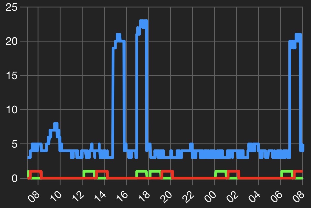
It’s the line thickness.
Can you post a screenshot?
Is that running on a small screen or on a PC? Unfortunately I am away from home and the broadband there has failed so I am unable to look at my charts to compare with yours.
There is an open feature request on the dashboard to allow access to the underlying echarts objects which would then allow you to modify the line thickness, but as far as I know that is not currently possible.
It’s a screenshot from my smartphone.
Copyright OpenJS Foundation and Node-RED contributors. All rights reserved. The OpenJS Foundation has registered trademarks and uses trademarks. For a list of trademarks of the OpenJS Foundation, please see our Trademark Policy and Trademark List. Trademarks and logos not indicated on the list of OpenJS Foundation trademarks are trademarks™ or registered® trademarks of their respective holders. Use of them does not imply any affiliation with or endorsement by them.
The OpenJS Foundation | Terms of Use | Privacy Policy | OpenJS Foundation Bylaws | Trademark Policy | Trademark List | Cookie Policy