I have made a project in which the points come from mySQL and are listed in ui_template.
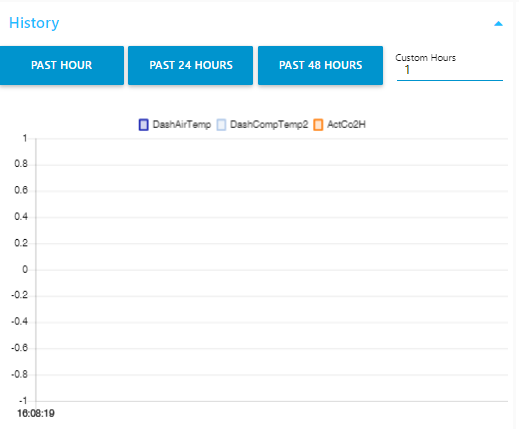
By selecting each point, that point will be added to the chart array.![History|690x298]
The problem:
Although series and data are adding to the chart payload, but it is not possible to see the graphs on UI.
In a function I make the Custom Past Hours. This function is directly connected to the chart.
During pushing the chart format, I add series, data and labels to the array, but after deploying, the labels is not shown in the debug.
Even if one point is selected, still the graph is not made on UI.
If I use any other keyword except labels , pushing process will be successful.
I've reviewed related posts, specially by @hotNipi, but so far couldn't find a solution.
That is very odd. Is the debug node directly after the function node?
Can you create a very simple flow with just an inject node, a function node and a debug node using a slightly modified version of your function which demonstrates the problem?
This function node generates an output containing labels as expected.
var allCharts = [];
var A = [];
flow.set("B", [])
var C =[];
C.push("");
allCharts.push({series:A,data:flow.get("B"),labels:C});
msg.payload = allCharts;
return msg;
OK, so the labels are probably not the issue. Show us what is going into the chart and expand a few elements of the arrays so we can see what you are passing in.
Also, temporarily, configure the chart manually with appropriate settings and disable the node that uses ui_control to set it up. Then you will know that the data going in is ok.
[Edit] Possibly the reason that labels doesn't appear coming out of the chart is that the chart is not bothering to send it on because it is empty. I think if you look what is going into the chart you will see it is there. Concentrate on what is going into the chart for the moment.
The values in the data array should be x and y, not timestamp and value. See node-red-dashboard/Charts.md at master · node-red/node-red-dashboard · GitHub
Also till you get it going expand the timescale on the chart to 24 hours to make sure the data are not off the front.
Do you realise you are feeding three series, each containing 17000 points to the chart? To be drawn on a chart which is, I assume, a few hundred pixels across. So probably for each line you have 40 pixels all drawn on top of each other. I hope the machine running the browser is reasonably high powered or the browser will grind to a halt under the onslaught of 50,000 points to plot.
The problem was timestamp,value as the columns in my DB.
I was using the same columns for single chart and it was working for that purpose.
By the way, no worries for the 17000 points, because I am still filtering them to smaller number.
Anyways it is working as I wanted and thank you so much for the help.
[EDIT:]
I still cannot see the labels, but graphs are drawn as I need.