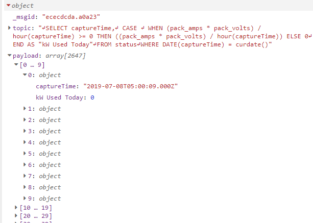
I'm trying to query some data from MySQL and plot it to a line chart. I'm pretty sure the issue is that the output from MySQL is the issue since it outputs an array of arrays which isn't what the chart node accepts.
I'm pretty sure I need to use a function and a loop to iterate through each array, problem is JS is not one of my strengths so i'm kind of lost as to how to accomplish this.
Does anyone have any tips as to how to accomplish this?
I'm familiar with the formatting the data needs in order to get a time based line graph. The issue I have is I don't exactly know enough JS to write a loop of loops to flatten the multiple arrays into a single one to then pass that into the graph node.
Your data is already an array of objects, each with the X (captureTime) and Y (kW Used Today) values to be charted. So the restructuring of the payload can be done with a fairly simple JSONata expression inside a change node -- something like this:
[{
    "series": ["kW"],
    "labels": ["kW Used Today"],
    "data": [[payload.{
        "x": captureTime,
        "y": $."kW Used Today"
    }]]
}]
That's the beauty of JSONata -- the "." operator is a mapping function, that iterates over every object of the payload array.
Since I don't have your query data in a usable format, I couldn't test it -- so your best option is to use the "Expression Tester" built-in to the change node... copy that payload array from the debug sidebar, and paste it in after the input property "payload": ...
As you work on the expression, you can immediately see what the output will be. It's a bit of a learning curve to understand JSONata, but well worth it, imo.
Please note that I changed the syntax of the expression in my previous post to match the working example...
One other comment: you have a HUGE number of rows being returned, for such a little dashboard chart. You will not find that UI performance to be very good -- recommended max is less than 1 point per pixel of width, so hundreds, not thousands. Before you go too far you will want to change your sql query to group those readings into larger time slots.
Well I'll be damned, I had no idea that a JSON expression could do that. I also modified the query to return less objects so now the graph is more readable.
Now I just need to figure out how to make it into a line graph instead of a scatter plot.
That "scatter plot" is actually a series of 10 1-point lines (I'm betting). That can happen when your JSONata expression returns the wrong number of nested levels of array data. Maybe I put too many square brackets around that portion of the expression?
I clearly don't know the formatting well enough. I only see 4 curly brackets and when I remove any pair errors come up.
here's some sample data if that helps:
[{"captureTime":"2019-07-10T21:06:35.000Z","kW Used Today":285.3500099182129},{"captureTime":"2019-07-10T21:06:05.000Z","kW Used Today":282.60625982284546},{"captureTime":"2019-07-10T21:05:35.000Z","kW Used Today":285.3500099182129},{"captureTime":"2019-07-10T21:05:05.000Z","kW Used Today":285.3500099182129},{"captureTime":"2019-07-10T21:04:35.000Z","kW Used Today":282.60625982284546},{"captureTime":"2019-07-10T21:04:05.000Z","kW Used Today":277.1187596321106},{"captureTime":"2019-07-10T21:03:35.000Z","kW Used Today":277.1187596321106},{"captureTime":"2019-07-10T21:03:05.000Z","kW Used Today":282.60625982284546},{"captureTime":"2019-07-10T21:02:35.000Z","kW Used Today":279.862509727478},{"captureTime":"2019-07-10T21:02:05.000Z","kW Used Today":277.1187596321106}]
That's interesting, for me it's still showing as a "scatter plot". Also for the hell of it I attached a debug node to the chart node and I got this message:
"Invalid JSONata expression: The expressions within an order-by clause must evaluate to numeric or string values"
Because i just got here to this topic and it helped me and i saw that someone had an error message and i knew the answer, so if anyone else (now or later) check this topic, they know the answer if they got the same error