I've watched Nick's last twitch video so seen all the musings about the size of the group boxes.
And they look nicer now that they resize on demand but...
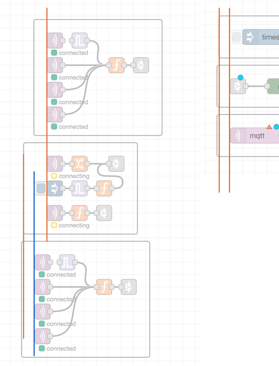
.. I was the one to raise the issue on the beta about wires going outside the boundaries so I'm coming back to it as the reduced size makes them do it again
Now - I know I could move the debug node to the right - but it spoils the aesthetics of being inline with the function node.
Two solutions come to mind:
Add checkbox in node config for standard/wide operation for people like me wit ha bit of visual OCD
or
A big one ... alter wire behaviour to not go out so wide which would benefit standard flow layouts as well
I know altering wire behaviour has to be carried out as if doing brain surgery, but its been a little while since the last noticeable change so maybe it'd be worth another go?
Personally, if a node comes after another node in the flow, I prefer to have the second node indented slightly. But it is all personal preference.
I reduced the margin because it was just too big. And I figured this was an edge case not worth sacrificing the broader aesthetic for.
We aren't going to add options for things like this. They simply aren't portable.
Can certainly consider other approaches - I'm still not 100% happy with the curve of the wires when the nodes are closely stacked, so there could be room for something to be done there.
It just looks as though the inject hotspot does not have quite the same amount of padding as the normal nodes.
As I said in another post, I'm loving the grouping feature as it makes my cluttered flows look organised and sections easily distinguishable.
Although like @cymplecy has said, the wires don't look good when they overlap the box, and hopefully in time they will be fixed - maybe even by altering the wire curves. But in the meantime there are always ways around such minor glitches.
I have to admit it bothers my visual eye also that the group border extends based on the inject button as I tend to align nodes by their "main body". But that issue might not have a good solution as fitting in the button would require the padding to be too large on groups without nodes with buttons....
Maybe the question is whether there is an automatic solution that handles all these cases such that everyone is satisfied?
It somehow reminds me on graph visualization algorithms, where there are a lot of solutions but none of them works all the time.
Maybe some sort of manual tuning of the group width (height seems to be fine)? (Although Nick clearly said that such options aren't portable)
I noticed those alignment issues, too. It triggered my OCD, wanting to move the nodes within, then the group itself, and again, and again... finally gave up, before my head explodes.
The benefits of having the groups in the first place outweigh that. So I decided to cope with it... for now.
No reverting, please.