UPDATE 2025-06-08:
Note that UIBUILDER includes fully working example flows for both this grid/dashboard style layout and the blog/news style layout. Import from Node-RED's examples library.From v7.4 of UIBUILDER, there will also be documentation pages covering both types of layout.
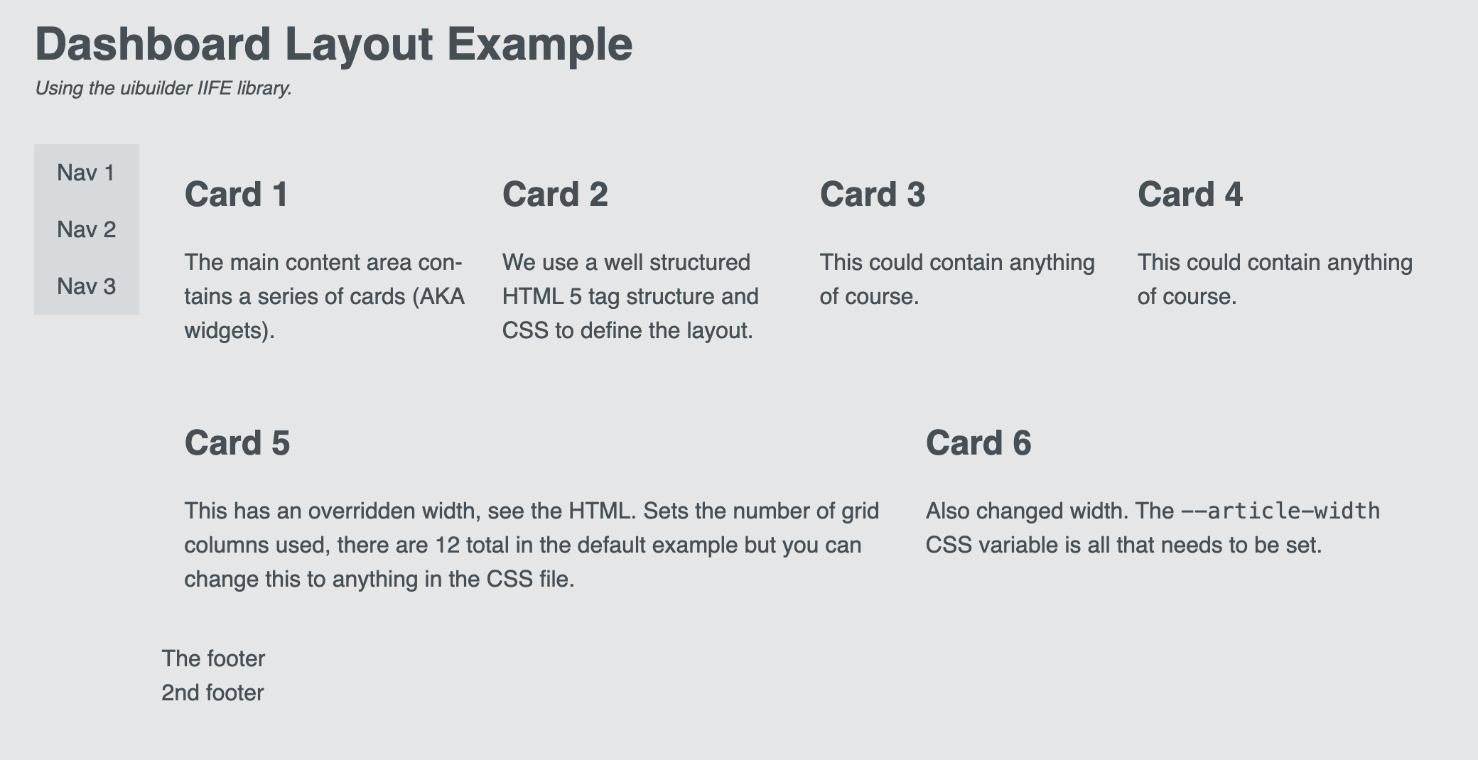
As hinted at in UIBUILDER: Example web page layout #1 (typical content-heavy or blog style), here is the 2nd example page layout.

The flow below contains everything needed to fully reproduce this layout along with some design documentation and hints on adjusting it to taste.
Cards 7 & 8 have been dynamically inserted from Node-RED by the use of UIBUILDER's no-code uib-element node. A no-code uib-update node also illustrates how to make further adjustments - in this case, adding a style attribute to change the width of the card.

While I have only put a heading and some text in the cards - which you may think of as "widgets" in Dashboard terminology - you could, of course, put anything such as user inputs, charts, gauges, etc.
Example flow
[{"id":"f3af73c0bc66eba4","type":"group","z":"7e598dbf2e556452","name":"Example Dashboard-style layout","style":{"fill":"#bfdbef","fill-opacity":"0.31","label":true,"color":"#000000"},"nodes":["aace4caa6a7f9504","c491db3c048c152f","1dfd6d4773866c25","dca484848d810b89","eb4e4f88d0796b52","558cd04e3f31a17a","09b283477b67586e","63c60624c5178d4f"],"x":58,"y":599,"w":1004,"h":368},{"id":"aace4caa6a7f9504","type":"inject","z":"7e598dbf2e556452","g":"f3af73c0bc66eba4","name":"","props":[],"repeat":"","crontab":"","once":false,"onceDelay":0.1,"topic":"","x":145,"y":660,"wires":[["c491db3c048c152f"]],"l":false},{"id":"c491db3c048c152f","type":"uibuilder","z":"7e598dbf2e556452","g":"f3af73c0bc66eba4","name":"","topic":"","url":"layout-dash-grid","okToGo":true,"fwdInMessages":false,"allowScripts":false,"allowStyles":false,"copyIndex":true,"templateFolder":"blank","extTemplate":"","showfolder":false,"reload":true,"sourceFolder":"src","deployedVersion":"7.0.0","showMsgUib":false,"title":"","descr":"","editurl":"vscode://file/src/uibRoot/layout-dash-grid/?windowId=_blank","x":330,"y":660,"wires":[["1dfd6d4773866c25"],["dca484848d810b89"]]},{"id":"1dfd6d4773866c25","type":"debug","z":"7e598dbf2e556452","g":"f3af73c0bc66eba4","name":"debug 452","active":true,"tosidebar":true,"console":false,"tostatus":true,"complete":"true","targetType":"full","statusVal":"","statusType":"counter","x":525,"y":640,"wires":[],"l":false},{"id":"dca484848d810b89","type":"debug","z":"7e598dbf2e556452","d":true,"g":"f3af73c0bc66eba4","name":"debug 453","active":false,"tosidebar":true,"console":false,"tostatus":true,"complete":"true","targetType":"full","statusVal":"","statusType":"counter","x":465,"y":680,"wires":[],"l":false},{"id":"eb4e4f88d0796b52","type":"comment","z":"7e598dbf2e556452","g":"f3af73c0bc66eba4","name":"Design","info":"This layout is designed to roughly replicate\nthe Node-RED Dashboard grid layout.\n\nIt keeps the outer layout from the content/blog\nstyle (header, footer, left-sidebar, main).\n\nBut the sidebar now has the navigation menu\ninstead of the header.\n\nThe main content area is now a sub-grid. It has\nthe `id` of `more` which means that you can\neasily add new content using uibuilder's \nno-code nodes.\n\nEach `<article>` or `<div>` tag in the main \ncontent sub-grid can be considered the \nequivalent of a \"widget\" in Node-RED Dashboard \nterms. It can contain whatever you want it to.\nIt has a slightly different background colour\nand a rounded border.\n\nIn the example all of the layout can be\ncontrolled from the CSS variables in `:root`.\n\nThe sub-grid has 12 columns by default, you\ncan change that to whatever is useful to you.\n\nThe articles have a default width of 3. You can\neasily override a single article by adding:\n`--article-width: 6` or however many columns\nyou want it to take up.\n\nBy default, specific grid rows are undefined\n(set to `auto`) so articles take up whatever\nheight they need. If you want to define the\nrows, you can easily do so by changing\n`--main-rows` to `repeat(12, 1fr)` or some\nother number. You have lots of control over the\ncolumn/row layout but it can get a bit complex\nso you are advised to keep it simple, at least\nto start with.\n\n-----------------\n\n## NOTES\n\nIt is very likely that much of the\ndefined CSS in this example will be incorporated\ninto UIBUILDER's `uib-brand.css` in the \nfuture.\n\nThe Markdown-IT library has been included in\n`index.html`, loaded from a public Internet\nCDN. Install & use the library locally using \nUIBUILDER's library manager if you prefer.\nOr remove completely if you don't need to use\nMarkdown dynamic content.","x":690,"y":660,"wires":[]},{"id":"558cd04e3f31a17a","type":"group","z":"7e598dbf2e556452","g":"f3af73c0bc66eba4","name":"Setup - run this first to set up the page and style - only needs to run once","style":{"fill":"#ffffff","fill-opacity":"0.31","label":true,"color":"#000000"},"nodes":["91bd4a5399fd8450","7d99df5c50fe8352","d6b8ff40eb6cee22","6017acfb3acc8300","162206ae3cbdc006","e79304a2973c2f53"],"x":94,"y":719,"w":782,"h":122},{"id":"91bd4a5399fd8450","type":"template","z":"7e598dbf2e556452","g":"558cd04e3f31a17a","name":"index.html","field":"payload","fieldType":"msg","format":"html","syntax":"mustache","template":"<!doctype html>\n<html lang=\"en\"><head>\n\n <meta charset=\"utf-8\">\n <meta name=\"viewport\" content=\"width=device-width, initial-scale=1\">\n <link rel=\"icon\" href=\"../uibuilder/images/node-blue.ico\">\n\n <title>Dashboard Layout - Node-RED uibuilder</title>\n <meta name=\"description\" content=\"Node-RED uibuilder - Dashboard Layout\">\n\n <!-- Your own CSS (defaults to loading uibuilders css)-->\n <link type=\"text/css\" rel=\"stylesheet\" href=\"./index.css\" media=\"all\">\n\n <!-- #region Supporting Scripts. These MUST be in the right order. Note no leading / -->\n <script defer src=\"https://cdn.jsdelivr.net/npm/markdown-it/dist/markdown-it.min.js\"></script>\n <script defer src=\"../uibuilder/uibuilder.iife.min.js\"></script>\n <!-- <script defer src=\"./index.js\">/* <= OPTIONAL: Put your custom code in that */</script> -->\n <!-- #endregion -->\n\n</head><body>\n\n <div class=\"container\">\n <header class=\"header\">\n <h1 class=\"with-subtitle\">Dashboard Layout Example</h1>\n <div role=\"doc-subtitle\">Using the uibuilder IIFE library.</div>\n </header>\n\n <main id=\"more\"><!-- '#more' is used as a parent for dynamic HTML content in examples -->\n <article>\n <h2>Card 1</h2>\n <p>\n The main content area contains a series of cards (AKA widgets).\n </p>\n </article>\n\n <article>\n <h2>Card 2</h2>\n <p>\n We use a well structured HTML 5 tag structure and CSS to define the layout.\n </p>\n </article>\n\n <article>\n <h2>Card 3</h2>\n <p>\n This could contain anything of course.\n </p>\n </article>\n\n <article>\n <h2>Card 4</h2>\n <p>\n This could contain anything of course.\n </p>\n </article>\n\n <article style=\"--article-width: 7;\">\n <h2>Card 5</h2>\n <p>\n This has an overridden width, see the HTML. Sets the number of grid columns used, there are 12 total in the default example but you can change this to anything in the CSS file.\n </p>\n </article>\n\n <article style=\"--article-width: 5;\">\n <h2>Card 6</h2>\n <p>\n Also changed width. The <code>--article-width</code> CSS variable is all that needs to be set.\n </p>\n </article>\n </main>\n\n <aside class=\"sidebar\">\n <nav class=\"nav-side\">\n <ul>\n <li><a href=\"#nav1\">Nav 1</a></li>\n <li><a href=\"#nav2\">Nav 2</a></li>\n <li><a href=\"#nav3\">Nav 3</a></li>\n </ul>\n </nav>\n </aside>\n\n <footer>\n The footer\n <div>2nd footer</div>\n </footer>\n </div>\n\n</body></html>\n","output":"str","x":550,"y":760,"wires":[["6017acfb3acc8300"]]},{"id":"7d99df5c50fe8352","type":"inject","z":"7e598dbf2e556452","g":"558cd04e3f31a17a","name":"","props":[{"p":"topic","vt":"str"}],"repeat":"","crontab":"","once":false,"onceDelay":0.1,"topic":"setup all FE files","x":155,"y":760,"wires":[["d6b8ff40eb6cee22","162206ae3cbdc006"]],"l":false},{"id":"d6b8ff40eb6cee22","type":"change","z":"7e598dbf2e556452","g":"558cd04e3f31a17a","name":"index.html","rules":[{"t":"set","p":"fname","pt":"msg","to":"index.html","tot":"str"}],"action":"","property":"","from":"","to":"","reg":false,"x":310,"y":760,"wires":[["91bd4a5399fd8450"]]},{"id":"6017acfb3acc8300","type":"uib-save","z":"7e598dbf2e556452","g":"558cd04e3f31a17a","url":"layout-dash-grid","uibId":"c491db3c048c152f","folder":"src","fname":"","createFolder":false,"reload":true,"usePageName":false,"encoding":"utf8","mode":438,"name":"","topic":"","x":770,"y":760,"wires":[]},{"id":"162206ae3cbdc006","type":"change","z":"7e598dbf2e556452","g":"558cd04e3f31a17a","name":"index.css","rules":[{"t":"set","p":"fname","pt":"msg","to":"index.css","tot":"str"}],"action":"","property":"","from":"","to":"","reg":false,"x":300,"y":800,"wires":[["e79304a2973c2f53"]]},{"id":"e79304a2973c2f53","type":"template","z":"7e598dbf2e556452","g":"558cd04e3f31a17a","name":"index.css","field":"payload","fieldType":"msg","format":"css","syntax":"plain","template":"/* Load defaults from `<userDir>/node_modules/node-red-contrib-uibuilder/front-end/uib-brand.min.css`\n * This version auto-adjusts for light/dark browser settings.\n */\n@import url(\"../uibuilder/uib-brand.min.css\");\n\n/* CSS variables to make it easier to control */\n:root {\n /* The layout container */\n --container-max-width: 1000px;\n --container-col-gap: 1rem;\n --container-row-gap: 1rem;\n\n /* The main content container */\n --main-cols: repeat(12, 1fr);\n --main-rows: auto; /* auto OR repeat(12, 1fr); ... */\n --main-col-gap: var(--container-col-gap);\n --main-row-gap: var(--container-row-gap);\n \n /* The articles */\n --article-width: 3; /* number of columns or auto */\n --article-height: auto; /* auto or number of rows */\n\n /* The Sidebar container */\n --sidebar-max-width: 1fr;\n --sidebar-min-width: 0.1fr;\n}\n\n/* The outer container div */\n.container {\n width: 100%;\n max-width: var(--container-max-width);\n margin: 0 auto;\n /* Center the container horizontally */\n display: grid;\n gap: var(--container-row-gap) var(--container-col-gap);\n\n /* 2 cols x 3 rows layout. Middle row & right column are larger. Left col is constrained min/max */\n grid-template-columns: minmax(var(--sidebar-min-width), var(--sidebar-max-width)) var(--main-width);\n grid-template-rows: 0fr 1fr 0fr;\n grid-template-areas: \n \"header header\"\n \"sidebar main\"\n \"sidebar footer\";\n justify-items: stretch;\n}\n\n/* The main content container */\nmain {\n /* Where you put your content */\n grid-area: main;\n \n display: grid;\n gap: var(--main-row-gap) var(--main-col-gap);\n grid-template-columns: var(--main-cols, 12); /* fallback to 12 cols */\n grid-template-rows: var(--main-rows, auto); /* fallback to auto */\n}\n\n/* Any article within the main container */\nmain > article, main > div {\n /* Width of an article in number of columns */\n grid-column: span var(--article-width);\n /* Height of an article in number of rows */\n grid-row: span var(--article-height);\n margin: 0;\n}\n/* Set a child div to have same format as an article */\nmain > div {\n border: 1px solid var(--text3);\n border-radius: var(--border-radius);\n padding: var(--border-pad);\n margin: 0;\n background-color: var(--surface3);\n}\nmain > div > h2, main > div > h3, main > div > h4 {\n margin-block-start: 0;\n border-bottom: 1px solid var(--text3);\n padding-block-end: var(--border-pad);\n}\n\nheader {\n /* Headings, nav, etc */\n grid-area: header;\n}\n\nfooter {\n /* at the bottom, (c), dates, etc */\n grid-area: footer;\n margin-top: 0;\n}\n\n/* We might want other sidebars so be more explicit for this */\naside.sidebar {\n /* stuff to one side of the main content */\n grid-area: sidebar;\n}\n\n/*#region Simple horizontal navigation main menu (in the header) */\n.nav-main {\n background-color: var(--surface3);\n}\n.nav-main ul {\n /* Remove bullet points */\n list-style-type: none;\n /* Remove default padding */\n padding: 0;\n /* Remove default margin */\n margin: 0;\n /* Use Flexbox to align items horizontally */\n display: flex;\n}\n/* Add space between menu items */\n.nav-main li {\n margin-right: 1rem;\n}\n/* Remove margin on the last item */\n.nav-main li:last-child {\n margin-right: 0;\n}\n.nav-main a {\n /* Remove underline from links */\n text-decoration: none;\n /* Add padding for better click area */\n padding: var(--border-pad);\n /* Ensure the entire area is clickable */\n display: block;\n}\n/* Highlight on hover */\n.nav-main a:hover {\n background-color: var(--surface5);\n /* Optional: Add rounded corners */\n border-radius: var(--border-radius);\n}\n/*#endregion */\n\n/*#region simple vertical navigation menu */\n.nav-side {\n background-color: var(--surface3);\n}\n.nav-side ul {\n /* Remove bullet points */\n list-style-type: none;\n /* Remove default padding */\n padding: 0;\n /* Remove default margin */\n margin: 0;\n}\n.nav-side a {\n /* Remove underline from links */\n text-decoration: none;\n /* Add padding for better click area */\n padding: 0.5rem 1rem;\n /* Ensure the entire area is clickable */\n display: block;\n}\n/* Highlight on hover */\n.nav-side a:hover {\n background-color: var(--surface5);\n}\n/*#endregion */\n\n/* Adapt for narrow screens */\n@media only screen and (max-width: 512px) {\n /* Very simple adaption example, a single column, 4 rows */\n .container {\n gap: 0.5rem;\n\n /* 1 cols x 4 rows layout. 2nd row is larger */\n grid-template-columns: 1fr;\n grid-template-rows: 0.1fr 1fr 0.1fr 0.1fr;\n grid-template-areas:\n \"header\"\n \"main\"\n \"sidebar\"\n \"footer\";\n }\n}\n","output":"str","x":560,"y":800,"wires":[["6017acfb3acc8300"]]},{"id":"09b283477b67586e","type":"link in","z":"7e598dbf2e556452","g":"f3af73c0bc66eba4","name":"uib input","links":["a200ce9460e26c07"],"x":185,"y":680,"wires":[["c491db3c048c152f"]]},{"id":"63c60624c5178d4f","type":"group","z":"7e598dbf2e556452","g":"f3af73c0bc66eba4","name":"Add dynamic data - 2 added widgets, 1 markdown and 1 list","style":{"label":true,"fill":"#ffffbf","fill-opacity":"0.22","color":"#000000"},"nodes":["7dc04e1820bfa998","a200ce9460e26c07","ad9aa1454c010926","478c86bc95d76da9","dab3745a1b327ad3","6cff3768c26f6361","2e1e04d89c148272"],"x":84,"y":859,"w":952,"h":82},{"id":"7dc04e1820bfa998","type":"uib-element","z":"7e598dbf2e556452","g":"63c60624c5178d4f","name":"Markdown article","topic":"","elementtype":"markdown","parent":"#more","parentSource":"","parentSourceType":"str","elementid":"md1","elementId":"","elementIdSourceType":"str","heading":"","headingSourceType":"str","headingLevel":"h2","data":"payload","dataSourceType":"msg","position":"last","positionSourceType":"str","passthrough":false,"confData":{},"x":450,"y":900,"wires":[["6cff3768c26f6361"]]},{"id":"a200ce9460e26c07","type":"link out","z":"7e598dbf2e556452","g":"63c60624c5178d4f","name":"to uib input","mode":"link","links":["09b283477b67586e"],"x":995,"y":900,"wires":[]},{"id":"ad9aa1454c010926","type":"inject","z":"7e598dbf2e556452","g":"63c60624c5178d4f","name":"","props":[{"p":"payload"}],"repeat":"","crontab":"","once":false,"onceDelay":0.1,"topic":"","payload":"$formatInteger($random() * 100, \"#00\")","payloadType":"jsonata","x":145,"y":900,"wires":[["478c86bc95d76da9"]],"l":false},{"id":"478c86bc95d76da9","type":"template","z":"7e598dbf2e556452","g":"63c60624c5178d4f","name":"Markdown","field":"payload","fieldType":"msg","format":"markdown","syntax":"mustache","template":"## Markdown Card\n\nDynamically added from a Node-RED/UIBUILDER no-code node.\n\nRandom number: {{payload}}","output":"str","x":270,"y":900,"wires":[["7dc04e1820bfa998"]]},{"id":"dab3745a1b327ad3","type":"uib-element","z":"7e598dbf2e556452","g":"63c60624c5178d4f","name":"List","topic":"","elementtype":"ul","parent":"#more","parentSource":"#more","parentSourceType":"str","elementid":"ul1","elementIdSourceType":"str","heading":"A List","headingSourceType":"str","headingLevel":"h2","data":"payload","dataSourceType":"msg","position":"last","positionSourceType":"str","passthrough":false,"confData":{},"x":750,"y":900,"wires":[["2e1e04d89c148272"]]},{"id":"6cff3768c26f6361","type":"change","z":"7e598dbf2e556452","g":"63c60624c5178d4f","name":"List","rules":[{"t":"set","p":"payload","pt":"msg","to":"[\"I was dynamically\",\"inserted by a\",\"Node-RED/UIBUILDER\",\"no-code flow\"]","tot":"json"}],"action":"","property":"","from":"","to":"","reg":false,"x":630,"y":900,"wires":[["dab3745a1b327ad3"]]},{"id":"2e1e04d89c148272","type":"uib-update","z":"7e598dbf2e556452","g":"63c60624c5178d4f","name":"List width","topic":"","mode":"update","modeSourceType":"update","cssSelector":"#ul1","cssSelectorType":"str","slotSourceProp":"","slotSourcePropType":"msg","attribsSource":"{\"style\":\"--article-width: 6;\"}","attribsSourceType":"json","slotPropMarkdown":false,"x":880,"y":900,"wires":[["a200ce9460e26c07"]]}]
This example will be part of UIBUILDER v7.
 The layout is correct but you are missing some CSS that has been included in the v7 default css that isn't in v6.

