UIBUILDER v6.6 beta progress: New landing page for the docs - feedback wanted

Hi all,

In a fit of "creativity" (:cough:), I decided that the landing page for the docs needed a bit of snazing up.

It has been pushed to the v6.6.0 branch so you can play with it if you like.

Still a bit boring basic though so I'm looking for some ideas to help make it look even better. Sticking within the current overall style colour scheme though unless you fancy doing us a complete makeover!

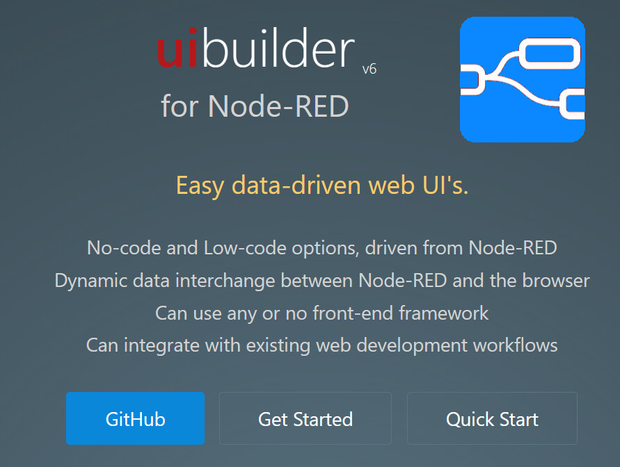
Note that the previous homepage is still there, just scroll down or click on the "Get Started" button. The "Quick Start" button takes you to the example walkthough tutorial.

4 Likes

IMO the blue logo looks out of place, and the overall page would look more balanced without it.

I like your choice of typeface & colours :+1:

Yes, I know what you mean. Actually, the uibuilder logo started as a bit of an in-joke being an IBM blue version of the Node-RED logo.

Maybe we need a new logo - any designers out there?

You could consider changing the word uibuilder into your logo... maybe increasing the weight & the colour of the first 2 letters to 8f0000 ?

3 Likes

Need to find the right lightness and need to thicken the ui part.

image

image

That second looks better to me, at least on a darker background. hsl(0 100% 50% / 50%)

I'd still like an actual graphical logo though.

1 Like

I suggested 8f0000 because it's node-RED red, but yes, the second red looks OK and subtly contrasts the background.

1 Like

Looks OK in light mode too I think

image

Testing if Discourse supports the highlighting:

uibuilder v6

for Node-RED

Hmm, sadly not.

I may try changing the blue in the logo to something lighter and in keeping with the rest of that scheme - just to see if that works.

1 Like

How's this:

2 Likes

Oh...I LIKE the lighter background!

me too!....!

Actually, that has always been there in the docs. You can flip between light and dark modes.

But yes, the icon is a much better colour now. I've also changed the favicon as well. :slight_smile:

Pushed to GitHub right now.

OK, off to visit a front-line hospital trust so I'd better get going.

I think would look OK if icon was same size as uibuiler text and before the u. Disclaimer, I am not or have never been a graphic artist.

I want a go :joy: (I do enjoy rendering in 3D) - so this is up my street (as in my likes, not skill)

4 Likes

Interesting. Some nice things there. Not having everything centred, I was thinking about that.

However ... :grin: ...

I don't like the white backdrop I'm afraid. And I'd like the strapline to stand out a bit more.

I may have a go to see if the ghosted backdrop versions of the logo can be incorporated in the existing background. I think the Node-RED part looks better so that will get incorporated. And I do tend to prefer bullets on the list. However, I may play with putting them in boxes instead to see how that looks. Be nice to get icons for each of the bullets but I'm not sure I'm up to that.

Thanks for taking part and contributing!

2 Likes

Just because I like this sort of thing, here is some inspiration :grin:

Code Data Framework Wokrflow

1 Like

Ohh! Nice. Don't suppose those are SVG's are they? If you are happy for me to use them, I'll give them a go - might change the blue to the new lighter blue though if that's OK?

I'll be honest and say that I was somewhat prompted by FlowForge's Dashboard 2 homepage. :wink: But I like the sketch style you've used here.

Just back from a 2-day away architecture session at a specialist hospital so fairly tired tonight but will certainly be looking to incorporate the inspirations.

Im not going to take credit :angel:

I used your blue box, with icons from here (data exchange icon example)

I just Inverted them so they become white
MIT License

Super. And they have SVG versions which is nice. Especially as those can be used inside the Editor too.

And don't put yourself down, you found some and that is a great contribution. :grin:

2 Likes

OK, so I may have gone a little overboard on the branding! :woozy_face:

From here-on out, what was the all lower-case "uibuilder" becomes the all upper case "UIBUILDER" with the red "UI" and the blue "BUILDER".

It will appear as lower case still when referring to one of the technical aspects, e.g. "uibuilder node".

Just a thought Julian... but if you are wanting user's opinion about the logo, upper/lower case etc, have you considered using a poll?

Is a poll a good idea?
  • Yes
  • No
0 voters
1 Like