It's a pretty simple implementation (for svg, that is): the input port is an svg <polygon ... > element with its list of points determined by the number of incoming wires --
1 or more wires: <polygon class="port" points="0,5 -2,-2 10,5 -2,12"></polygon>
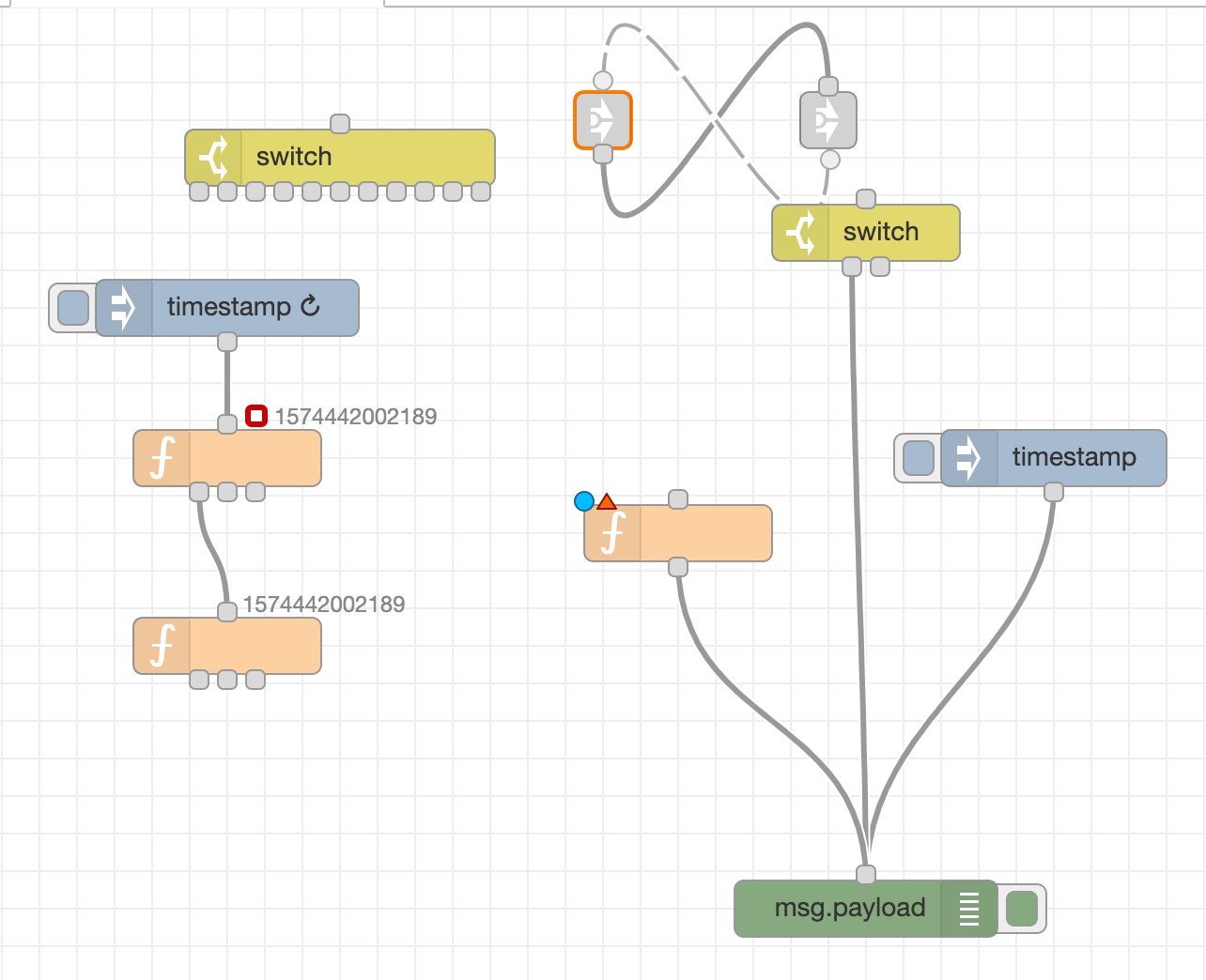
The big benefit of having visual feedback on the connected state of the input port is noticeable when you have a wire running underneath a node, but not connected to it, like this...
Notice the highlighted wire at the top, which goes under the function node, and so never actually triggers the intermediate function! Very difficult to debug, that one...
Agreed! "Some people" *ahem spend way too much time making sure all the horizontal lines are "correct" ... thank goodness all nodes with 0-1 output ports have identical heights!
Oh, and "snap to grid" should be the default setting ;*)
Very nice, indeed. I stumbled upon that sort of error myself when the "insert node when hovering over the wire" feature misbehaves. At the moment I always check the connection by moving the inserted node around a bit. Very hard to find otherwise.
I only ever do that when I want to debug as well as output. So I only ever do it with nodes that kind of "finish" the current flow. Typically a link-out for example but also mqtt-out or similar.
Anywhere else, I would never overlay the wires like that.
@shrickus I know we discussed this before, but can you remind me if there was a particular reason you modified the port shape rather than put an arrow head on the wire? I don't want this thread to stray too far off topic (as its primarily about the vertical flows, not other changes to the appearance of flows), but I'd be interested to know if that's something you tried and discounted for some reason.
I'm less inclined to modify the port shape, but I can certainly see adding an option to show an arrow head on the wire would be helpful. That will still make it clear if a wire is connected to a node or passes underneath.
For what it’s worth the added arrow to the wire, and the usual consistent look of the square ports, looks cleaner and less messy to me.
That said, if the problem is whether ports are connected (rather than also the need of seeing the direction of the flow (which I think is less of a problem)) maybe a change in colour of the connected (still square) ports is enough?
Of course, if there’s going to be vast choice of node flow directions in the future an arrow may be wiser.
The issue is that if there are N wires, then there are N arrowheads -- and if they don't all line up exactly, it looks messy (and it's less efficient to draw). With the way the bezier curve tangents work, my implementation caused the arrowheads to be slightly off horizontal, but it looks like your implementation solves that issue... (hmm, maybe not, since I don't see multiple wires attached at different angles)
The advantage to putting an arrowhead on every wire is that each node does not have to know how many wires are attached, and since that information is stored on the source node (instead of the target), I can see why you would want to not change the shape of the node's port.
Either way, glad you are thinking of implementing arrowhead... one less piece of Editor customization I'll need to worry about in the future -- cheers!
I had to jump in on this with some opinions ... of course.
@sakazuki thank you for this work! This is really awesome! And I appreciate your persistence and continued work on this. I actually have several flows where this vertical alignment would have them be much more readable.
I'm NOT going to say that I like all flows to be vertical ... but many would benefit from this. Because of this I would vote/lobby for the choice to be on a "per tab" basis ... NOT one way or the other. I know this might add complexity and other side effects, but long term I think this is the better solution.
Several people mentioned the "status" text being a complexity of the vertical design. I agree and was thinking of various possible solutions. One way to deal with this might be, in the vertical alignment, to put the status to the right of the last output node coming from the bottom of the node. Not ideal, but prevents the collision of the status text with the output node(s).
Per the "arrow heads" ... I really like the examples that @knolleary created ... they look good, and seem to look clean!
Just some thoughts ... this is a really interesting potential addition that I like!
Whilst there is some way to go, I've taken the code from @sakazuki and started exploring some of the issues discussed here.
In the short term, I expect we'll enable vertical flows via a flag in editorTheme - at least whilst we figure out how vertical and horizontal flows co-exist (if at all). Later on, we'll have a similar flag to enable/disable any ability to change the flow layout from within the editor directly - we will not force those who embed Node-RED to adopt this sort of change.
I've also been making some tweaks to the appearance and wanted some initial feedback.
The ports are positioned slightly further off the node than in horizontal mode. They are also spaced slighted further apart.
The change/error icons have moved to the left hand corner. There is still an issue if you turn off a node's label then the error icon will collide with the Input port. I may stack the change/error icons down the edge instead.
The status has moved to the top edge next to the Input port - I think that's the only place to put it where it has room to expand to the right without colliding with anything else on the node.
The snap-to-grid feature uses the horizontal centre of the node, rather than the left-hand edge. This guarantees the input/output port (when there is 1 output) will line up on a grid line.
If you want to follow along at home, this is happening in the v-flow branch on github.
Looks good Nick. while it is something I would probably not use as I find it is simply not my thing, I am sure others will be delighted with the progress this is making. Just a random question:
If I import a flow, in either variation, will it automatically be converted to the view I have set in my preferences?
Very nice. I think you're well on the way to answering the request, so I'll play Devil's Advocate or just be annoying again. Doesn't visual consistency require:
The node icon is directly adjacent to the input or output port.
The vertical dimension is at least as large as the horizontal one.
Buttons on the inject and debug nodes are at the top and bottom of the node, respectively.
These changes might be a bit jarring to current NR users who are trained to read flows from left to right, but they would make sense to new users who don't have that prejudice. How hard they would be to implement is another matter.
Well, no. The goal here is not to flip the entire UI - only those bits that make sense to.
We don't want to completely change the appearance of nodes - their icons sit alongside their label. The nodes expand horizontally to fit the label. There is no benefit to growing the node vertically - that would just be wasted space.
I see this as a important benefit of the vertical flow. That the nodes grow horizontal and the flow vertical. So there can be more information about the flow and connections on a scree.