I want to visualize some data that i receive from a mqtt broker. So far this is working and I can display the values in a line chart
But when I reload the page my complete line chart has a different scale on the x-axis and it's not anymore usable.

Is that a bug?
I'm using NODE-Red v0.20.0 and Dashboard v2.14.0 on a raspberry pi 3b+
To say anything meaningful, it requires more things to know about your flow and setup.
So if you can, share your flow or at least that part of flow, where you feed your data to chart.
Sorry for the late response.
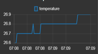
I'm using a temperature sensor and publish the values with a python script to my MQTT-Broker. I create a MQTT-Node to subscribe the channel with the temperature values and forward these to the line chart-node.

And how your chart node is configured? Make a picture of configuration tab.
I tried to figure out the time difference when those 2 chart screenshots are taken. Is it a day and the half? And then, does the chart get any new data at all on that second image? If not, the chart just tries to do its best and show the data from far past at left side and as there is no data for current time there will be nothing to show. Also calculations to rearrange the time scale may then lose its meaning.
Thing to realize here that Node-RED charts are general purpose charts thus they must support very lot of strange use cases. This is not an easy case to solve. Therefore the configuring options are limited and this is something you'll just need to respect and get used to. Find best suitable settings and learn how they behave and how to read them.
Charts work well if the data feeding is consistent. I think this is the main issue here.
If you need more precise charting, there is many options. Grafana for example. But this is another story over all.
