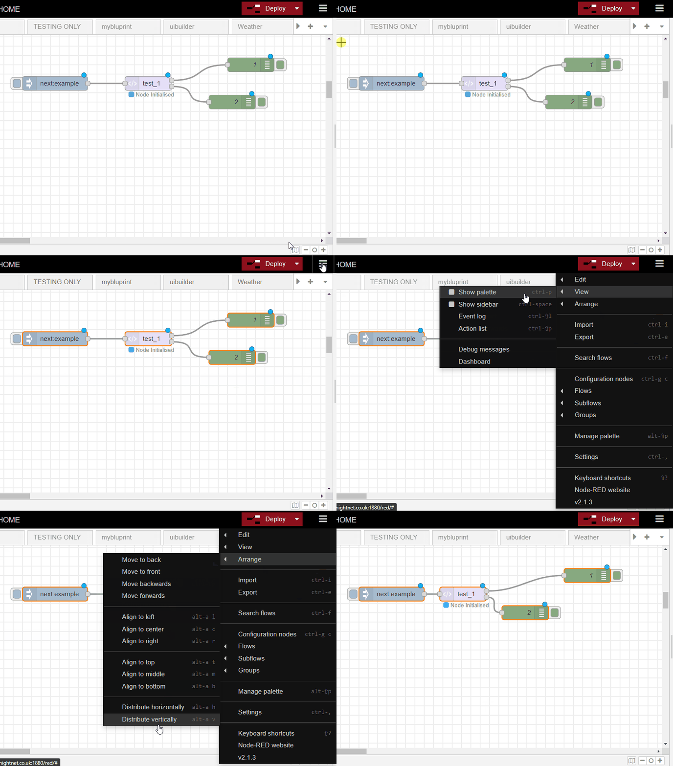
for me both the left and right edges of a named node do seem to snap to the grid
Which version of NR are you running ?
If I change the grid to 10px I see major and minor grid lines and they are too closely packed for comfort. (Firefox)
Is it possible to hide the minor grid lines - so it snaps to 10px but I only see a 20px grid?
I've tried to find the CSS to achieve it but can't pin it down.
I am running 2.1.3
I think we've now got into a word semantics issue (and I'm not the best at words) 
Can I simply refer back to first post that shows that in default 20 grid mode, we can't align nodes visually evenly at short spacing intervals
I think this is due to width of nodes not being xxx (whatever xxx is) but I'm just a user here 
Before:

Select all, top-left to bottom-right & distribute horizontally - same happens if you copy bottom-right to top-left or if you select everything individually.

Select individual nodes bottom-right to left:

I see what your saying - my issue/request is about packing nodes close together
Yes, just realised that 
You are right, no easy way of doing that with the align features. Personally, I don't like things being too close.
I did manage to get this:

But I don't know that it is easily repeatable.
When snap to grid is enabled, the node widths (when label is shown) snap to the grid. I can see that in your original screenshot for the first 3 cases. The four case is where snap-to-grid has been disabled.
The issue is that collapsed nodes do not adjust their width to the grid - they are, as I said previously, intentionally kept square.
Placing two nodes so their ports overlap is not considered a good idea as you can't tell if they are wired together or not. Imagine the wire was accidentally deleted... how long would it take you to track down the missing wire?
A great exercise for a class when you have that one smart-Alec that needs an extra challange ![]()
I'm failing to communicate here
I completely understand that collapsed nodes are square and fixed ![]()
100% agreed - I like to personally touch to save space but it's not a good general idea and if it can't be done then so be it ![]()
On top image, if input spacing could be made the same as the output spacing (i.e small but noticeable) then all is good AFAIC ![]()
I think it's the width of full fat nodes that's the issue. The right hand edges are being quantised as Dave shows but I don't think in a manner to make the next node line up consistently
I simply don't see that.
With snap-to-grid enabled, as Dave shows, both the left and right edges line up to the grid. Your own screenshot shows the same.
So if both of a node's edges line up to the grid, then what doesn't line up with the next node?
The top image shows that if you try to pack the nodes together as close as possible, then you can't get the gaps to visually be the same.
That's as succinct as I can put it
That is because the right-hand edge of collapsed nodes do not align to the grid.... which is because collapsed nodes are square, and have their left-hand edge aligned to the grid, so their right-hand edge is not aligned to the grid.
Which is why I suggested we could look at allowing the snap to grid to allow a collapsed node to align to either its left edge (as today) or its right edge.
That would allow you to get the gaps between the nodes to match.
Super ![]() Sorry I didn't understand what you meant earlier
Sorry I didn't understand what you meant earlier
If you set the grid to 15 - then the right hand edge of collapsed nodes do line up.... and any NEWLY created nodes will also have their right hand node aligned correctly... however any "old" nodes that had their size created at (say) grid 20 won't suddenly resize to refit the grid. So you need to set the grid first - then add your nodes to your flow.
Not workign out at my end
I set grid to 15, created new tab and then added these fresh nodes

Top is closest I can get without touching and isn't evenly spaced
Yes - ok - got it now... but if you want compact I still prefer


I need some sort of label to remind me tomorrow what it does ![]()
[Edit the rest is complete horlicks by me]
Can I refer back to
and the little issue of the blue dots when you just move a group of compacted nodes
What issue? You've moved the nodes, so they are marked as having changed.
Well - if you move a node that isn't in a group - they don't get marked as being changed
[edit complete horlicks by me]
Yes they do.

