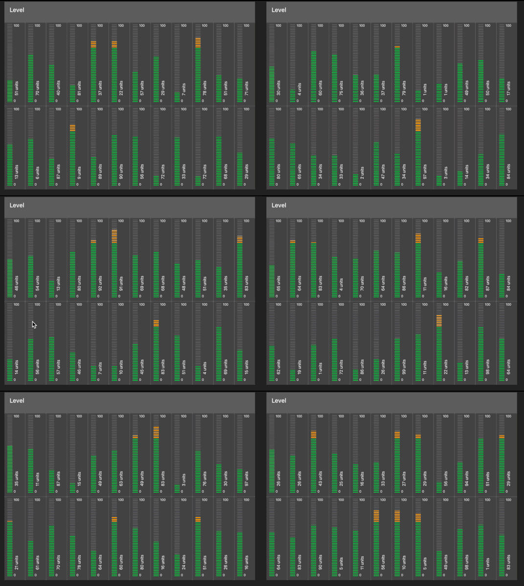
Version 0.1.0 doesn't bring any new feature for widget. Well ... almost. Minor things may be can be noticed with layout and I hope those will not break existing graphical beauty for anyone.
Main reason of this update is performance improvement.
This involves complete new solution for graphical elements.
Also as one of bottlenecks was animation of value text, I decided to separate it from main animations and turned it off by default. But there is checkbox to allow value text be animated. Handle with care 
As the change was actually quite heavy, I cant be sure I tested all the edge cases properly so bugs ... if found, don't hesitate to report here or at ui-level github page
And bugfix 0.1.1 published.
Mea culpa.
Working great @hotNipi! very snappy.
Can I suggest one feature (I am not a good enough coder to create a pullrequest :') );
Provide an option to hide the text for both vertical and horizontal.
For vertical an option to rotate the label (or perhaps even inherent to vertical).
The idea behind a level is that you have a visual representation for a certain value, meaning one doesn't necessarily need to see the value itself.
Visual representation what I would think would be awesome:

The default font of the value is quite huge, is this correct ?

So feature request in short
- Option to hide value
- Condensed vertical layout (fit into one unit width)
I believe that is correct 
Thinking out loud; for the value one could use the label to show it as well (ends up with the same font as the label). Would be great, I can already see a dashboard with only levels for batteries haha
Maybe then
3. text option - disable bold (gives more freedom for every layout)
and for vertical condensed layout if you leave label empty, value (if not hidden) will be at the label position
It is. You have text options to adjust it to fit better into your design.

imho - default should be the dashboard default font and size... - and then customise from there.
I think even regular gauge does not follow that rule for value field...
But anyway the text options are public and easy to use. Font size for default I guess it is rather question of art (and this is not something where I can call myself an expert)
touche - it is indeed (thanks to the justgage library). larger and bolder - but does use the default font-style - so when you change the Site - theme font it all changes.
Sure. This is all same for ui_level. Font type and color is inherited from dashboard (widget text related values). All what is changed is sizes in relative manner. (small figures for min and max, bold and little bigger value field)
thanks @hotNipi, fantastic stuff!
Nicely performant, no issues 

Just driving home tonight, and thinking how cool it would be if the level could optionally display peak values, similar to my car dashboard (but of course not a gauge).
Especially if the delay time for the peak indicator could be set from the node config.
Maybe a step too far??
Peak option has been in my mind and after redesign seems to be doable. No promises but let's see 
So there will be peak option. Peak will have two modes. One mode will be with adjustable delay just like @Paul-Reed described. Additionally peak can be so to say permanent with manual reset option via msg.ui_control And here I am little stuck with naming those options. I need short but clear names for nodes configuration page option selector.
Edit: there can be also possibility to follow peak that user can send via msg.peak or something like that. If anybody sees such thing usable, make some noise 
With this little help from community the peak option may be then released already tomorrow. 
Maybe call the 'permanent peak' simply peak,
and the 'delay peak' - auto-peak (as in auto resetting peak)


