[Beta] node-red-contrib-ui-uPlot-charts

Anybody into charts (like me)?
withBands

Perhaps somebody likes to try out this one sitting on my desk too long:

Still BETA so NOT on flows.node-red.org
Have fun. Any feedback highly welcome (even my time is limited so progress will not be at a fast pace)

Chris

6 Likes

Thanks Christian. A fast responsive chart is important.

Used the installation script and it produced the following error:

It doesn't looks like you have 'git' installed. Install git and try and install the node again. I just installed it fine macOS v12.1.0
NR 2.1.1
node.js v14.16.0
git v2.17.1

1 Like

As @zenofmud mentioned it seams that the problem is on your side ...

npm i Christian-Me/node-red-contrib-ui-uplot-charts
+ node-red-contrib-ui-uplot-charts@0.0.1
updated 1 package and audited 580 packages in 8.749s

But I pushed it to npm too. So for your convenience

npm i node-red-contrib-ui-uplot-charts

should work too :wink:

No I don't install 'git' intentionally (Had problem with git slowing down systems before. Installed many packages from "npm" wo problems in the past :grinning_face_with_smiling_eyes:. )

@Christian-Me This time it installed well. Will try out soon.

1 Like

Did some quick testing and here are some initial thoughts and several-bug report:
Can see clear speed improvement over the original chart during the speed test. When the msg is over 160/s, uplot is still very responsive. Chart still responds, but hard to operate other keys.

Bugs (Note: the following bugs happened when I copied example codes and imported via clipboard). No such bugs when using ui-uplot directly via the dashboard and used own flows.

  1. There are duplicate charts shown. See attached picture.
  2. There are duplicate options with the default example, such as the following picture. You can select 1-hour period, or 1-month period in the duplicate fields.
  3. It plots starting from the right. Can it start from left and then start filling in the points, until it reaches the specified number of points? The original chart is working well in terms of this.
  4. If I delete a ui-uplot group or tab, and remove it from the editor, the browser still shows the group and tab. Only stopping and re-starting Node-RED can clear the deleted group or tab.

More testing:
Use default ui-uPlot directly without importing the example codes, bugs 1-4 did not happen this time. (used copy/paste method to import the example codes and the bugs happened).

Plots are very responsive at 50Hz data rate, 3 axes data coming in. Very impressive already :heart_eyes:

One major issue: when switching between tabs, loading of the ui-uplot chart is noticeably slower than chart. It takes roughly 0.6-0.9s to load ui-uplot when switching tabs. The original chart took less than 0.2s to load.

Feature request: the name of the curves can be random. If we can specify the color of the curves based on incoming order (similar to the current chart node), then it would be great. Also it would be great to be able to turn off the default shade from the node options.

Still trying to figure out how to adjust the x,y label colors quickly.

Hi David,

Thank you for testing and your comments. Highly appreciated!

Strange. Re-exported the basic demo. Hope this helps

This is controlled by the Keep Zoom and Pan plugin
image
If not used or disabled it should behave like the chart node (always show the complete data). If Enabled: positive period show time into the past (now is right) and negative into the future (now is left). (fixed: input negative values) - still some work to do to maintain the default zoom

Please clarify "random": By default a series is added by incoming topics. (To be tested msg.label as default name if present)

Should already use the same colors as the chart node for new topics:

        const defaultColors = ['#1F77B4', '#AEC7E8', '#FF7F0E', '#2CA02C', '#98DF8A', '#D62728', '#FF9896', '#9467BD', '#C5B0D5'];
        const defaultSeries = {show:true, spanGaps:true, band: false, width: 2, dash: [], label:'unnamed',stroke:'rgba(255, 0, 0, 1)',fill:'rgba(255, 0, 0, 0)',path:'linear'}

and

                                    let color = (defaultColors[index]!==undefined) ? defaultColors[index] : '#ff0000';
                                    item.label = msg.label || msg.topic || "unnamed";
                                    item.stroke = HEXtoRGB(color ,100);
                                    item.fill = HEXtoRGB(color,0);

OK, done for now (not tested). (But not sure about that as this is a feature of uPlot) The default width is now 2.

You can do that now here: Set the side to X-Axes:


and you get this:

This also pave the way to non time based charts ... but this has to wait a little bit.

Version 0.0.2 is on github & npm.

2 Likes

This was due to glitches in the replay mechanics (asking for several replays). Should be solved now.

This is in my experience a normal behavior. Empty groups or tabs are not automatic deleted if the lst remaining node is deleted (can't fix that)

The auto config should now work similar to the chart node (OK the grid colors should be chosen better to work in light or dark mode)

Not sure about the flexible X-Axis in general. good for a start but later it gives a wrong impression as trends will look different over time (where they in reality aren't). This is what the "keep zoom and pan" plugin is or will be good for. Same for auto scaling Y (see the auto curve (pressure) change shape while panning. Use the fixed (non auto) scales to avoid this. (here are some usefull links "how charts cheat on you" or "how to cheat with charts" methods most of us became quite sensitive the last two years)

0.0.3 contains the latest fixes (auto/no config)

HI thanks for creating this, just running it on Win10( yeuch!) node-red 2.1.0
just chucking random data into at 0.01 sec to see if it keeps up , and yes it does , nice.
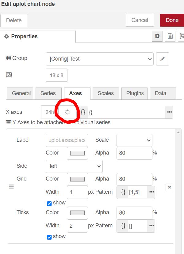
only issue each time i deploy i get an extra widget ( not sure if correct term) appears.


and the chart stacks under each other in the first widget.

[
    {
        "id": "60950dadd724506a",
        "type": "ui_uplot-charts",
        "z": "f6f2187d.f17ca8",
        "group": "f5e2c3bf3d5a99b2",
        "order": 0,
        "width": 0,
        "height": 0,
        "name": "chart",
        "title": "test chart",
        "series": [],
        "scales": [],
        "axes": [],
        "axesX": {},
        "plugins": [],
        "dataPlugins": [],
        "dataStore": {
            "context": "node",
            "store": "memory"
        },
        "debugServer": false,
        "debugClient": false,
        "spaceForTitle": 50,
        "spaceForLegend": 50,
        "x": 700,
        "y": 340,
        "wires": [
            []
        ]
    },
    {
        "id": "ebb07f9c072fbaa9",
        "type": "random",
        "z": "f6f2187d.f17ca8",
        "name": "",
        "low": "-10",
        "high": 10,
        "inte": "true",
        "property": "payload",
        "x": 530,
        "y": 340,
        "wires": [
            [
                "60950dadd724506a"
            ]
        ]
    },
    {
        "id": "22c8752050675b0a",
        "type": "inject",
        "z": "f6f2187d.f17ca8",
        "name": "",
        "props": [
            {
                "p": "payload"
            },
            {
                "p": "topic",
                "vt": "str"
            }
        ],
        "repeat": ".01",
        "crontab": "",
        "once": true,
        "onceDelay": 0.1,
        "topic": "",
        "payloadType": "date",
        "x": 360,
        "y": 340,
        "wires": [
            [
                "ebb07f9c072fbaa9"
            ]
        ]
    },
    {
        "id": "f5e2c3bf3d5a99b2",
        "type": "ui_group",
        "name": "Default",
        "tab": "450ac4c9b5c2acc6",
        "order": 1,
        "disp": true,
        "width": "11",
        "collapse": false,
        "className": ""
    },
    {
        "id": "450ac4c9b5c2acc6",
        "type": "ui_tab",
        "name": "test",
        "icon": "dashboard",
        "disabled": false,
        "hidden": false
    }
]

https://github.com/Christian-Me/node-red-contrib-ui-uplot-charts/issues/1#issue-1038216637

Thanks much Christian.

First and the most important of all, the tab switching speed is good now. No delay clicking around. Very important for user experience. This is great.

Some remaining issues:

  1. In our case, there could be dozens of sensors with random IDs (the IDs could range from 1 up to millions) coming in each time, so we can not define the color just by the topic. ui-uplot assigns the same red color to different topics in default when there are more than ten sensors (1.x, 1.y, 1.z, ... in the figure) at the moment:

The original chart handles this well:

  1. Clicking the default 12h or 24h x-axis button changes them into "spinning wheel" icon, and then nothing happens:

    So still can not change the color of axes at the moment. A default light color axis will work for now.

Also, modifying the axes brought the shades back. Even if I deleted everything from the "Axes" option. Can not get rid of the shades after this.

  1. Another bug is the "erase" history button. It does not work yet. Clicking the button changes it into a "spinning wheel" too and all data are still there.

Nice to hear that the slow data loading is solved (keep in mind the data has to be loaded each time you switch tabs form the runtime). Hope the ghost groups and charts diapered too :jack_o_lantern:.

The spinning wheel indicates that the ui is waiting for a reply form the runtime - I‘ll investigate (perhaps you can see something in the server log). If you click on the info button (which is non destructive) you should see this (if debug messages are enabled)

28 Oct 21:30:45 - [info] [ui_uplot-charts:7609eb8c228cf217] http request "getSizes" fom ip: 127.0.0.1:1880

and get this
image

Loading the X-Axes def you should get this

28 Oct 21:32:22 - [info] [ui_uplot-charts:7609eb8c228cf217] http request "axesX" fom ip: 127.0.0.1:1880

The browser console will show any errors.

For the y-axes currently you have to define an scale and set it to the series and axes. This will build the link between all three options (this is how uPlot works). I think I can define a default scale and axis which can be defined for all new and not connected series. The Time Axes don't need a Scale. Only select X axes as side (Scale is then disabled)
image

For more (automatic) colors (discussed here before) I plan to utilize my chroma node (or build chroma.js directly into the uPlot node) to generate nice and scientific color scales (including colorBrewer, paletteHelber) and others. This will be interesting when I implement the gardient features of uPlot. But this is a complete new task. For now I can make the default palette accessible to play with or perhaps send a msg.series.stroke or msg.ui_control.series.stroke.with your data. I have to think about a good way to implement this (and perhaps lift the internal mystery of ui_control messages this time).

Ok for now the defaultColors can be edited (you can use the chroma node or other tools to generate longer palettes and paste them in). Have fun :wink:

image

1 Like

The color palette did the job and the color can be differentiated easily now. Excellent.

The slow loading issue when switching tabs seems to come back now. I changed the maximum number of columns to 1000 and it is still little bit slow.

Also, the shade suddenly came back automatically when checking the information panel. Please see attached picture:

Don't see such message from the debug window. Are you talking about this information button (picture below)?

Managed to get x-axis color working. But y-axis scale is disabled and the color selection does not work?


I will look into configurable defaults (for series, axes and scales) over the weekend. Makes no sense to hack in quick solutions as some of us might like the shades or thin lines as default.

The error messages should either appear in the browser console (aka development tools) of the editor page or in your terminal window (console) or logging system depending your OS.

Scales you have to define first in the scales tab, close the config (as described in the known issues) and when you reopen the config panel you can select them for your axes.

Chris

This topic was automatically closed 30 days after the last reply. New replies are no longer allowed.