I am sending data to a chart node.
Really there are 8 for the 8 machines.
But one is always on, as it is the MQTT host and the main machine where a lot of NR stuff is.
I did find a problem a long time ago with the chart and thought I had fixed the colour of the data being shown.
Silly me.
All the charts have BLACK set as their data to be shown.
Usually - when other machines are on - their charts are black. This one for this machine is blue.
At one stage I copied one of the other nodes and edited the name and replaced the existing one.
That worked for a while, but now the problem of blue data is back.
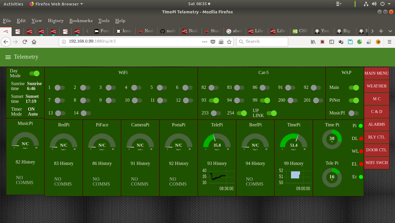
These are two nodes.
The TelePi colour is back.
The TimePi data is blue.
[{"id":"8db15eb6.2a99e8","type":"ui_chart","z":"c636aa5a.cc34","name":"TimePi","group":"47fbc9ac.ccfb","order":6,"width":"3","height":"3","label":"99 History","chartType":"line","legend":"false","xformat":"HH:mm:ss","interpolate":"linear","nodata":"NO COMMS","dot":false,"ymin":"","ymax":"","removeOlder":1,"removeOlderPoints":"","removeOlderUnit":"3600","cutout":0,"useOneColor":false,"colors":["#000000","#aec7e8","#ff7f0e","#2ca02c","#98df8a","#d62728","#ff9896","#9467bd","#c5b0d5"],"useOldStyle":false,"x":2400,"y":1040,"wires":[[],[]]},{"id":"f8a910f9.1566e8","type":"ui_chart","z":"c636aa5a.cc34","name":"TelePi","group":"304a3add.03ccce","order":6,"width":"3","height":"3","label":"93 History","chartType":"line","legend":"false","xformat":"HH:mm:ss","interpolate":"linear","nodata":"NO COMMS","dot":false,"ymin":"","ymax":"","removeOlder":1,"removeOlderPoints":"","removeOlderUnit":"3600","cutout":0,"useOneColor":false,"colors":["#000000","#aec7e8","#ff7f0e","#2ca02c","#98df8a","#d62728","#ff9896","#9467bd","#c5b0d5"],"useOldStyle":false,"x":2399,"y":944,"wires":[[],[]]},{"id":"47fbc9ac.ccfb","type":"ui_group","z":"","name":"TimePi","tab":"1c792414.600e94","order":12,"disp":false,"width":"3","collapse":false},{"id":"304a3add.03ccce","type":"ui_group","z":"","name":"TelePi","tab":"1c792414.600e94","order":10,"disp":false,"width":"3","collapse":false},{"id":"1c792414.600e94","type":"ui_tab","z":"","name":"Telemetry","icon":"dashboard","order":2}]
From what I see, there is nothing special with either which would make one blue and other other black.
Here is a screen shot.
I'm open to ideas which could be causing the problem.
Also sometimes the chart is just blank.
(Lucky it happened now so see second screen shot.)
And being honest, (typically) after posting this, the data has come back to being shown.
I have not edited anything or knowingly changed any settings.
I'm torn between "a rock and hard place" on how much of the flow to post.
I don't want to burden people digging through my code, but there again, where is the line between enough and too much information?