Chart - line not displayed if same value as x-axis

If I specify a y-axis min of -1, I see;

pid1
...note that you can see the value line along the x-axis up to the current time.

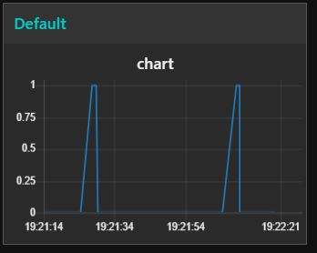
However, if I leave the y-axis blank, or set it min = 0 & max = 4, I see;

pid2

...and the value line is not being displayed when it is at zero..

  • Node-RED version: v0.20.5
  • Dashboard version 2.15.4
  • Viewed on Windows Chrome Version 74.0.3729.169 (Official Build) (64-bit)

On Android mobile I can see the value line but it is very thin, and not as thick as values above zero.
It seems that the y-axis is cut-off below zero (as it should) BUT it halves the width of the value line.

Did you try it in raw chart.js ?

I'm sorry, you've lost me there.

The chart is using the angular-chart.js wrapper of the chart.js library - we don't do anything special re axis - so I was wondering if the underlying library has the same issue.

I've no idea how to load data direct into the underlying library to test, I only use chart.js through node-RED.

Hmm, odd for me I see
image
which indeed is cut in half - but is at least visible. So would seem to be the default behaviour.

My experiments suggest that what is happening is that it is drawing the line at 0 with half above and half below the axis, but then clipping it so that it does not draw outside the box. That is not what you are seeing however. Have you checked that the values going in are exactly zero and not slightly negativ? Feed the incoming data into a debug node and check.

Definitely zero, I have checked that.
As I said above, on mobile browser I see what Dave has observed - a half width value line.

Try it on the PC with this, does it show it? It works ok for me in Chrome on Ubuntu

[{"id":"e9184f85.148f7","type":"inject","z":"514a90a5.c7bae8","name":"","topic":"","payload":"0","payloadType":"num","repeat":"5","crontab":"","once":false,"onceDelay":0.1,"x":219.5,"y":166,"wires":[["d6aec62c.6439a8"]]},{"id":"d6aec62c.6439a8","type":"ui_chart","z":"514a90a5.c7bae8","name":"","group":"40f20804.878068","order":0,"width":0,"height":0,"label":"chart","chartType":"line","legend":"false","xformat":"HH:mm:ss","interpolate":"linear","nodata":"","dot":false,"ymin":"0","ymax":"1","removeOlder":1,"removeOlderPoints":"","removeOlderUnit":"3600","cutout":0,"useOneColor":false,"colors":["#1f77b4","#aec7e8","#ff7f0e","#2ca02c","#98df8a","#d62728","#ff9896","#9467bd","#c5b0d5"],"useOldStyle":false,"x":393.5,"y":165,"wires":[[],[]]},{"id":"40f20804.878068","type":"ui_group","z":"","name":"Default","tab":"c993b967.19cbc8","disp":true,"width":"6","collapse":false},{"id":"c993b967.19cbc8","type":"ui_tab","z":"","name":"VTEMP","icon":"dashboard","order":32,"disabled":false,"hidden":false}]

Don't know about versions in use but seems to be fixed at Chart.js side

Sadly we use angular-chartjs which pre-reqs chart.js 2.3.x - so we can't get that fix that is in 2.8.0

More sadly it seems to living its life at very low maintenance rate. :roll_eyes:

@Colin problem exists as described with your flow. I've also injected number '1's so that you can see the difference.

line

@hotNipi Good spot! Yes that appears to be the same issue.

Tried setting the y-axis to min = -1 & max = 10 which of course displays the line, but the scale looks untidy.

pid

Can you try size=auto ?

It may help if you define limits with manner that odd lines are not needed. Like from -5 to +15 or similar.

1 Like

pid2