I've mentioned the problem where the chart's line and digits are blurred.
I just noticed this new problem:
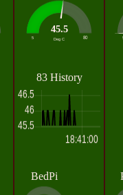
The lower values not shown on the chart.
I've mentioned the problem where the chart's line and digits are blurred.
I just noticed this new problem:
The lower values not shown on the chart.
which lower values ? By default the chart auto scales min and max.
Well, I just looked at it quickly.
The machine had rebooted recently to the graph view.
For me, the black line should be connected at the 45.5 line if that is the lower value.
To me it looks like all I am seeing is the top parts of the spikes.
Yeah, it won't be the first time I am wrong. I just saw it as I explained then and asked.
For clarity:
See enlarged picture with red lines depicting the missing black lines.
computers - meh.
It is known issue. Discussed here Chart - line not displayed if same value as x-axis
@Trying_to_learn - If you open up the chart config, is there an entry in the Y-axis Min box?
Indeed chart.js has an algorithm to auto-fit (or auto-scale) the chart that can bring issues.
See for instance these two charts that use the very same data source.


See how bad this can be. If you look at the first chart, without reading the values in the y axis, you would be led to think that value in the first bar (May, 5th) is much higher (10 x probably) than the value of the second bar (May, 6th). The second chart would not mislead you. The proportions are preserved in the visualization. This issue happens because of the auto-scale algorithm. Fortunately it is easy to change that using msg.ui_control.
I used below configuration to force the chart to be plotted with initial value equal zero. Also added configuration to make the bar thinner.
let msg.ui_control = {
    "options": {
        "scales": {
            "xAxes": [
                {
                    "barThickness": 25
                }
            ],
            "yAxes": [
                {
                    "ticks": {
                        "suggestedMin": 0
                    }
                }
            ]
        }
    }
}
Probably you can get the same result by configuring the field Y axis min. I did not try as I wanted in the first place make the bars less thicker.
Checked. No.
Thanks Andrei.
I am not really losing sleep over it, I just saw it and wanted to check.
If the problem is know, then so be it.
The code you posted looks nice, but I have not played with that sort of stuff. Though it may be good for me in the longer run, just now I am really consumed with getting my RPI WAP working again.
And a few other things buzzing around.
But appreciated.
Copyright OpenJS Foundation and Node-RED contributors. All rights reserved. The OpenJS Foundation has registered trademarks and uses trademarks. For a list of trademarks of the OpenJS Foundation, please see our Trademark Policy and Trademark List. Trademarks and logos not indicated on the list of OpenJS Foundation trademarks are trademarks™ or registered® trademarks of their respective holders. Use of them does not imply any affiliation with or endorsement by them.
The OpenJS Foundation | Terms of Use | Privacy Policy | OpenJS Foundation Bylaws | Trademark Policy | Trademark List | Cookie Policy
