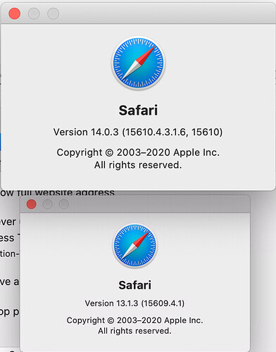
I was just googling to try and figure out this issue that I have had with node-red since I started using it years ago. Until now, I've just been tolerating it. I found this thread, about the same issue.
In my case, I was zoomed out slightly - viewing at 85%. Safari is applying its own CSS when you use its zoom feature and it is changing the font size when it does so. This is apparently incompatible with the CSS that node-red uses. I tried editing the CSS in the web inspector to see if I could figure out what needed to change in order for the cursor and highlights to be in the correct positions respective of the text, but I couldn't figure it out. If anyone who knows CSS better has any insights into this, it would be very useful. Given my small laptop screen, I always use the zoom out feature to be able to see more of a flow and it's irksome that I have to keep adjusting the zoom to edit in a node-red text box.
I'd also be curious if other browsers have a similar zoom feature and if they have a similar issue...
Here are some potentially relevant screen shots I took. Note the cursor is at the end of the line in the text box in the first image and the inspector is highlighting it - you can see how the highlight is off. You can also see that the call to translate in the HTML says 336px. I suspect that may be(?) what it thinks the cursor position is, but given the box/highlight width is 418, I don't think that's right. It should be closer to 400.


