Leave here your question and element of your creation to publicize the dashboard 2.0 and improve it. @hotNipi
on/off button

<template>
    <v-btn class="button" ref="button" stacked @click="alternar">
        <div class="title">Luz</div>
        <v-icon class="icon" ref="icon">{{icon}}</v-icon>
    </v-btn>
</template>

<script>
    export default {
        data() {
            return {
                value: "OFF",
                icon: "mdi-lightbulb-outline"
            };
        },
        methods: {
            alternar: function () {
                if (this.value === 'ON') {
                    this.desligar();
                } else if (this.value === 'OFF') {
                    this.ligar();
                } else {
                    this.desligar();
                }
            },
            ligar: function () {
                this.icon = "mdi-lightbulb-on-outline";
                this.$refs.icon.$el.style.color = '#BD9608';
                this.$refs.icon.$el.style.textShadow = '0px 0px 10px #BD9608';
                if (this.value === 'OFF') {
                    this.send({ payload: 'ON' });
                    this.value = "ON";
                }
            },
            desligar: function () {
                this.icon = "mdi-lightbulb-outline";
                this.$refs.icon.$el.style.color = '#A9A9A9';
                this.$refs.icon.$el.style.textShadow = '0px 0px 0px';
                if (this.value === 'ON') {
                    this.send({ payload: 'OFF' });
                    this.value = "OFF";
                }
            }
        },
        watch: {
            msg: function(){
                if(this.msg.payload != undefined){
                    console.log('got message :',this.msg)
                    if (this.msg.payload === "ON") {
                        this.ligar();
                    } else if (this.msg.payload === "OFF") {
                        this.desligar();
                    }
                }
            }
        }
    }
</script>

<style>
    .button {
        display: flex;
        flex-direction: column;
        margin: auto;
        height: 100%;
        width: 100%;
        background-color: #4F4F4F;
        color: #000000;
        border: 1px solid #000000;
        ont-size: 14px;
        border-radius: 18px;"
    }
    .title {
        font-size: 14px;
    }
    .icon {
        font-size: 40px;
    }
</style>
How can we place the buttons side by side and not one below the other in the group? @hotNipi @joepavitt


Mine doesn't open the option like that... I can only run sideways.
Doesn't it depend upon which layout you have selected in the page props?
@hotNipi has posted tons of great "css sttuff" some of which I've used already, now he's posting more and I'm trying to figure out how to preserve all this for the future when I'll probably need it rather than hunting through the forum for hours. Is there somewhere somehow his code can be put somewhere so everyone can find it easier, easily?
Probably not the place but thought I'd tack it on here
Just don't ask for category with my name or smth like that 
This forum has really good searching capabilities.
Maybe get them tagged with "css"?
If you have a list of threads, I'd be happy to add the tag if people agree.
PS: Meant to say that would be for generic CSS related matters - not necessarily for D1/D2 specific. Some of the things posted cover both though.
I want to start documenting more of the examples into the documentation. I already put a placeholder page in place here: UI Template Examples | Node-RED Dashboard 2.0
The source for that docs page is here: node-red-dashboard/docs/user/template-examples.md at main · FlowFuse/node-red-dashboard · GitHub
All PRs and contributions are welcome
Hmmm, that option should be opening like that for all layouts. (fyi @Paul-Reed)
Each layout just then interprets the value slightly differently (sometimes as a fixed px value, e.g. 2 x 48 px, sometimes as a fraction, e.g 2/12.
Can you share a little recording (or open a GH issue if it's definitely not opening like that) as that suggests a bug on the element sizing widget.
Here the same shape always opens regardless of the layout you place. I keep trying to adjust the position of the elements. I confess that it is quite complicated given the way I create the elements.

Ah yes, understood - that's the group size, which will always be a given width. The template nodes can then be sized accordingly by setting their width for each node, e.g. if each template has a width of 2, then you'll have 3 x side-by-side
Below is an example of a button that issues a reboot to an ssh node to restart the server using the password. Password "780705"

<template>
  <div>
    <v-btn class="button_reboot" ref="button" stacked @click="opendialog">
      <div class="title_reboot">Reboot</div>
      <v-icon class="icon_reboot" ref="icon">{{icon}}</v-icon>
    </v-btn>
    <v-dialog class="dialog_reboot" v-model="dialog">
      <v-text-field class="text_dialog_reboot" label="Senha" variant="outlined" v-model="senha" @keyup.enter="closedialog"></v-text-field>
      <v-btn class="btn_dialog_reboot" @click="closedialog">Autorizar</v-btn>
    </v-dialog>
  </div>
</template>

<script>
  export default {
    data() {
      return {
        icon: "mdi-restart",
        dialog: false,
        senha: ''
      };
    },
    methods: {
      opendialog() {
        this.dialog = true;
        this.$refs.button.$el.style.backgroundColor = '#FF8C00';
      },
      closedialog() {
        if (this.senha === '780705') {
          this.dialog = false;
          this.ligar();
          this.senha = ''
          this.$refs.button.$el.style.backgroundColor = '#4F4F4F';
        } else {
          this.senha = ''
          this.$refs.button.$el.style.backgroundColor = '#4F4F4F';
        }
      },
      ligar() {
        this.send({ payload: 'reboot' });
      }
    }
  };
</script>

<style>
  .dialog_reboot {
    display: flex;
    flex-direction: column;
    margin: auto;
    background-color: #A9A9A9;
    border: 1px solid #000000;
    border-radius: 18px;
    height: 150px;
    width: 300px;
  }

  .btn_dialog_reboot {
    display: flex;
    margin: auto;
    background-color: #A9A9A9;
    border: 1px solid #000000;
    color: #000000;
    border-radius: 08px;
    width: 40%;
  }

  .button_reboot {
    display: flex;
    flex-direction: column;
    margin: auto;
    height: 75px;
    width: 75px;
    background-color: #4F4F4F;
    color: #000000;
    border: 1px solid #000000;
    font-size: 14px;
    border-radius: 18px;
  }

  .title_reboot {
    font-size: 75%;
  }

  .icon_reboot {
    font-size: 40px;
  }
</style>
Had someone just DM me asking a question about accessing the width/height and just wanted to share the answer here too.
Anything configured on the ui-template in the Node-RED Editor is available inside the ui-template via this.props, e.g:
In the Template:
<template>
    <div>Width: {{ props.width }}</div>
    <div>Height: {{ props.height }}</div>
</template>
In the Vue Component's Logic:
<script>
    export default {
        mounted() {
            // code here when the component is first loaded
            console.log(this.props.width, this.props.height)
        }
    }
</script>
Is there a write-up on props 'cause there is loads of stuff there?
Not formally, as it's not something I'd anticipated many utilising, for now the best I can offer is the source where they're first defined: node-red-dashboard/nodes/widgets/ui_template.html at c595d8eb9f194f406c3f2e9abb33a9fbafdcbc59 · FlowFuse/node-red-dashboard · GitHub
Worth noting thought that some of that is also legacy from node-red-dashboard 1.0, and I've not done a full clear out of.
The other nice place to see this is in our Debug View: Debugging Dashboard 2.0 | Node-RED Dashboard 2.0
Where I have a full table of the properties, their values, etc. at runtime for your own Dashboard
Brilliant, thank you for pointing this out. I had ignored this because I haven't thought of developing a ui_widget but there is useful stuff for ui_template widgets also
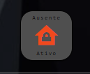
Here's another button implementation with a password request for 3 home alarm states. I do not offer automation for the alarm, but rather the ui-template code for dashboard 2.0 in 1x1. I hope you cooperate. Use whatever you want.


<template>
    <v-btn class="button_alarme" stacked @click="opendialog">
        <div class="title_alarme">{{ titulo_presenca }}</div>
        <v-icon class="icon_alarme" ref="icon_alarme">{{ icon }}</v-icon>
        <div class="title_alarme">{{ titulo_status }}</div>
    </v-btn>
    <v-dialog class="dialog_alarme" v-model="dialog" @click:outside="closedialog_b">
        <v-text-field class="text_dialog_alarme" type="password" label="Senha" variant="outlined" v-model="senha" @keyup.enter="closedialog_a"></v-text-field>
        <v-btn class="btn_dialog_alarme" @click="closedialog_a">Autorizar</v-btn>
    </v-dialog>
</template>

<script>
    export default {
        data() {
            return {
                value: '',
                senha: '',
                icon:'mdi-home-alert',
                titulo_presenca: '--',
                titulo_status: '--',
                dialog: false
            };
        },
        mounted() {
            this.$socket.on('widget-load:' + this.id, (msg) => {
                this.value = msg.payload;
                if (this.value === "ativo_em_casa") {
                    this.ativo_em_casa();
                } else if (this.value === "ativo_fora_de_casa") {
                    this.ativo_fora_de_casa();
                } else if (this.value === "desativado") {
                    this.desativado();
                }
            });
        },
        methods: {
            opendialog() {
                this.dialog = true;
            },
            closedialog_a() {
                if (this.senha === '1234') {
                    this.senha = '';
                    this.dialog = false;
                    this.ativo_em_casa();
                    this.send({ payload: 'ativo_em_casa' });
                } else if (this.senha === '12345') {
                    this.senha = '';
                    this.dialog = false;
                    this.ativo_fora_de_casa();
                    this.send({ payload: 'ativo_fora_de_casa' });
                } else if (this.senha === '0') {
                    this.senha = '';
                    this.dialog = false;
                    this.desativado();
                    this.send({ payload: 'desativado' });
                } else {
                    this.senha = '';
                }
            },
            closedialog_b() {
                this.senha = '';
                this.dialog = false;
            },
            ativo_em_casa() {
                this.$refs.icon_alarme.$el.style.color = '#F0881D';
                this.icon = "mdi-home-lock";
                this.titulo_presenca = "Presente";
                this.titulo_status = "Ativo";
            },
            ativo_fora_de_casa() {
                this.$refs.icon_alarme.$el.style.color = '#F0491D';
                this.icon = "mdi-home-lock";
                this.titulo_presenca = "Ausente";
                this.titulo_status = "Ativo";
            },
            desativado() {
                this.$refs.icon_alarme.$el.style.color = '#1DF088';
                this.icon = "mdi-home-lock-open";
                this.titulo_presenca = "Presente";
                this.titulo_status = "Desativado";
            }
        }
    }
</script>

<style>
    .dialog_alarme {
        display: flex;
        flex-direction: column;
        margin: auto;
        background-color: #A9A9A9;
        border: 1px solid #000000;
        border-radius: 18px;
        height: 150px;
        width: 300px;
    }

    .btn_dialog_alarme {
        display: flex;
        margin: auto;
        background-color: #A9A9A9;
        border: 1px solid #000000;
        color: #000000;
        border-radius: 08px;
        width: 40%;
    }
    .button_alarme {
        display: flex;
        flex-direction: column;
        margin: auto;
        height: 75px;
        width: 75px;
        background-color: #4F4F4F;
        color: #000000;
        border: 1px solid #000000;
        font-size: 14px;
        border-radius: 18px;
    }
    .title_alarme {
        font-size: 60%;
    }
    .icon_alarme {
        font-size: 40px;
    }
</style>
I would like to introduce a new component for the thermostat. This component is designed to receive temperature, humidity, and battery level data from a Zigbee sensor. Furthermore, it calculates the Heat Index (HI) directly and accurately. Additionally, it produces a comprehensive object containing all the information, including the calculated HI. This component is fully functional and supports page refresh in browsers.

<template>
    <div class="card_ic">
        <div class="title_temp_umi_ic">T/{{ temp }}° U/{{ umR }}%</div>
        <div class="sample_ic" ref="ic">{{ ic }}°</div>
        <div class="title_bat_ic" ref="bat">{{ bat }}%</div>
    </div>
</template>

<script>
export default {
    data() {
        return {
            temp: 0,
            umR: 0,
            bat: 0,
            hi: 0,
            tempF: 0,
            icparcial: 0,
            ic: 0
        };
    },
    mounted() {
        this.$socket.on('widget-load:' + this.id, (msg) => {
            this.temp = parseInt(msg.payload.temperature);
            this.umR = parseInt(msg.payload.humidity);
            this.bat = parseInt(msg.payload.battery);
            this.active();
        });
    },
    methods: {
        active() {

            this.tempF = (this.temp * 9 / 5) + 32;
            this.hi = 0.5 * (this.tempF + 61.0 + ((this.tempF - 68.0) * 1.2) + (this.umR * 0.094));

            if (this.hi > 79) {
                this.hi = -42.379 + 2.04901523 * this.tempF + 10.14333127 * this.umR - 0.22475541 * this.tempF * this.umR - 0.00683783 * this.tempF * this.tempF - 0.05481717 * this.umR * this.umR + 0.00122874 * this.tempF * this.tempF * this.umR + 0.00085282 * this.tempF * this.umR * this.umR - 0.00000199 * this.tempF * this.tempF * this.umR * this.umR;
                if ((this.umR <= 13) && ((this.tempF >= 80) && this.tempF <= 112)) {
                    this.hi -= ((13 - this.umR) / 4) * Math.sqrt((17 - Math.abs(this.tempF - 95.)) / 17);
                }
                if ((this.umR > 85) && ((this.tempF >= 80) && this.tempF <= 87)) {
                    this.hi += ((this.umR - 85) / 10) * ((87 - this.tempF) / 5);
                }
            }

            this.icparcial = (this.hi - 32) / 1.8;
            this.ic = this.icparcial.toFixed(0);

            this.send({ payload: {
                temperature: this.temp,
                humidity: this.umR,
                ic: this.ic,
                battery: this.bat
            }});

            if (this.ic < 22) {
                this.$refs.ic.style.textShadow = '0px 0px 10px #1DF088';
            } else if (this.ic >= 22 && this.ic <= 27) {
                this.$refs.ic.style.textShadow = '0px 0px 10px #F0881D';
            } else if (this.ic > 27) {
                this.$refs.ic.style.textShadow = '0px 0px 10px #F0491D';
            }

        },

    },
    watch: {
        msg: function(msg) {
            if (msg.payload != undefined) {
                this.temp = parseInt(msg.payload.temperature);
                this.umR = parseInt(msg.payload.humidity);
                this.bat = parseInt(msg.payload.battery);
                this.active();
            }
        }
    }
};
</script>

<style>
.card_ic {
    display: flex;
    flex-direction: column;
    margin: auto;
    height: 75px !important;
    width: 75px !important;
    background-color: #4F4F4F !important;
    border: 1px solid #000000;
    font-size: 14px;
    border-radius: 18px;
}

.title_temp_umi_ic {
    display: flex;
    margin: auto;
    font-size: 65%;
}

.title_bat_ic {
    display: flex;
    margin: auto;
    font-size: 80%;
}

.sample_ic {
    display: flex;
    margin: auto;
    font-size: 24px;
}
</style>