I am migrating from Dashboard 1 to Dashboard 2. I select temperatures from a database (mariadb) from a whole day and format those with a JSONata expression in a change-node. Dash1 gives a nice graph with the 3 temperature values from the whole day, but dash2 displays the mysql statement that was used to get the data. Both have the GRAPH node.
Anyone any ideas how to tackle this?
Do you need more info?
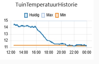
Yes. SQL query & output data. Picture of Dashboard 1 chart. Picture of Dashboard 2 chart displaying the sql statement.
This is the JSONata:
(
  $series := [
    { "field1": "d_waarde", "field2": "d_max", "field3": "d_min", "label": "TuinTemp" }
  ];
  $xaxis := "UNIX_TIMESTAMP(d_ts)";
  [
    {
      "series": ["Huidig","Max","Min"],
      "labels": [$series.label],
      "data": $series.[[
        (
          $yaxis := $.field1;
          $$.payload.{
            "x": $lookup($, $xaxis)*1000,
            "y": $number($lookup($, $yaxis))
          }
        )
      ],[
        (
          $yaxis := $.field2;
          $$.payload.{
            "x": $lookup($, $xaxis)*1000,
            "y": $number($lookup($, $yaxis))
          }
        )
      ],[
        (
          $yaxis := $.field3;
          $$.payload.{
            "x": $lookup($, $xaxis)*1000,
            "y": $number($lookup($, $yaxis))
          }
        )
      ]]
    }
  ]
)
SQL Query:
SELECT UNIX_TIMESTAMP(d_ts), d_waarde, d_max, d_min
FROM data
WHERE d_ts >= "{{payload}}:00:00:00"
    AND d_ts <= "{{payload}}:23:59:59"
ORDER  BY d_ts ASC;
Dash1:
Dash2:
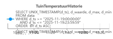
SELECT UNIX_TIMESTAMP(d_ts), d_waarde, d_max, d_min FROM data WHERE d_ts >= "2022-11-02:00:0... : msg.payload : array[1]
array[1]
0: object
series: array[3]
0: "Huidig"
1: "Max"
2: "Min"
labels: array[1]
0: "TuinTemp"
data: array[3]
0: array[915]
1: array[915]
2: array[915]
For dashboard 2 you do not need to process the SQL output to give (x,y) couplets. You should be able to wire directly from the SQL node to the chart.
I would use aliases in the query. I may have misunderstood Huidig/d_waarde since I don't recognise the language.
SELECT UNIX_TIMESTAMP(d_ts) AS ts, d_waarde AS Huidig, d_max AS Max, d_min AS Min ,,,,
Then try configuring the chart like this.

If it doesn't work, post some actual SQL output for us to experiment with.
The strange thing is, was, that although I cnaged the sql statement the statement in the graph stayed the same. So I deleted the node and created a new one and now it works.
Thanks
Dashboard 2 seems to cling to previously displayed data.
If you change a widget config, always reload the dashboard and if that doesn't show the new version, force a reload (ctrl f5 or shift ctrl r or something like that) or clear the browser cache.

Show us what is going into the chart.
Or is the sql node directly wired to the chart?
it is yes at the moment
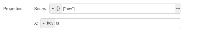
I can't explain why it's different but if you change Series from type Json to string, then you get to specify the source of both X and Y.
In your case X should be key ts, Y should be key mw.
I have no idea what the string value of Series is used for here.
In my example it does not seem to make any difference what value I give it, but neither can I get the legend to show up.


A unix_timestamp is seconds since god created the universe (January 1970).
A javascript timestamp is milliseconds since the creation, and the chart assumes you are giving it a js timestamp.
If UNIX_TIMESTAMP() is not really what you intend to select, you have to research how to select a js timestamp, or just multiply it by 1000
SELECT UNIX_TIMESTAMP(mw_timestamp) * 1000 AS ts (untested)
What happens if you just select mw_timestamp?
The *1000 works...
Ah. But is it the right solution?
The multiple line graph works now OK but the single line doesn't yet.
And the date picker from the TextInput returns a string...
2025-11-28T23:00:05.000Z
I now have the single line working ok with series to none x to key ts and y to key mw.
The only problem is that now the datapoints are given in succession all the colors of the series and not one color.
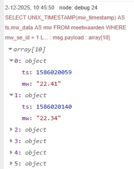
Can use the Copy Value button that pops up in the debug pane to copy a set of values and paste them here. Also select the Chart node and Export that and paste it here too. Then we can put the values into an Inject node and use that to simulate your data. See the canned text below on how to get the Copy Value feature.
There’s a great page in the docs (Working with messages : Node-RED) that will explain how to use the debug panel to find the right path/value for any data item.
Pay particular attention to the part about the buttons that appear under your mouse pointer when you over hover a debug message property in the sidebar.
