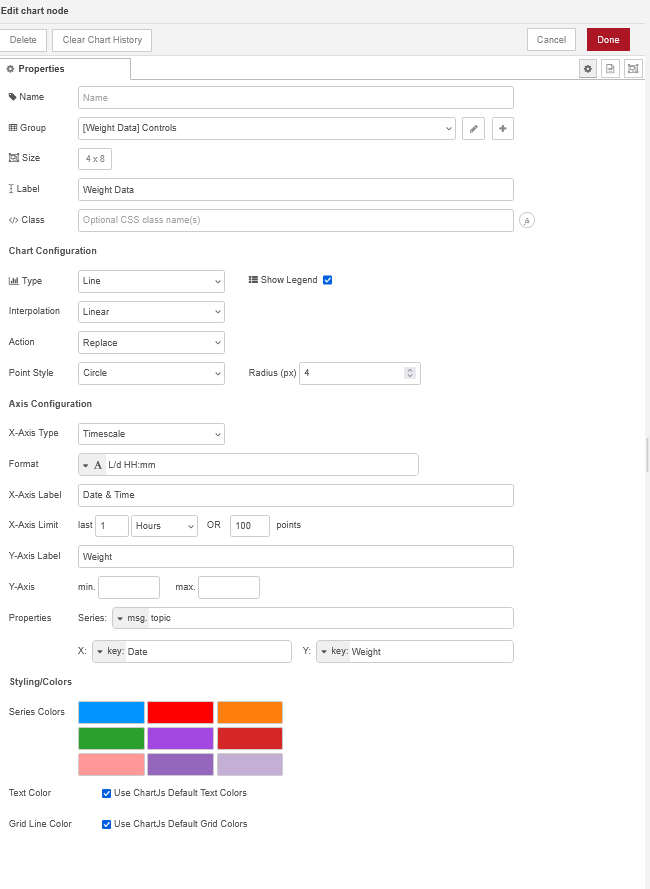
I'm just curious if there's a way to have the X-axis of my chart display the date and time each data point was recorded, while keeping the spacing between points even—so there aren’t large gaps when data is collected irregularly (e.g., every hour or every few days). I've included the function block that feeds the chart, the chart itself, and the chart setup. Any information or help on this would be appreciated!
flow.set('selectedPart', msg.payload)

const selectedPart = flow.get('selectedPart') || '';
const productionQuery = flow.get('productionQuery') || [];

let result = [];

if (selectedPart === "") {
    result = productionQuery;
} else {
    productionQuery.forEach(item => {
        if (item.PartNumber === selectedPart) {
            result.push({
                Weight: item.Weight,
                Date: item.Date_and_Time
                });
        }
    });
}

msg.topic = selectedPart
msg.payload = result;
msg.selectedValue = selectedPart
return msg;