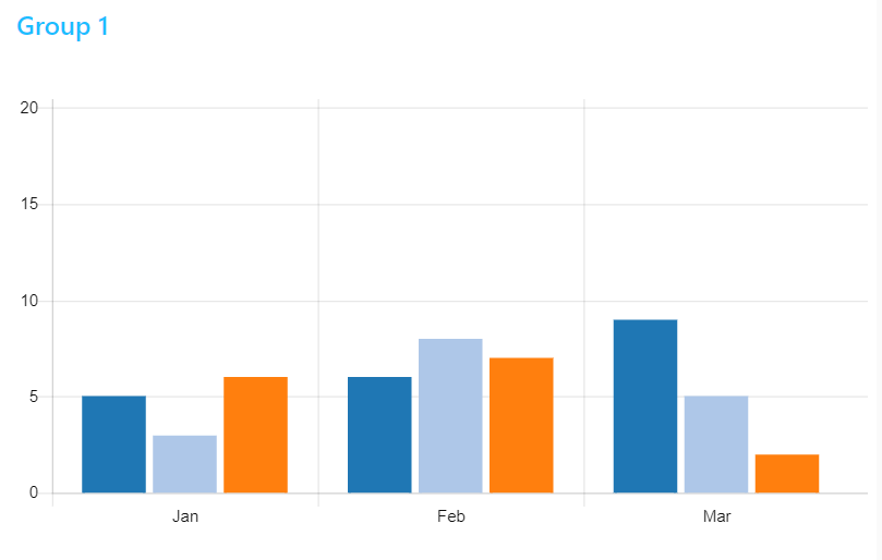
Hi @baqwas, I found this use case interesting as I never needed to build a bar chart from live data (it is quite common to build line charts with live data). So, after revisiting the documentation my understanding is that you indeed need to format the labels before you feed the data. By doing that you will get the x-axis perfectly ordered (from 00 hours to 23 hours). I put a flow that show the difference between two bar charts. When you inject the values in a random way you will see the difference during the chart drawing.
[{"id":"754c42dd.02afac","type":"tab","label":"Bar chart - Live data","disabled":false,"info":""},{"id":"c2fe955a.59f8a8","type":"inject","z":"754c42dd.02afac","name":"","topic":"00","payload":"5","payloadType":"num","repeat":"","crontab":"","once":false,"onceDelay":0.1,"x":190,"y":140,"wires":[["56c8ff44.a0d05"]]},{"id":"b1d037a.54011c8","type":"inject","z":"754c42dd.02afac","name":"","topic":"01","payload":"10","payloadType":"num","repeat":"","crontab":"","once":false,"onceDelay":0.1,"x":190,"y":180,"wires":[["56c8ff44.a0d05"]]},{"id":"c28ed217.17b2b","type":"inject","z":"754c42dd.02afac","name":"","topic":"02","payload":"20","payloadType":"num","repeat":"","crontab":"","once":false,"onceDelay":0.1,"x":190,"y":220,"wires":[["56c8ff44.a0d05"]]},{"id":"143125bc.30ef2a","type":"inject","z":"754c42dd.02afac","name":"","topic":"03","payload":"30","payloadType":"num","repeat":"","crontab":"","once":false,"onceDelay":0.1,"x":190,"y":260,"wires":[["56c8ff44.a0d05"]]},{"id":"6880757d.17529c","type":"inject","z":"754c42dd.02afac","name":"","topic":"04","payload":"40","payloadType":"num","repeat":"","crontab":"","once":false,"onceDelay":0.1,"x":190,"y":300,"wires":[["56c8ff44.a0d05"]]},{"id":"f5838e8.c35487","type":"ui_chart","z":"754c42dd.02afac","name":"","group":"d4cc65a.8bf5b98","order":6,"width":0,"height":0,"label":"1 - Bar Chart - Live Data","chartType":"bar","legend":"false","xformat":"HH:mm:ss","interpolate":"linear","nodata":"","dot":false,"ymin":"0","ymax":"60","removeOlder":1,"removeOlderPoints":"","removeOlderUnit":"3600","cutout":0,"useOneColor":false,"colors":["#ff8040","#0000ff","#ff7f0e","#2ca02c","#98df8a","#d62728","#ff9896","#9467bd","#c5b0d5"],"useOldStyle":false,"outputs":1,"x":810,"y":240,"wires":[["53d9b4d5.c704ac"]]},{"id":"589393f1.7dae0c","type":"link in","z":"754c42dd.02afac","name":"","links":["56c8ff44.a0d05"],"x":395,"y":240,"wires":[["d92c9117.2e7e6"]]},{"id":"56c8ff44.a0d05","type":"link out","z":"754c42dd.02afac","name":"","links":["589393f1.7dae0c"],"x":335,"y":240,"wires":[]},{"id":"6527bad7.947af4","type":"inject","z":"754c42dd.02afac","name":"","topic":"01","payload":"60","payloadType":"num","repeat":"","crontab":"","once":false,"onceDelay":0.1,"x":190,"y":340,"wires":[["56c8ff44.a0d05"]]},{"id":"2690282b.d85878","type":"inject","z":"754c42dd.02afac","name":"","topic":"","payload":"[]","payloadType":"json","repeat":"","crontab":"","once":true,"onceDelay":0.1,"x":530,"y":160,"wires":[["f5838e8.c35487"]]},{"id":"697d8c5f.d17054","type":"comment","z":"754c42dd.02afac","name":"Without formatting the x-axis","info":"","x":240,"y":80,"wires":[]},{"id":"421764e1.8f80dc","type":"inject","z":"754c42dd.02afac","name":"","topic":"00","payload":"5","payloadType":"num","repeat":"","crontab":"","once":false,"onceDelay":0.1,"x":190,"y":540,"wires":[["5b6a900a.fc63"]]},{"id":"c0bcafde.4bea","type":"inject","z":"754c42dd.02afac","name":"","topic":"01","payload":"10","payloadType":"num","repeat":"","crontab":"","once":false,"onceDelay":0.1,"x":190,"y":580,"wires":[["5b6a900a.fc63"]]},{"id":"88985614.df2038","type":"inject","z":"754c42dd.02afac","name":"","topic":"02","payload":"20","payloadType":"num","repeat":"","crontab":"","once":false,"onceDelay":0.1,"x":190,"y":620,"wires":[["5b6a900a.fc63"]]},{"id":"1a8a66a6.42ec49","type":"inject","z":"754c42dd.02afac","name":"","topic":"03","payload":"30","payloadType":"num","repeat":"","crontab":"","once":false,"onceDelay":0.1,"x":190,"y":660,"wires":[["5b6a900a.fc63"]]},{"id":"7b93fdd3.8774d4","type":"inject","z":"754c42dd.02afac","name":"","topic":"04","payload":"40","payloadType":"num","repeat":"","crontab":"","once":false,"onceDelay":0.1,"x":190,"y":700,"wires":[["5b6a900a.fc63"]]},{"id":"5a9cd277.b0564c","type":"ui_chart","z":"754c42dd.02afac","name":"","group":"d4cc65a.8bf5b98","order":6,"width":0,"height":0,"label":"2- Bar Chart - Live Data","chartType":"bar","legend":"false","xformat":"HH:mm:ss","interpolate":"linear","nodata":"","dot":false,"ymin":"0","ymax":"60","removeOlder":1,"removeOlderPoints":"","removeOlderUnit":"3600","cutout":0,"useOneColor":false,"colors":["#ff8040","#0000ff","#ff7f0e","#2ca02c","#98df8a","#d62728","#ff9896","#9467bd","#c5b0d5"],"useOldStyle":false,"outputs":1,"x":810,"y":640,"wires":[["d029554c.98f4a8"]]},{"id":"9bedcc0a.1f9a6","type":"link in","z":"754c42dd.02afac","name":"","links":["5b6a900a.fc63"],"x":395,"y":640,"wires":[["3b2dbbff.7e7df4"]]},{"id":"5b6a900a.fc63","type":"link out","z":"754c42dd.02afac","name":"","links":["9bedcc0a.1f9a6"],"x":335,"y":640,"wires":[]},{"id":"57565930.4b7498","type":"inject","z":"754c42dd.02afac","name":"","topic":"01","payload":"60","payloadType":"num","repeat":"","crontab":"","once":false,"onceDelay":0.1,"x":190,"y":740,"wires":[["5b6a900a.fc63"]]},{"id":"f73b6177.38e8e","type":"comment","z":"754c42dd.02afac","name":"Pre formatting the x-axis","info":"","x":230,"y":440,"wires":[]},{"id":"42bc501e.6f2b6","type":"inject","z":"754c42dd.02afac","name":"","topic":"","payload":"go","payloadType":"str","repeat":"","crontab":"","once":true,"onceDelay":"0.3","x":430,"y":540,"wires":[["12be8fc4.499a6"]]},{"id":"53d9b4d5.c704ac","type":"debug","z":"754c42dd.02afac","name":"","active":true,"tosidebar":true,"console":false,"tostatus":false,"complete":"true","targetType":"full","x":1010,"y":240,"wires":[]},{"id":"12be8fc4.499a6","type":"function","z":"754c42dd.02afac","name":"Format Data","func":"\nlet array0 = Array(24).fill(0);\nlet arrayhours = [ \"00\", \"01\", \"02\", \"03\", \"04\", \"05\", \"06\",\"07\", \"08\", \"09\", \"10\", \"11\", \"12\", \"13\",\"14\", \"15\", \"16\", \"17\", \"18\", \"19\", \"20\", \"21\", \"22\", \"23\"]\n\nmsg.payload = \n[{\n \"series\": [ \"rainfall\" ],\n \"data\": [ array0 ],\n \"labels\": arrayhours\n}];\nreturn msg;","outputs":1,"noerr":0,"x":570,"y":540,"wires":[["5a9cd277.b0564c"]]},{"id":"d029554c.98f4a8","type":"debug","z":"754c42dd.02afac","name":"","active":true,"tosidebar":true,"console":false,"tostatus":false,"complete":"true","targetType":"full","x":1010,"y":640,"wires":[]},{"id":"d92c9117.2e7e6","type":"change","z":"754c42dd.02afac","name":"","rules":[{"t":"set","p":"ui_control","pt":"msg","to":"{\"options\":{\"scales\":{\"xAxes\":[{\"barThickness\":15}],\"yAxes\":[{\"ticks\":{\"suggestedMin\":0}}]}}}","tot":"json"}],"action":"","property":"","from":"","to":"","reg":false,"x":550,"y":240,"wires":[["f5838e8.c35487"]]},{"id":"3b2dbbff.7e7df4","type":"change","z":"754c42dd.02afac","name":"","rules":[{"t":"set","p":"ui_control","pt":"msg","to":"{\"options\":{\"scales\":{\"xAxes\":[{\"barThickness\":15}],\"yAxes\":[{\"ticks\":{\"suggestedMin\":0}}]}}}","tot":"json"}],"action":"","property":"","from":"","to":"","reg":false,"x":550,"y":640,"wires":[["5a9cd277.b0564c"]]},{"id":"d4cc65a.8bf5b98","type":"ui_group","z":"","name":"Group 1","tab":"90c6a3a3.ea2ca","disp":true,"width":"12","collapse":false},{"id":"90c6a3a3.ea2ca","type":"ui_tab","z":"","name":"Tab1","icon":"dashboard","order":3}]