Second series in bar chart and Data Labels on each bar on graph, Converting this to Horozontal Bar Chart

I have a working bar chart with below function code feeding the chart.

i have one more series of data to be added in the same chart, msg.payload.Count.
i have tried several ways, but no success. if i make "data" as an array with two series data, nothing is shown on the graph.

what changes in the below function should i do to get it right ?
i also want the data labels on the bars,

i have added a small sample data in below flow.

let mname = flow.get("dt_code1")
let dataC = [[]];
let dataLabels = [];

for (let X in msg.payload) {
    dataLabels[X] = msg.payload[X].machine;
    dataC[0][X] = msg.payload[X].Duration;
}

var m = {
    "series": [{mname}],
    "data": dataC,
    "labels": dataLabels
};

return { payload: [m] };


flow with sample data.

[{"id":"714dacca9f798ed7","type":"inject","z":"a0eee751005e0e89","name":"","props":[{"p":"payload"},{"p":"topic","vt":"str"}],"repeat":"","crontab":"","once":false,"onceDelay":0.1,"topic":"","payload":"[{\"Date\":\"14-June-C Shift\",\"Duration\":123,\"Count\":2},{\"Date\":\"15-June-C Shift\",\"Duration\":96,\"Count\":4},{\"Date\":\"16-June-A Shift\",\"Duration\":227,\"Count\":4},{\"Date\":\"17-June-B Shift\",\"Duration\":47,\"Count\":1},{\"Date\":\"18-June-A Shift\",\"Duration\":67,\"Count\":2}]","payloadType":"json","x":1840,"y":2400,"wires":[["5e3c61d37f0ebfe9"]]},{"id":"5e3c61d37f0ebfe9","type":"function","z":"a0eee751005e0e89","name":"Prepare Bar Graph Data","func":"let mname = flow.get(\"dt_code1\")\nlet dataC = [[]];\nlet dataC1 = [[]];\nlet dataLabels = [];\n\nfor (let X in msg.payload) {\n    dataLabels[X] = msg.payload[X].Date;\n    dataC[0][X] = msg.payload[X].Duration;\n    dataC1[0][X] = msg.payload[X].Count;\n        }\n\nvar m = {\n    \"series\": [{mname}],\n    \"data\": dataC,\n    \"labels\": dataLabels\n};\n\nreturn { payload: [m] };","outputs":1,"noerr":0,"initialize":"","finalize":"","libs":[],"x":1995,"y":2400,"wires":[["69c92bb74e936b1a","e18781def7d9297d"]],"l":false},{"id":"69c92bb74e936b1a","type":"change","z":"a0eee751005e0e89","name":"Set Graph Title","rules":[{"t":"set","p":"mname","pt":"msg","to":"'Chart Title'","tot":"jsonata"}],"action":"","property":"","from":"","to":"","reg":false,"x":2085,"y":2400,"wires":[["38aef9b45e99c257"]],"l":false},{"id":"38aef9b45e99c257","type":"ui_chart","z":"a0eee751005e0e89","name":"Bar Chart","group":"aa8eec0d5014b069","order":1,"width":"20","height":"9","label":"{{mname}}","chartType":"horizontalBar","legend":"false","xformat":"HH:mm:ss","interpolate":"linear","nodata":"","dot":false,"ymin":"","ymax":"","removeOlder":1,"removeOlderPoints":"","removeOlderUnit":"3600","cutout":0,"useOneColor":false,"useUTC":false,"colors":["#1f77b4","#aec7e8","#ff7f0e","#2ca02c","#98df8a","#d62728","#ff9896","#9467bd","#c5b0d5"],"outputs":1,"useDifferentColor":false,"className":"","x":2190,"y":2400,"wires":[[]]},{"id":"e18781def7d9297d","type":"debug","z":"a0eee751005e0e89","name":"debug 368","active":true,"tosidebar":true,"console":false,"tostatus":false,"complete":"false","statusVal":"","statusType":"auto","x":2120,"y":2310,"wires":[]},{"id":"aa8eec0d5014b069","type":"ui_group","name":"second","tab":"4f903fa3c7ed98d8","order":2,"disp":true,"width":"20","collapse":false,"className":""},{"id":"4f903fa3c7ed98d8","type":"ui_tab","name":"Dashboard2","icon":"dashboard","order":1,"disabled":false,"hidden":false}]

It is explained in the built in help

thanks for the response, i did check the help section, and as described above, tried but there is no graph displayed.

image

let mname = flow.get("dt_code1")
let dataC = [[]];
let dataC1 = [[]];
let dataLabels = [];

for (let X in msg.payload) {
    dataLabels[X] = msg.payload[X].Date;
    dataC[0][X] = msg.payload[X].Duration;
    dataC1[0][X] = msg.payload[X].Count;
        }

var m = {
    "series": [{mname},"Count"],
    "data": [[dataC],[dataC1]],
    "labels": dataLabels
};

return { payload: [m] };

i know i am making some msitake, but could not figure out what, the output looks similar to the help

image

let mname = flow.get("dt_code1")
let dataC = [];
let dataC1 = [];
let dataLabels = [];

for (let X in msg.payload) {
    dataLabels[X] = msg.payload[X].Date;
    dataC[X] = msg.payload[X].Duration;
    dataC1[X] = msg.payload[X].Count;
        }

var m = {
    "series": [{mname},'Count'],
    "data": [dataC,dataC1],
    "labels": dataLabels
};

return { payload: [m] };
1 Like

i had used
dataC[0][X]

that [0] was the culprit ?

thanks !

@hotNipi Sorry for tagging you.
I tried very hard to get what i wanted, by myself, and am giving up now after 2 days. i succesfully change the font size and font color of the graph using msg.ui_control in a function node,i wanted the same with data labels. (number/value on each bar) . i finally landed up in a page for a plugin for datalabels for chart.js. but thats how far i could go. i have no idea how to get this done in a function node.
do i need to start the graph from scratch in a template ndoe,like you had suggested in one of the post i was reviewing ?
i just want the datalabels on the bar like it is shown in the pic.

my function node where i change font size and color of y axis labels. is it possible to add some code to get the labels of chart ? i understand the values for these individual labels has to be embedded in the data block (where you given solution to make dataC[0][X] to dataC[X] )

[{"id":"9a878fa4c89cb834","type":"function","z":"23feefdbe1543fe3","name":"","func":"msg.ui_control = {\n    options: {\n        scales: {\n            yAxes: [{\n                ticks: {\n                    fontSize:15 ,\n                    fontColor: '#FFF',\n                    display: true,\n                }\n            }]\n        }\n    }\n}\nreturn msg;","outputs":1,"noerr":0,"initialize":"","finalize":"","libs":[],"x":810,"y":300,"wires":[["643caf443be445c1"]]}]

Yes. Modified that same example for you.

[{"id":"3afc2e42.168ee2","type":"function","z":"dacd402cc3c30c34","name":"make data","func":"let d = [];\nlet l = [];\nlet c = []\nconst getHue = (seed) => {\n    let h = Math.floor(seed * 361);\n    let s = 100;\n    let l = 50;\n    h /= 360;\n    s /= 100;\n    l /= 100;\n\n    let r, g, b;\n    if (s === 0) {\n        r = g = b = l;\n    } else {\n        const hue2rgb = (p, q, t) => {\n            if (t < 0) t += 1;\n            if (t > 1) t -= 1;\n            if (t < 1 / 6) return p + (q - p) * 6 * t;\n            if (t < 1 / 2) return q;\n            if (t < 2 / 3) return p + (q - p) * (2 / 3 - t) * 6;\n            return p;\n        };\n        const q = l < 0.5 ? l * (1 + s) : l + s - l * s;\n        const p = 2 * l - q;\n        r = hue2rgb(p, q, h + 1 / 3);\n        g = hue2rgb(p, q, h);\n        b = hue2rgb(p, q, h - 1 / 3);\n    }\n    const toHex = x => {\n        const hex = Math.round(x * 255).toString(16);\n        return hex.length === 1 ? '0' + hex : hex;\n    };\n   \n    return { value: seed, color: '#' + toHex(r) + toHex(g) + toHex(b),label: toHex(r) + toHex(g) + toHex(b)};\n};\n\nfor(var i = 0;i<16;++i){\n    const col = getHue(Math.random())\n    d.push(col.value)\n    c.push(col.color)\n    l.push(col.label)\n}\nmsg.payload = {data:d,colors:c,labels:l};\nreturn msg;","outputs":1,"noerr":0,"initialize":"","finalize":"","libs":[],"x":490,"y":1000,"wires":[["639096c5.76e7a8","64e85953cd987006"]]},{"id":"639096c5.76e7a8","type":"ui_template","z":"dacd402cc3c30c34","group":"109b0b40.54c0b5","name":"BAR Chart","order":4,"width":"14","height":"8","format":"<canvas id=\"my_barchart\" width=600 height=250></canvas>\n<script>\n\n\n(function(scope) { \n    \n    \n    function createChart(){       \n        const ctx = document.getElementById(\"my_barchart\").getContext('2d');\n        const chart = new Chart(ctx, {\n            type: 'bar',\n            data: {\n                labels: [],\n                datasets: [{\n                    label: '',\n                    backgroundColor:[] ,\n                    data: [],\n                    borderWidth: 1\n                }]\n            },\n            options: {\n                hover: {\n                    animationDuration: 0\n                },\n                animation: {\n                    duration: 1,\n                    onComplete: function () {\n                        var chartInstance = this.chart, ctx = chartInstance.ctx;                        \n                        ctx.textAlign = 'center';\n                        ctx.textBaseline = 'bottom';                        \n                        this.data.datasets.forEach(function (dataset, i) {\n                            var meta = chartInstance.controller.getDatasetMeta(i);\n                            meta.data.forEach(function (bar, index) {\n                                var data = dataset.data[index];\n                                var pos = bar._model.y - 5\n                                if(data > .9){\n                                    pos = bar._model.y + 20\n                                }\n                                ctx.fillText(data.toFixed(2), bar._model.x, pos);\n                            });\n                        });\n                    }\n                },\n                scales: {\n                    xAxes: [{\n                        gridLines: {\n                            tickMarkLength:5,\n                            color: 'rgba(255,255,255,0.1)'\n                        },\n                        ticks:{\n                            fontColor:'rgba(255,255,255,0.5)',\n                            padding:20\n                        }\n                    }],\n                    yAxes: [{\n                        gridLines: {\n                            tickMarkLength:5,\n                            color: 'rgba(255,255,255,0.1)'\n                        },\n                        ticks:{\n                            fontColor:'rgba(255,255,255,0.5)',\n                            padding:20\n                        }\n                    }]\n                },\n                tooltips: {\n                    enabled: false\n                    /* callbacks: {\n                        label: function(tooltipItem, data) {\n                            let label = tooltipItem.xLabel || '';                        \n                            if (label) {\n                                label += ': ';\n                            }\n                            label += Math.round(tooltipItem.yLabel * 1000) / 1000;\n                            return label;\n                        },\n                        title:function(tooltipItem, data){\n                            return 'Color value'\n                        }\n                    } */\n                },\n                onClick: function (e) {\n                    const el = this.getElementAtEvent(e)[0];\n                    if (el) {\n                        const label = chart.data.labels[el._index];\n                        const value = chart.data.datasets[el._datasetIndex].data[el._index];\n                        scope.send({payload:value,topic:label,frontend:true})\n                    }\n                }\n            }\n            }\n        );\n        return chart\n    }\n\n\n    \n    function updateChart(chart,input) { \n        chart.data.labels = input.labels\n        chart.data.datasets[0].data = []\n        chart.data.datasets[0].backgroundColor = []\n        input.data.forEach((el,idx) => {\n            chart.data.datasets[0].data.push(el)\n            chart.data.datasets[0].backgroundColor.push(input.colors[idx])\n        })        \n        chart.update(200);\n    }\n    \n    const barchart = createChart()\n\n    scope.$watch('msg', function(msg) {\n        if (msg) {\n            if(msg.frontend){\n                return\n            }\n            if(!barchart){\n                console.log('no chart')\n                return\n            }\n            updateChart(barchart,msg.payload)\n        }\n    });\n\n\n})(scope);\n\n</script>","storeOutMessages":true,"fwdInMessages":false,"resendOnRefresh":true,"templateScope":"local","className":"","x":690,"y":1040,"wires":[["b045a83a99d21516","776f16809c6b0c2b"]]},{"id":"1cddf5d5.9564da","type":"inject","z":"dacd402cc3c30c34","name":"Test","props":[{"p":"payload"}],"repeat":"","crontab":"","once":true,"onceDelay":"1","topic":"","payload":"","payloadType":"date","x":270,"y":1040,"wires":[["639096c5.76e7a8","3afc2e42.168ee2"]]},{"id":"cfe72466.cb83d8","type":"ui_button","z":"dacd402cc3c30c34","name":"","group":"109b0b40.54c0b5","order":2,"width":"3","height":"1","passthru":false,"label":"random data","tooltip":"","color":"","bgcolor":"","className":"","icon":"fa-refresh","payload":"true","payloadType":"bool","topic":"","topicType":"str","x":290,"y":1000,"wires":[["3afc2e42.168ee2"]]},{"id":"ab4d4b5e.528e18","type":"ui_template","z":"dacd402cc3c30c34","group":"109b0b40.54c0b5","name":"Title","order":3,"width":"14","height":"1","format":"<style>\n    #charttitle{\n        text-align:center;\n    }\n</style>\n<div id='charttitle'>COMPARE COLORS</div>\n\n","storeOutMessages":false,"fwdInMessages":true,"resendOnRefresh":false,"templateScope":"local","className":"","x":670,"y":1000,"wires":[[]]},{"id":"b045a83a99d21516","type":"debug","z":"dacd402cc3c30c34","name":"chart click","active":true,"tosidebar":true,"console":false,"tostatus":false,"complete":"payload","targetType":"msg","statusVal":"","statusType":"auto","x":880,"y":1040,"wires":[]},{"id":"776f16809c6b0c2b","type":"ui_text","z":"dacd402cc3c30c34","group":"109b0b40.54c0b5","order":12,"width":0,"height":0,"name":"","label":"chart click","format":"{{msg.topic}}: {{msg.payload}}","layout":"row-left","className":"","x":680,"y":1100,"wires":[]},{"id":"64e85953cd987006","type":"debug","z":"dacd402cc3c30c34","name":"chart data","active":true,"tosidebar":true,"console":false,"tostatus":false,"complete":"true","targetType":"full","statusVal":"","statusType":"auto","x":680,"y":960,"wires":[]},{"id":"109b0b40.54c0b5","type":"ui_group","name":"body","tab":"24b8f2c0.76ab8e","order":2,"disp":false,"width":"14","collapse":false},{"id":"24b8f2c0.76ab8e","type":"ui_tab","name":"Home","icon":"dashboard","disabled":false,"hidden":false}]
1 Like

WOW. You got me a bonus of 'on click' also. :pray::pray::pray::pray::pray:

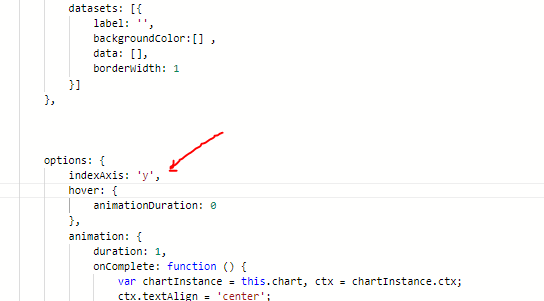
Sorry, for keeping this thing going, i want actually this graph to be horizontal. and i looked up the chart js documentation, it says to add oneline indexAxis:'y' in options. i did the same, but there is no expected result. what am i doing wrong ?

horizontal chart1

added one line indexAxis:'y' as per the docs, but the chart is not changing to horizontal, it continues to show vertical bars. i must be putting the line in the wrong place, and may be some commas and squiggly brackets are wrong. i tried several places in the code, but the code breaks and does not show any graph if i put it in wrong place or with wrong brackets and commas, the following version, continues to show the graph but all bars are vertical still.

image

What docs?

If you mean chartjs docs then were you reading the docs for v2 (that's what dashboard charts use) or are you importing and using a later version of charts.

1 Like

Sorry, had no idea about the versions of chart.js being used in dashboard.
I was just using the flow sample @hotNipi gave me as a solution for the data labels, which was my original requirement, datalabels parts is perfectly working for me,. but i wanted a horizontal bar chart. and before asking for help, i tried to do it on my own, and referred to the chart.js documentation.
Here
obviously i failed.

I will now try and explore the net and see if there is any way i can continue to use the sample i have with bar orientation changed.

if the forums way of working is to create a new thread for a new issue in the same thread, i am happy to close this and start a new one. i am changing the solution to the actual thread.

EDIT: FOUND THE SOLUTION

thanks

image

was so simple !.

1 Like

This topic was automatically closed 14 days after the last reply. New replies are no longer allowed.