With that in mind, is there any way to automatically determine the ui-card-size?
I think that what hotNipi means is that the overall balance is determined by the --container-size, hence as you noted it must be the same as the ui-card-size, but other sizes must be determined individually i.e if you want to change the font size of any the text (or tick size) it has to be done in the relevant class. As you noted, by altering the percentage (or adding a fixed value).
The only handy addition would be being able to have the --container-size adjusted automatically to align with the ui-card-size
On my system if I go below a ui-card-size less than 2 (apart from being too small to read without some significant magnification) the numbers overwrite the ticks, the cause of which I think is the fixed font sizes in g-label::after
I think 2x2 will be too small for such kind of design anyway. Readability goes down below zero.
Card size can be read (as any element property), but then it takes to wait scope initialization and make fist initialization and draw after that. Makes code unreasonably complicated but giving not too much ...
But the card size is known property for regular ui widgets so that is not obstacle.
wow this is awesome @hotNipi cudos!
thought must have carbon, cant claim any credit for the carbon look, it was from this stack overflow post by Harry https://stackoverflow.com/questions/34556024/how-to-do-a-true-carbon-fiber-css-background
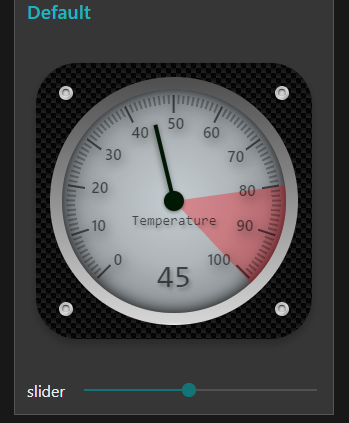
This will make some pretty cool Guis.
    background color:rgb(32,32,32);
    background-image:linear-gradient(45deg, rgba(0,0,0,1) 25%, transparent 25%, transparent 75%,black 75%, black),linear-gradient(45deg, black 25%, transparent 25%, transparent 75%, black 75%, black), linear-gradient(to bottom, rgb(8, 8, 8), rgb(32, 32, 32));
    background-size: 10px 10px, 10px 10px, 10px 5px;
    background-position: 0px 0px, 5px 5px, 0px 0px;
keep up the good work.
Thanks all
The "Realism" in design brings up couple of questions.
In real world such gauges are fabricated to measure some kind of environmental property. So they carry only the information which is common of that kind of measurement. (and manufacturer logo or something like that)
With the dashboard design, things are a bit different. To show some measurement - the source of that measurement should be tied to the value or should be at least easily identified.
Widgets for dashboard often provide such fields and it helps in many steps. Design is art-proven, may help with space conservation and so on.
So here's the question - ...
(I left the question open deliberately to not cut out any option to think as far out of box as you like)
Nice... Goes well with my dark-theme
To anyone else... I wanted to experiment a little further, but with the more minimal gauge ring... but having difficulty understanding the "official" names for things.
A = ui-card-panel
B = ?
C = ?

OK B seems to be md-content md-card
I wish there was a clear manual with these designatipns... or if there is one, the location would be nice. I really don't like the lack of search option in the documents. Yes I can use Google's site: but not a quick.
Not going to bother looking for C right now, as there is such a thing as too much carbon fiber  Meanwhile, I am liking this...


I think a node-contrib with toggle settings for the more common/popular presets would be nice, but somehow the whole idea of your initial creation is much better for us "tweek freeks" who must make it "fit" their aesthetic needs.... For that, perhaps a node-contrib with toggles and a special "custom" section that accepts "HTTP/CSS" override code that is specifically aimed at only that node.
Each of the elements on [that bit of] your dashboard resides within an md-card with a class depending on it's type.
So you have 5 md-cards
div .nr-dashboard-cardpanel
   div id<Group name from the editor>
      md-card class nr-dashboard-template (Gauge)
      md-card class nr-dashboard-button (x2)
      md-card class nr-dashboard-slider
      md-card class nr-dashboard-switch
   /div
/div
There is a proposal to add a custom class field to the editor for dashboard items, which would make it easier to customise, allowing for example nr-dashboard-button round-button or nr-dashboard-button square-button. I'm not sure if it has been considered yet.
It would be good to have a wiki document with examples of tweeking dashboard appearance through CSS. I'm never clear if my changes are well implemented or not, and what side effects they might casue - on other tabs for instance.
There are quite a few examples in the forum.
Coming in Dashboard V3 - Dave has merged it 
available to try as node-red/node-red-dashboard@next
Is there any change list to explore? I know the angular goes up to 1.8 but any other "good to know " things?
Feedback of course most welcome.
I have had a play with dashboard v3, adjusting colours, fonts and backgrounds of individual gauges.
Of course there's no real advantage in using a custom class rather than node id with just one instance of each.
I think I can trust you not to use the middle one in real life?
Hopefully it provides a useful introduction to restyling the widget.
These are 3 copies of hotNipi's 6x6 gauge unaltered except for giving the 2nd and 3rd widget a custom class "gauge2" or "gauge3", then the CSS overrides for those classes.

dashboard3gauges.json (42.1 KB)
You are, of course, correct. As I'm certain you know - the beauty is when you want consistent styling across multiple widgets. Or the ability to (on the fly via a msg) change the class - then this becomes very useful.

Home tanned and stitched by hand of course 
Ouch, the time ...

Bed time..
I really like the clock, nice work.
Really ? are you sure about that?