I've found the header in Node-RED to look quite dated for some time, and whilst I don't want to propose a significant overhaul, I did want to at least offer some small improvements that, whilst subtle, I think make an improvement to how "modern" it makes the Node-RED header feel.
I have a WIP branch here: GitHub - joepavitt/node-red at header-styling
Naturally checking with community for feedback before opening PR.
Before:
After:
Summary of Changes:
- Modernise the layout with
display: flex rather than fixed margins/padding
- Change the height from
40px to 48px (and parametrise this in the SCSS variables
- Ad a 2px solid border below the header to prevent the sharp contrast between the navigation (black) and the editor background (white)
5px > 8px spacing between the icon and "Node-RED" heading#C7C7C7 > white font color for the main title.
Other Thoughts
- Header B/G: I toyed with the idea of steering away from
#000 black too as it's quite harsh on the eye, but going into the grey palette also dates it again. May revisit
- Icon: I would also like to update the Node-RED icon to look more modern too, probably a single white color, rather than the grey border which dates it imo. Didn't want to go that far without further consultation.
Please do throw in a PR (against the dev branch) and we can have a play to see how it feels.
Can discuss the finer points in the PR - although I don't think anything is jumping out at me here.
There are a lot of places I know we'd benefit from moving to flex - it's just a bit of a mountain to climb to rework it all. So doing things bit by bit makes sense - just as long as existing 3rd-party themes aren't unnecessarily broken along the way if it can be avoided.
Can we please have key sizes and colours as CSS variables (in keeping with much of the other settings now) since that is easy for people to overrule should they need/want to without needing to understand or delve into SCSS.
Also, if considering reducing contrast, please to make sure that it remains accessible.
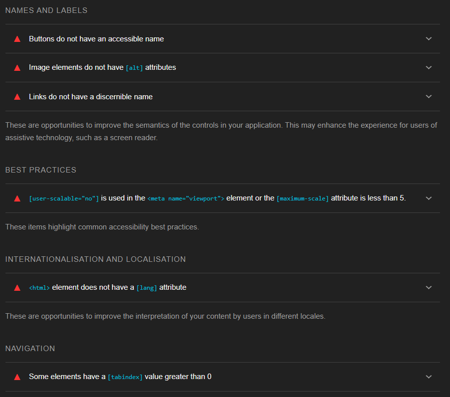
Indeed, it would be worth running a Lighthouse accessibility check on the Editor. I just ran it and it highlighted a couple of things that could be tweaked, thankfully nothing too big:
If you checkout the PR, you'll see I've done precisely that re: variables
I just tried this out with the 4.0.0.beta.2 version and I have two comments:
- The red border I find too harsh, I would suggest using 1px instead of 2px
- The white of the "Node-RED" is also a bit harsh with the black background, it also jumps into my eyes. Perhaps a little less white?
- The glare affect of the red border is also enhanced when the sidebar is greyed out (e.g. when opening the settings):

The border effect is different than the screenshot above since that screenshot is expanded and hence the red border is thicker, so hard to get a feeling from that.
Just my 2cents 
Edit: added 3rd point
Edit2: of course this is very depended on my screen and it's configuration, so I might well be well off the mark...
Just to say I'm not bothered by the additional red line at all - hadn't even noticed it - my eyes are on my flows not the room decoration
It is decoration only, and could be reduced to a slightly diluted red vs. what it is now.
That would be great - for me. If the red is some corporate red (i.e. branding), then a reduction from 2px to 1px would also do it. But as I said, it's also very depended on monitor settings etc.
I tried the same red as the deploy button (#8c101c) it became very subtle:
with setting menu open: