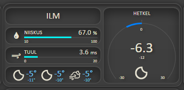
Nice thing done ![]() .
.
Got some inspiration from it and adjusted the weather card on my dashboard to have a little more info.

I've always thought on wind indicator, which acts like a wind vane, north was considered the top of a circle (as 0/360 degrees). So a north wind (wind coming from the north and going to the south) would be shown by the arrow pointing up - to the north.
A northward wind sould be coming from the south and going to the north so in that case the arrow would point down.
A northerly wind comes from the North so the arrow should point N for a Northerly wind from the North.
That dilemma exists since I don't know how long and probably stays forever.
That's why I suggested to @Paul-Reed to add also the aliases in form of wi-from-ne and wi-towards-ne
And everybody can be happy 
...and which has been added to v1.6.0 - see Add further aliases to rotations · Paul-Reed/weather-icons-lite@5de9f5f · GitHub
I have not yet updated it to npm though. I need to finish the readme and see if there is any other feedback, and then maybe add it in the queue for a future dashboard update.
I'll go with what the experts say....
See UK Met Office

UK BBC Weather

Google

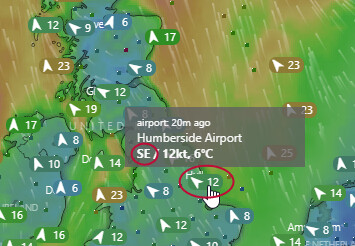
It depends whether you are showing which direction a wind is blowing, using an arrow, or trying to represent a wind vane, which points into the wind.
Well yes... I'm just saying that I have yet to see an online weather site use the "wind vane standard" ...
This is from the US National Weather service
I guess the answer is 'it depends'. There are many terms and devices describing wind direction so I’d say pick the one that fits your needs.
Typical have to be different US - Just like date format MM/DD/YYYY to confuse the rest of the world 


To me, those icons on that image look like a wind vane (and so the arrow points towards source of wind)
So definitely as @zenofmud - it depends.
In my head...
- If the icon looks like a wind vane (like an arrow with a tail), its pointing to the source of the wind.
- If its a simple arrow (like a windsock), I tend to think of it as pointing in the direction of wind travel.
More examples ...
Met Office

It is the same for meteorological charts the world over, eg
dont get me wrong Colin, agreed, if the symbols being discussed here were standard - but in this case ...
... they are more like met office and other examples.
My mind says it is the direction of wind flow (i.e. looks more like a windsock than a wind vane)
Not much to discuss about the wind if there is no weather to go surfing.
Let us not forget that provided solution is not directly connected to wind direction. It is rotation logic for any fa- wi- icon which may freely be pointer type of icon but the logic doesn't care. It just adds some degrees of rotation to the icon. Even if part of it is represented with cardinals, still widely usable as the directional indicator.
i would argue even the US one is still consistent.

The head of the arrow is bottom right - and the fletches/tail feathers are to the top left.
The dot is the x,y spot on the ground where the measurement is and the line heads towards it.
Consistently inconsistent is probably more accurate ![]()

The arrow still show where the wind is coming from....
Ahhh I thougt block was the center and the shaft point to the direction of the wind.
@Paul-Reed If you look at the compass it says 'Wind data - 8 MPH 270° from W' So the arrow represents a wind sock not a wind vane.
And with that, I'm now clear on this and am out of this thread ![]()
@thomasvjohansen made a request to add, (do they call them half-winds?) to weather-icons-lite, and has kindly prepared a PR which will be merged into v1.6.0.
This means that there will be 16 rotational values, for example N, NNE, NE, ENE, E, etc.
I have also prepared two wind direction indicators icons, which could be added to the icon files;

Please let me know if these icons would be of use, and if not, I'm open to ideas 
As long the lite therm stays valid 
These additions add about 1.4k to the CSS (uncompressed state), and the icon file increase from 13,948B to 14,056B as the vector graphics are very lightweight.
It's still considerably smaller than the full weather-icons set, but yes, agree, I need to keep it lite.


