Hi folks,
Some users have been asking us if we could add a button-like-behaviour to our node-red-contrib-multistate-switch. But of course - like @dceejay already mentioned - a switch is not a button...
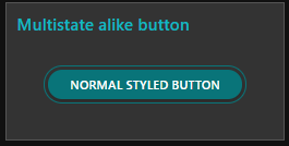
But to make sure your buttons have the same style as the multistate switches, you can easily style your normal buttons to look similar to the multistate switches:

You can read this tutorial to see how easy it is.
All credits go to @hotNipi for this one. I was wearing only the hat of technical writer 
Have fun with it !
HotNipi and Bart
I tried with FF and Chrome but it seems to spill out of its container ?

@hotNipi could you take a look at this please ?
Share that part of flow with those buttons including the CSS.
Sorry it looks like its fighting with some of your other CSS tips.
I thought it would have targeted OK using custom class, but will have a look to see what else I need to overide from "Master style override"
Hi @Sean-McG,
I will need to redirect you unfortunately to my CSS partner @hotNipi. But the poor devil is currently busy behind the scene, answering all my questions about one of his other nodes 
It's OK I found some other CSS that was clashing.
Is it something general that we should update or add on our readme page, to avoid other users run into the same problem?
Bart,
No its all OK now, I think its just down to my experiments with CSS. I should have thought of that before posting.


