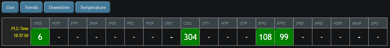
I am trying to display a html table in the uibuilder, the table is displayed, but i am unable to control the width to my requirement. the same set of html tags obey correctly in dashboard-1
I changed the display default to flexbox in the css file.
display: flexbox;
The layout is perfect for me, however i am unable to control the cell width.

below my index.html and index.css files.
PS: I have several other questions (which i am trying to find answers in the forum) will raise them if I dont get success..
[{"id":"0007173c4b498ca7","type":"template","z":"8ad51e99d084f0bf","g":"94a98c028fff17dd","name":"index.css","field":"payload","fieldType":"msg","format":"css","syntax":"plain","template":"/* Load defaults from `<userDir>/node_modules/node-red-contrib-uibuilder/front-end/uib-brand.min.css`\n * This version auto-adjusts for light/dark browser settings.\n */\n@import url(\"../uibuilder/uib-brand.min.css\");\n\n/* CSS variables to make it easier to control */\n:root {\n /* The layout container */\n --container-max-width: 1366px;\n --container-col-gap: 0.2rem;\n --container-row-gap: 0.2rem;\n\n /* The main content container */\n --main-cols: repeat(20, 1fr);\n --main-rows: auto;\n /* auto OR repeat(12, 1fr); ... */\n --main-col-gap: var(--container-col-gap);\n --main-row-gap: var(--container-row-gap);\n\n /* The articles */\n --article-width: 1;\n /* number of columns or auto */\n --article-height: auto;\n /* auto or number of rows */\n\n /* The Sidebar container */\n --sidebar-max-width: 1fr;\n --sidebar-min-width: 0.1fr;\n}\n\n\n/* The outer container div */\n.container {\n width: 100%;\n max-width: var(--container-max-width);\n margin: 0 auto;\n /* Center the container horizontally */\n display:felxbox;\n gap: var(--container-row-gap) var(--container-col-gap);\n\n /* 2 cols x 3 rows layout. Middle row & right column are larger. Left col is constrained min/max */\n grid-template-columns: minmax(var(--sidebar-min-width), var(--sidebar-max-width)) var(--main-width);\n grid-template-rows: 0fr 1fr 0fr;\n grid-template-areas:\n \"header header\"\n \"sidebar main\"\n \"sidebar footer\";\n justify-items: stretch;\n}\n\n/* The main content container */\nmain {\n /* Where you put your content */\n grid-area: main;\n\n display: grid;\n gap: var(--main-row-gap) var(--main-col-gap);\n grid-template-columns: var(--main-cols, 12);\n /* fallback to 12 cols */\n grid-template-rows: var(--main-rows, auto);\n /* fallback to auto */\n}\n\n/* Any article within the main container.\n You can use a div instead of an article, useful for no-code uibuilder elements. */\nmain>article,\nmain>div {\n /* Width of an article in number of columns */\n grid-column: span var(--article-width);\n /* Height of an article in number of rows */\n grid-row: span var(--article-height);\n margin: 0;\n}\n\n/* Set a child div to have same format as an article */\nmain>div {\n border: 1px solid var(--text3);\n border-radius: var(--border-radius);\n padding: var(--border-pad);\n margin: 0;\n background-color: var(--surface3);\n}\n\nmain>div>h2,\nmain>div>h3,\nmain>div>h4 {\n margin-block-start: 0;\n border-bottom: 1px solid var(--text3);\n padding-block-end: var(--border-pad);\n}\n\nheader {\n /* Headings, nav, etc */\n grid-area: header;\n}\n\nfooter {\n /* at the bottom, (c), dates, etc */\n grid-area: footer;\n margin-top: 0;\n}\n\n/* We might want other sidebars so be more explicit for this */\naside.sidebar {\n /* stuff to one side of the main content */\n grid-area: sidebar;\n}\n\n/*#region Simple horizontal navigation main menu (in the header) */\n.nav-main {\n background-color: var(--surface3);\n}\n\n.nav-main ul {\n /* Remove bullet points */\n list-style-type: none;\n /* Remove default padding */\n padding: 0;\n /* Remove default margin */\n margin: 0;\n /* Use Flexbox to align items horizontally */\n display: flex;\n}\n\n/* Add space between menu items */\n.nav-main li {\n margin-right: 1rem;\n}\n\n/* Remove margin on the last item */\n.nav-main li:last-child {\n margin-right: 0;\n}\n\n.nav-main a {\n /* Remove underline from links */\n text-decoration: none;\n /* Add padding for better click area */\n padding: var(--border-pad);\n /* Ensure the entire area is clickable */\n display: block;\n}\n\n/* Highlight on hover */\n.nav-main a:hover {\n background-color: var(--surface5);\n /* Optional: Add rounded corners */\n border-radius: var(--border-radius);\n}\n\n/*#endregion */\n\n/*#region simple vertical navigation menu */\n.nav-side {\n background-color: var(--surface3);\n}\n\n.nav-side ul {\n /* Remove bullet points */\n list-style-type: none;\n /* Remove default padding */\n padding: 0;\n /* Remove default margin */\n margin: 0;\n}\n\n.nav-side a {\n /* Remove underline from links */\n text-decoration: none;\n /* Add padding for better click area */\n padding: 0.5rem 1rem;\n /* Ensure the entire area is clickable */\n display: block;\n}\n\n/* Highlight on hover */\n.nav-side a:hover {\n background-color: var(--surface5);\n}\n\n/*#endregion */\n\n/* Adapt for narrow screens */\n@media only screen and (max-width: 512px) {\n :root {\n /* --article-width: 12; */\n }\n\n /* Very simple adaption example, a single column, 4 rows */\n .container {\n gap: 0.5rem;\n\n /* 1 cols x 4 rows layout. 2nd row is larger */\n grid-template-columns: 1fr;\n grid-template-rows: 0.1fr 1fr 0.1fr 0.1fr;\n grid-template-areas:\n \"header\"\n \"main\"\n \"sidebar\"\n \"footer\";\n }\n\n /* We want the articles in a single col now so just display as block */\n main {\n display: block;\n }\n\n /* And add a bit of a top margin to articles for clarity */\n main>article,\n main>div {\n margin-top: 0.5em;\n }\n}\n\n.smallfont { font-family: \"arial narrow\";\n font-size: 0.8em; color: cyan;\n text-align: center; font-weight: 100;\n}\n.mf1 {\n font-size: 1rem;\n color: yellow;\n font-family: \"arial narrow\";\n text-align: right;\n background: #252525;\n}\n\n.raw-input {\n font-size: 1.2em;\n color: white;\n text-align: center;\n font-weight: 200;\n}\n.large-font-r {\n border-radius: 10px;\n font-size: 1.25em;\n background: black;\n color: white;\n font-family: \"Trebuchet MS\";\n text-align: center;\n}\n\n.large-font-b {\n border-radius: 10px;\n font-size: 1.8em;\n background: #101010;\n color: white;\n font-family: \"Trebuchet MS\";\n text-align: center;\n}\n\n.large-font-g {\n border-radius: 10px;\n font-size: 1.8em;\n background: green;\n color: white;\n font-family: \"Trebuchet MS\";\n text-align: center;}\n\n.table1 {\n border-radius: 10px;\n height:15px !important;\n font-size: 1.5em;\n background: black;\n color: white;\n text-align: center;\n}","output":"str","x":610,"y":900,"wires":[["9755d35070145c84"]]},{"id":"6d9227ab15f1708b","type":"template","z":"8ad51e99d084f0bf","g":"94a98c028fff17dd","name":"index.html","field":"payload","fieldType":"msg","format":"html","syntax":"mustache","template":"<!doctype html>\n<html lang=\"en\"><head>\n\n <meta charset=\"utf-8\">\n <meta name=\"viewport\" content=\"width=100%, initial-scale=1\">\n <link rel=\"icon\" href=\"../uibuilder/images/node-blue.ico\">\n\n <title>Dashboard</title>\n <meta name=\"description\" content=\"Node-RED uibuilder - Dashboard Layout\">\n\n <!-- Your own CSS (defaults to loading uibuilders css)-->\n <link type=\"text/css\" rel=\"stylesheet\" href=\"./index.css\" media=\"all\">\n\n <!-- #region Supporting Scripts. These MUST be in the right order. Note no leading / -->\n <script defer src=\"https://cdn.jsdelivr.net/npm/markdown-it/dist/markdown-it.min.js\"></script>\n <script defer src=\"../uibuilder/uibuilder.iife.min.js\"></script>\n <!-- <script defer src=\"./index.js\">/* <= OPTIONAL: Put your custom code in that */</script> -->\n <!-- #endregion -->\n\n</head><body>\n\n <div class=\"container\">\n <header class=\"header\">\n<!-- <h1 class=\"with-subtitle\">Dashboard Live</h1>\n -->\n \n<button id= \"button1\" type=\"button\" onclick=\"uibuilder.eventSend(event)\">Live</button>\n<button id= \"button2\" type=\"button\" onclick=\"uibuilder.eventSend(event)\">Trends</button>\n<button id= \"button3\" type=\"button\" onclick=\"uibuilder.eventSend(event)\">Downtime</button>\n<button id= \"button4\" type=\"button\" onclick=\"uibuilder.eventSend(event)\">Temperature</button>\n\n </header>\n\n <main id=\"more\"><!-- '#more' is used as a parent for dynamic HTML content in examples -->\n \n <table width=\"100%\" border=\"1px solid white\" border-collapse=\"collapse\">\n\n <tbody>\n <tr class=\"table1\">\n\n <td id= \"time\" col width=\"200px\" rowspan=\"2\" class=\"mf1\">PLC Time</td>\n <th width=\"80px\">CR03</th>\n <th width=\"80px\">MSP1</th>\n <th width=\"80px\">BTP1</th>\n <th width=\"80px\">SP04</th>\n <th width=\"80px\">SP03</th>\n <th width=\"80px\">PFSL</th>\n <th width=\"80px\">PFSR</th>\n <th width=\"80px\">CR01</th>\n <th width=\"80px\">CSDL</th>\n <th width=\"80px\">CFTJ</th>\n <th width=\"80px\">14TR</th>\n <th width=\"80px\">12TR</th>\n <th width=\"80px\">BTP2</th>\n <th width=\"80px\">BTP3</th>\n <th width=\"80px\">SP05</th>\n <th width=\"80px\">AP02</th>\n <th width=\"80px\">MSP2</th>\n <th width=\"80px\">BAGR</th>\n <th width=\"80px\">DIPS</th>\n \n </tr>\n <tr>\n <td id= \"cm00\" width=\"80px\" class=\"large-font-b\">-</td>\n <td id= \"cm01\" width=\"80px\" class=\"large-font-b\">-</td>\n <td id= \"cm02\" width=\"80px\" class=\"large-font-b\">-</td>\n <td id= \"cm03\" width=\"80px\" class=\"large-font-b\">-</td>\n <td id= \"cm04\" width=\"80px\" class=\"large-font-b\">-</td>\n <td id= \"cm05\" width=\"80px\" class=\"large-font-b\">-</td>\n <td id= \"cm06\" width=\"80px\" class=\"large-font-b\">-</td>\n <td id= \"cm07\" width=\"80px\" class=\"large-font-b\"><b>-</b></td>\n <td id= \"cm08\" width=\"80px\" class=\"large-font-b\"><b>-</b></td>\n <td id= \"cm09\" width=\"80px\" class=\"large-font-b\">-</td>\n <td id= \"cm10\" width=\"80px\" class=\"large-font-b\">-</td>\n <td id= \"cm11\" width=\"80px\" class=\"large-font-b\">-</td>\n <td id= \"cm12\" width=\"280px\" class=\"large-font-b\"><b>-</b></td>\n <td id= \"cm13\" width=\"280px\" class=\"large-font-b\"><b>-</b></td>\n <td id= \"cm14\" width=\"80px\" class=\"large-font-b\">-</td>\n <td id= \"cm15\" width=\"80px\" class=\"large-font-b\">-</td>\n <td id= \"cm16\" width=\"80px\" class=\"large-font-b\">-</td>\n <td id= \"cm17\" width=\"80px\" class=\"large-font-b\"><b>-</b></td>\n <td id= \"cm18\" width=\"80px\" class=\"large-font-b\">-</td>\n </tr>\n </tbody>\n </table>\n\n\n\n</md-card>\n </main>\n \n\n<!-- <aside class=\"sidebar\">\n <nav class=\"nav-side\">\n <ul>\n <li><a href=\"#nav1\">Nav 1</a></li>\n <li><a href=\"#nav2\">Nav 2</a></li>\n <li><a href=\"#nav3\">Nav 3</a></li>\n </ul>\n </nav>\n </aside>\n\n <footer>\n The footer\n <div>2nd footer</div>\n </footer>\n-->\n </div>\n\n</body></html>\n","output":"str","x":600,"y":820,"wires":[["9755d35070145c84"]]}]

 . (sorry, i am not asking you do my homework, but this is new to me.)


