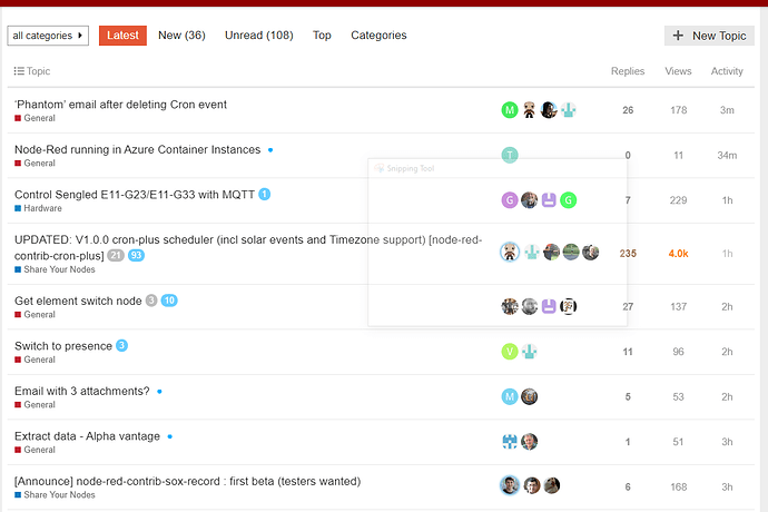
I started noticing it yesterday - is that happening for others?
Win10/Chrome
mmm - looks like read posts ARE a bit lighter but I swear the difference used to be a lot bigger
Must be my eyesight going 
I noticed it too, but it has been that way for at least a week or two. Some Discourse update I guess.
Using the dark theme exclusively now, easier on my aging eyes 
After years of disliking dark modes, I'm really coming to appreciate them more. Might be partly that I'm now working in a more subdued lighting environment than traditional office spaces with their harsh lighting. Possibly also partly due to the extra 2 hours a day I spend on screen now that I'm not commuting 
I don't understand the passion nowadays for pale text on a light background. With the standard node-red theme I sometimes had great difficulty reading the debug pane with the default theme. Many websites have gone down this route.


