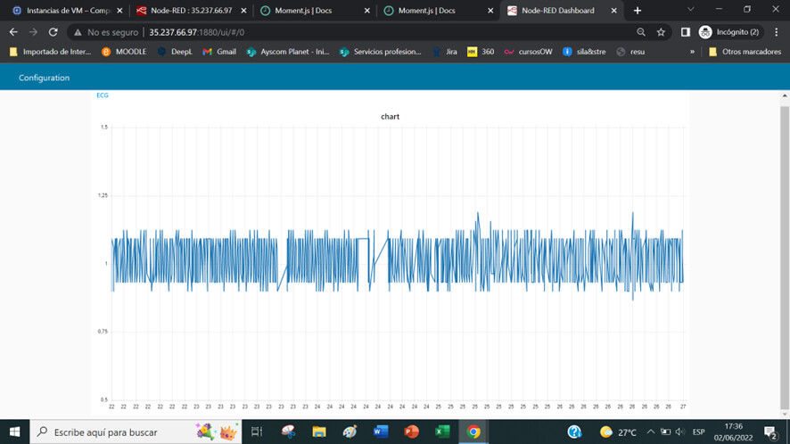
Chart line in Dashboard

Hi, I am a bit new to nodered and I need to make a line chart in dashboard with the data I am receiving.
The first data is a value for the X axis and the second for the Y axis.
I receive a lot of these pairs and I would like to represent them in the chart.
I have this function to treat the payload data but it does not represent anything:
image

Any help?
Thanks

Hi @alberparri and welcome to Node-RED community!

First to all, when you select the chart node, you can see the "tap help", it contain info about how to node work...

Maybe you need to set your payload as a single number. and also to have two differents payloads, for example, a payload set as time, and other payload set as voltage. Also you can set with different topic for each payload:

msg.payload = time;
msg.topic = Time;

msg.payload2 = voltage;
msg.topic = Voltaje;

I hope its helps you!

I mean:

Screenshot from 2022-06-01 12-41-56

and dashboard:

Screenshot from 2022-06-01 12-41-35

[{"id":"cb1a3d5460e00228","type":"tab","label":"Flow 1","disabled":false,"info":"","env":[]},{"id":"509f2e65acb1d7c1","type":"ui_chart","z":"cb1a3d5460e00228","name":"","group":"feee56445f470f84","order":0,"width":0,"height":0,"label":"chart","chartType":"line","legend":"false","xformat":"HH:mm:ss","interpolate":"linear","nodata":"","dot":false,"ymin":"","ymax":"","removeOlder":1,"removeOlderPoints":"","removeOlderUnit":"3600","cutout":0,"useOneColor":false,"useUTC":false,"colors":["#1f77b4","#aec7e8","#ff7f0e","#2ca02c","#98df8a","#d62728","#ff9896","#9467bd","#c5b0d5"],"outputs":1,"useDifferentColor":false,"className":"","x":730,"y":380,"wires":[[]]},{"id":"95a2bf1261670e2a","type":"inject","z":"cb1a3d5460e00228","name":"","props":[{"p":"topic","vt":"str"}],"repeat":"1","crontab":"","once":true,"onceDelay":0.1,"topic":"Time","x":410,"y":340,"wires":[["3b73600aaef1eb01"]]},{"id":"7955e5011809ccbf","type":"inject","z":"cb1a3d5460e00228","name":"","props":[{"p":"topic","vt":"str"}],"repeat":"1","crontab":"","once":true,"onceDelay":0.1,"topic":"Voltaje","x":420,"y":440,"wires":[["bb1b231451b142af"]]},{"id":"3b73600aaef1eb01","type":"random","z":"cb1a3d5460e00228","name":"","low":1,"high":10,"inte":"true","property":"payload","x":560,"y":340,"wires":[["509f2e65acb1d7c1"]]},{"id":"bb1b231451b142af","type":"random","z":"cb1a3d5460e00228","name":"","low":1,"high":"100","inte":"true","property":"payload","x":560,"y":440,"wires":[["509f2e65acb1d7c1"]]},{"id":"feee56445f470f84","type":"ui_group","name":"Default","tab":"0ed4eeb8e062e528","order":1,"disp":true,"width":"6","collapse":false,"className":""},{"id":"0ed4eeb8e062e528","type":"ui_tab","name":"Home","icon":"dashboard","disabled":false,"hidden":false}]

I don't think that can be what Alberto is looking for - you have provided a graph that shows two lines: voltage vs time and time vs time (!)

@alberparri : If the data is sent to the graph "live", you only need to send the Voltage value. The chart will automatically show each Voltage at the current time.

Alternatively, if it's "historical" data, from a database for example, you need to send the data as an array of {x: num, y: num} objects.
There is more detail in "Stored Data"

1 Like

Jbudd, that is what i need.
What i receive vĂ­a UDP is a lot of messages with 2 datas: "time,voltage". For example, "8,1.234".

Those datas come in ascii and maybe this is the problem, and it is necessary to convert to numbers. Do you think so? In this case, how can i convert them?

Thanks a lot.

What you mean is something like that?

msg.payload = {
x: time,
y:voltage
}
return msg;

Thanks

1 Like

The chart widget can work in two ways.

  1. You send a message with a single data point.
    The chart can plot that value as (current timestamp, msg.payload.something).
    This mode is ideal when you get regular readings such as a temperature sensor that you read every 10 seconds.
    This mode is single variable, plotted against time.

  2. It can also plot historic data, for example the temperature readings for 28th February. Very often this data will come from a database of some sort.
    To use this mode you have to send all the data points in a single message: an array of x,y objects, as described in the link I posted above.

And of course it's more complicated than that. As @MecatronicaMADE showed you, you can plot multiple lines using msg.topic.

I can't tell which of these modes is best for you because I don't understand if your data is live or historic.

The two datas, T and V, arrives every 3.9ms (so T is 0, 3.9, 7.8, ...), and due to the delay in the network they doesn't arrive with a fixed distance of 3.9ms. For this, i have to use that received time instead local time.
My problem, i think, is the construction of the function node to assign T to X axis, and V to Y axis.
Thanks

Maybe you should seperate receiving and displaying the data, something like this

It would give you accurate time/voltage charts but at the cost of a slight delay in displaying new data.
The entire chart would be redrawn every 5 seconds.

Take a look at InfluxDB and Grafana for displaying graphs too.

Hi, finally I have taken only the voltage data(Y axis) and use the local time (X axis).
The problem is that while the graph is being painted, the data occupy the whole screen of the graph, as you can see in this image (as I want):

However, when all the data arrives, the graph is compressed, leaving most of it blank(painting 70 seconds, but I only want the first 14 seconds):

Thank you

This is the capture of the chart node configuration:

Any idea to not compress the data and leave me only the 14 seconds that I have configured in chart as you can see in the previous image?

Thank you

This topic was automatically closed 30 days after the last reply. New replies are no longer allowed.