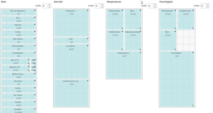
Hi, i try to make my Dashboard responsive.
at the moment i have the problem, the device of my wife and mine have different resolutions.
so if i use width of 8 per node, the device of my wife is to small to show the full content.
She can see all content with width of 6 (Like Weight 8 of my phone screenshot) per node. If i set 6, the dashboard looks creepy on my phone.
The last 2 Screenshots are my layout (Main is 6 for testing)
How i can solve this problem?
This Thread didnt help me: Responsive Dashboard
width 6
width 8
width 10
I am not going to say I have the answer, but I have had similar problems.
Thinking outside the box:
Leave things as they were. I know that sounds a bit silly, but hear me out.
On the device with lower resolution: zoom out a bit with the browser's view of the page. That way you see more. It won't (or shouldn't) be a lot if the difference is solved by changing it from 8 to 6 - unless you have a LOT of individual items across the screen.
Again: I'm not going to say it is the answer, but it may be a good alternative.
All the best.
Hm i will try it tomorrow. I hope it is so simple.


