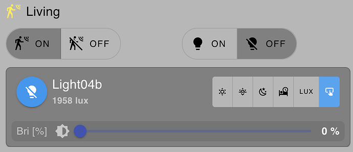
Hello everyone, I was in the mood to put some fancy multi-tab function into my light controls
So I went to Vuetify to check-out their samples. Unfortunately the ones of interest for me failed... see working test-flow in Vuetify here
this is the Vuetify version:
Unfortunately, when copy-pasting the content into ui-template it does not work the same way (most other samples work fine). Thats the same code result in NR below
<template>
  <v-card>
    <v-tabs
      v-model="tab"
      align-tabs="end"
      color="deep-purple-accent-4"
    >
      <v-tab :value="1">Landscape</v-tab>
      <v-tab :value="2">City</v-tab>
      <v-tab :value="3">Abstract</v-tab>
    </v-tabs>

    <v-tabs-window v-model="tab">
      <v-tabs-window-item
        v-for="n in 3"
        :key="n"
        :value="n"
      >
        <v-container fluid>
          <v-row>
            <v-col
              v-for="i in 6"
              :key="i"
              cols="12"
              md="4"
            >
              <v-img
                :lazy-src="`https://picsum.photos/10/6?image=${i * n * 5 + 10}`"
                :src="`https://picsum.photos/500/300?image=${i * n * 5 + 10}`"
                height="205"
                cover
              ></v-img>
            </v-col>
          </v-row>
        </v-container>
      </v-tabs-window-item>
    </v-tabs-window>
  </v-card>
</template>

<script setup>
  import { ref } from 'vue'

  const tab = ref(null)
</script>
I hope somebody can help getting this working.
OK... chatgpt came to the rescue  .. below is a sample code I will work on
<template>
  <v-card>
    <v-tabs v-model="tab" align-tabs="end">
      <v-tab value="overview">Overview</v-tab>
      <v-tab value="config">Config</v-tab>
      <v-tab value="misc">Misc</v-tab>
    </v-tabs>

    <v-window v-model="tab" class="mt-2">
      <!-- Overview -->
      <v-window-item value="overview">
        <v-container>
          <h3>Light Status</h3>
          <p><strong>Status:</strong> {{ msg?.payload?.status }}</p>
          <p><strong>Hue:</strong> {{ msg?.payload?.hue }}</p>
          <p><strong>Color:</strong> <span :style="{color: msg?.payload?.color}">{{ msg?.payload?.color }}</span></p>
          <p><strong>Remaining:</strong> {{ msg?.payload?.duration }} mins</p>
        </v-container>
      </v-window-item>

      <!-- Config -->
      <v-window-item value="config">
        <v-container>
          <h3>Configure Light</h3>
          <v-text-field v-model="lightConfig.hue" label="Hue" type="number" min="0" max="360"></v-text-field>
          <v-text-field v-model="lightConfig.color" label="Color" placeholder="e.g. red, #ff0000"></v-text-field>
          <v-text-field v-model="lightConfig.duration" label="Duration (mins)" type="number" min="1"></v-text-field>
          <v-btn color="success" class="mt-2" @click="send({payload: lightConfig})">Apply</v-btn>
        </v-container>
      </v-window-item>

      <!-- Misc -->
      <v-window-item value="misc">
        <v-container>
          <h3>Miscellaneous</h3>
          <p>Extra settings or notes can go here…</p>
        </v-container>
      </v-window-item>
    </v-window>
  </v-card>
</template>

<script>
export default {
  data() {
    return {
      tab: 'overview',
      lightConfig: {
        hue: 180,
        color: '#00ffff',
        duration: 30
      }
    }
  },
  watch: {
    msg(newMsg) {
      // You can update UI reactively if msg changes
    }
  }
}
</script>
OK .. somwhow the vuetify samples are not properly working for me anymore (they did well in the early days of DB2)
another example which does not work here
Anybody else having the issues , or is something wrong with my code or system?
Works for me. I reduced the height of the colour area from 300px to 260px to stop a scroll bar but that was all
<template>
  <v-card style="margin: auto" width="400">
    <v-responsive
      :style="{ background: `rgb(${red}, ${green}, ${blue})` }"
      height="260px"
    ></v-responsive>

    <v-card-text>
      <v-slider
        v-model="red"
        :max="255"
        :step="1"
        class="ma-4"
        label="R"
        hide-details
      >
        <template v-slot:append>
          <v-text-field
            v-model="red"
            density="compact"
            style="width: 80px"
            type="number"
            variant="outlined"
            hide-details
          ></v-text-field>
        </template>
      </v-slider>

      <v-slider
        v-model="green"
        :max="255"
        :step="1"
        class="ma-4"
        label="G"
        hide-details
      >
        <template v-slot:append>
          <v-text-field
            v-model="green"
            density="compact"
            style="width: 80px"
            type="number"
            variant="outlined"
            hide-details
          ></v-text-field>
        </template>
      </v-slider>

      <v-slider
        v-model="blue"
        :max="255"
        :step="1"
        class="ma-4"
        label="B"
        hide-details
      >
        <template v-slot:append>
          <v-text-field
            v-model="blue"
            density="compact"
            style="width: 80px"
            type="number"
            variant="outlined"
            hide-details
          ></v-text-field>
        </template>
      </v-slider>
    </v-card-text>
  </v-card>
</template>

<script>
    export default {
        data() {
            // define variables available component-wide
            // (in <template> and component functions)
            return {
                red: 64,
                blue: 128,
                green: 10,
            }
        },
        watch: {
            // watch for any changes of "count"

        },
        computed: {
            // automatically compute this variable
            // whenever VueJS deems appropriate

        },
        methods: {
            // expose a method to our <template> and Vue Application

        },
        mounted() {
            // code here when the component is first loaded
        },
        unmounted() {
            // code here when the component is removed from the Dashboard
            // i.e. when the user navigates away from the page
        }
    }
</script>
<style>
    /* define any styles here - supports raw CSS */

</style>
oh sorry, I should have been more specidic. The sliders do not work properly .. when sliding the textbox does not update
Are you trying to use that example as-is? It uses the Composition API.
Dashboard 2 uses the Options API export default {...} not the Composition API. (good comparison here)
Hi Steve, of course you are right  ... I totally missed that tiny part , as I was not doing layouts for a while


