Hide connections

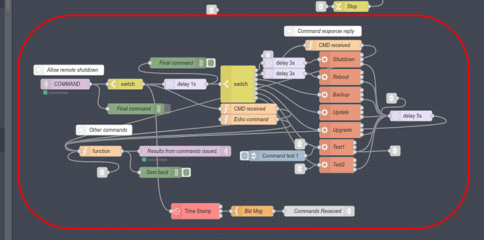
On very complicated flows, it would be nice to have the option to hide the node connections. Similar to the hide labels function. Hovering over a node would reveal the connections.


This is a simple example but with hundreds of connections, the link in / out is not practical.

As much as I can partly understand what you mean, there is a problem with what you suggest.

Node-red is a very visual system and hiding connections would not help the bigger picture.

Slight suggestion:

Make subflows.

They can take a screen full of things and make them a lot tidier.

This is the original code:

This is with a subflow

Screenshot from 2021-01-07 15-21-39

Original code:

Using a subflow.

Screenshot from 2021-01-07 15-21-55

If you don't like/use subflows you can use the link node and put the code on other tabs.
That is basically doing the same thing as subflows, but just on other tabs.

Some more explanation is needed. The use-case that I am describing is visualizing a very complex state machine that is on another flow.

I am using about 50 function nodes with node.status to visualize the process in realtime. The wires are simply to trigger the global.get in the function nodes. Perhaps a better solution would be if the function node could self trigger.

What if you used seperate Inject nodes, closer to the Functions that need to be triggered and also disable their label to take less space ?

image

PS. visualization of all those status with global.get ? isn't that what dashboards are used for ? hint :wink:

Also you may find this thread interesting .. it lists all globals and could make it easier to send it to the dashboard (if you choose that path)

Ok,

So maybe the link node/s.

There is an out and in. They may help clear up the jungle of connections.

and/or restructure the flow.

Rather than horizontal as you have it with the bigger nodes along the top:
put them vertically and the child nodes to their right.

1 Like

I am making extensive use of the dashboard nodes, however this was more a debugging excersize because the position of the nodes is in relation to the process, and I can observe the sequence of events easier than the way dashboard organizes it. I sometimes nest 5 or 6 variables in the node status messages, and it works really well. I guess I could use the ui-svg node but did not want to invest loads of time just for a debugging tool :slight_smile:

Maybe I am not a typical user, I am using NR for industrial applications.

Thanks for the suggestion. Yes, I tried link nodes but it quickly got tedious matching 100 link nodes, hence a simple toggle would have solved my needs the more I thought about it. The spaghetti wires are not a big deal, it just looks messy and is distracting when you're trying to concentrate on the node status messages to identify problems. Another option is rather than hide connections completely, it could adjust the transparency of the connections so they are barely visible. Maybe this is another feature request idea, but the option to make a flow that is designed this way (function nodes with node status) as a kind of dashboard (that is not editable of course) would be wicked.

Also, if there is the option to hide labels, it seems logical to also implement hiding connections for a similar reason (making complicated flows more visually appealing).

Hidden, colored or partially transparent is basically same field in this case, so I think it has been requested already.

Yes, I hear you. Believe me.

I would still advocate trying putting the 3 big function nodes DOWN the screen rather than across.

That will could really make a huge difference on how it is seen.

On the link nodes and that:
I've found these two tips handy.
1 - Naming the link nodes. Even if not making their names visible, it helps.
2 - Showing the names of the link nodes. That sometimes helps to make it easier to see.

You have a link out node and it is called something appropriate to what it is doing.

Then when you want to connect to it, you type in its name rather than having to scroll through a huge list of link nodes.

RE: hiding the names.... Sorry, I don't think I understand your reasoning there.

(Tangent - sorry)
You can also cheat and shrink the size of all the nodes to a 1x1 size if you untick the option in their appearance window.

If you click once anywhere on the node connection wire it will change colour, which should help visualise the route which the flow is taking.

Also, if you select a node, you can then navigate up or down stream in the flow using the arrow keys on your keypad, again which helps visualise complicated flows.

I am using about 50 function nodes with node.status to visualize the process in realtime. The wires are simply to trigger the global.get in the function nodes. Perhaps a better solution would be if the function node could self trigger.

You seem to repeat a lot of nodes, which can be greatly simpiflied by using array of objects. If this was done just for visualization, this might not be the right tool for it.

You can change the colour and thickness of the wires using an editor css file as described at https://discourse.nodered.org/t/editor-theme-css-file-example/2328

This snapshot has .red-ui-flow-link-line { stroke: #8ab0d2; stroke-width: 1; }
Untitled 1

1 Like

Looking at the image of your flow, it's maybe just in need of reorganisation to see connections more clearly. My first impression is that you have five main functions, each feeding to several sub-functions (plus a few others connected to the inject node). As @Trying_to_learn said, it might be tidier to arrange these vertically and then arrange the second level functions to the right, again in vertical groups, top to bottom.

My approach, and which is something I've done in a couple of flows, would be to have a link-out from the inject node and then put each top level and sub-function group on a separate tab, fed by a link-in. It means switching tabs to work on each part, but I find that's also helpful to keep sections of logic separated and avoid confusion.

Even with your current layout, just moving the function nodes around would let you tidy it up and remove 90% of the crossing wires.

2 Likes

Thanks, everyone for the suggestions.

Challenge accepted. Please do not take this as encouragement to "use the editor as a dashboard." (Search that phrase in the forum.)

[{"id":"3b0e731e.8ffc0c","type":"inject","z":"3b690bae.7e1914","name":"","props":[{"p":"payload"},{"p":"topic","vt":"str"}],"repeat":"2","crontab":"","once":false,"onceDelay":0.1,"topic":"","payload":"","payloadType":"date","x":250,"y":2100,"wires":[["8859d772.9b9c58"]]},{"id":"8859d772.9b9c58","type":"change","z":"3b690bae.7e1914","name":"","rules":[{"t":"set","p":"test","pt":"global","to":"payload","tot":"msg"}],"action":"","property":"","from":"","to":"","reg":false,"x":420,"y":2100,"wires":[["e6c2b82b.deafc"]]},{"id":"e6c2b82b.deafc","type":"debug","z":"3b690bae.7e1914","name":"","active":true,"tosidebar":true,"console":false,"tostatus":true,"complete":"payload","targetType":"msg","statusVal":"payload","statusType":"auto","x":590,"y":2100,"wires":[]},{"id":"3b0019ff.9337ae","type":"function","z":"3b690bae.7e1914","name":"","func":"\nreturn msg;","outputs":1,"noerr":0,"initialize":"// Code added here will be run once\n// whenever the node is deployed.\nsetInterval(showStatus,1000)\n\nfunction showStatus() {\n    node.status({text:global.get('test')})\n}","finalize":"","x":420,"y":2160,"wires":[[]]}]
2 Likes

Nice! I was working on similar idea (timer in On Start), but used timeouts instead... bad choice, didn't seem to work and I gave up :blush:

1 Like

What I do is smartly place "null" functions to consolidate the wires at different levels. Here's one of my logic flows which reduces the four wires visually to just two.

Instead of a null function. You can also use a change node with zero changes.

image

:musical_score: “Who let the dogs stdout?”

2 Likes

This topic was automatically closed 60 days after the last reply. New replies are no longer allowed.