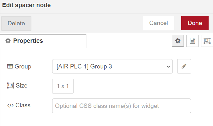
Hi everyone,
I want to make this 1x1 spacer invisible to make my dashboard look good.

Best regards
Hi everyone,
I want to make this 1x1 spacer invisible to make my dashboard look good.

Best regards
Have you tried a Dashboard spacer?
I want to leave a gap in space A, which is Group 3.

If I remove group 3, the B buttons are moved up.
Some possible approaches:
Thank you for your response
How can I put css to the spacer, background colour that is the same as the background?
Don't know if it is a bug or done intentionally but you can't actually add custom class to the spacer.
So you may have ui_template node with the size you want and you can make the appearance of it as you like.
The first 4 suggestions seem to me much simpler than option 5. Have you tried them?
If they did not work please show us the result.
But you can add a class to the group, which @Loveflowersx seems to have created for the sole purpose of containing his spacer.
I have not experimented with styling the group, and I'm not likely to try unless I'm sure the simple suggestions fail.
That works of course...
.my-group .nr-dashboard-spacer{
    border: 1px solid red;
}
But it applies to all spacers in that group and there is not any easy way to target one specific if there is more than one.
My experience is that if you want a defined layout then it is best to do it all within one group, using the layout editor as @jbudd suggests. Don't use multiple groups for layout.
Smells like a bug to me…
As the field to set the class is there, it should honour it.
For me the spacer is kind of helper node for layouting only. If to use it as decorative element it still requires to keep the position and size but you can't omit some CSS rules what the user can add or modify. Even it gives more freedom to do stuff, it also opens all doors to create complete mess.
Hi everyone,
I don't like to have everything in the same group, I want to leave each group in its own place on the dashboard. I'm going to try putting a template with its colour! If it doesn't work well I'll do it all in the same group.
Thank you very much!
I would be interested to know why, if merging the groups solves your problems.
I think it's more for the organisation of the graphics display and in another group you put the buttons.
Could it be that I don't know how to choose a theme (dashboard) well? ![]()
Hi everyone again,
A question @hotNipi ,
Where can I put this code you provided to make it invisible?
.my-group .nr-dashboard-spacer{
border: 1px solid red;
}

Best regards!
Question is what is the "it".
A template node, I want to leave that gap like this, did I understand with a template node?

Best regards!