But I got only half chart filled, how can I have the Y set to maximum value give into the array? Why now the maximum is only about the half of chart?
Thanks
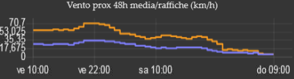
As you see I'm using a "flat" chart to save space vertically, and this result to less understandable result. If the Y can be set to maximum it would be enough..
The min and max of Y are empty for temperature, for wind the min is 0.
It looks like the chart always put a margin from the highest value of data and the max of chart, which looks like double of the max (or min), do you confirm this?
Thanks
no - it is probably an artefact of you having such a compressed y scale - it will usually either be the max value or just above it (it tries to use sensible scale steps) so in your pic above I guess you went just over 20 so it chose 0,20,40.
Yes it touch 22, but why 40? Can it be created with maximum on 22?
I've no particular setting, values enter directy on node and no max set. How can I set it exactly to the maximum?
thank you for info!
I't not really clear for me, I?m using a chart node, not a UI Widget, I don't understand if UI Widget is a generic name for all those nodes including chart. If yes you're suggesting me to include into msg a msg.ui_chart={ymax:calculatedvalue}; ? Sorry there are no examples there
yes all the things on the dashboard are widgets. The chart is a widget.
You can send a msg.ui_control = { "ymax": 22 } - or add a ui_control property to you existing msg going into the chart node
Works! But now I have another problem, how can I cut the decimal numbers on the Y?
I've tried to round the number.. and multiply it by 10.. so at least I'll see only .5, but if the result is rounded for defect, the Y data vales will exceed the maximum..
Can the cutout command help?
thanks
I've rounded the maximum to the ceiling and the lowest to the floor, and mutiply by ten, so in this case I should have numbers which are easy to divide. But in this chart it's not going well, can I reduce the legend on the Y to only 3 numbers? (max, 0, min)
let cell0=[];
let cell1=[];
let data=[];
let massimo=0;
let minimo=0;
for (let i = 0; i < 48; i++) {
cell0.push({y:((Math.round(msg.payload.hourly[i].temp*10))/10),x:msg.payload.hourly[i].dt * 1000});
cell1.push({y:((Math.round(msg.payload.hourly[i].feels_like*10))/10),x:msg.payload.hourly[i].dt * 1000});
if (msg.payload.hourly[i].temp>massimo) {massimo=msg.payload.hourly[i].temp;}
if (msg.payload.hourly[i].feels_like>massimo) {massimo=msg.payload.hourly[i].feels_like;}
if (msg.payload.hourly[i].temp<minimo) {minimo=msg.payload.hourly[i].temp;}
if (msg.payload.hourly[i].feels_like<minimo) {minimo=msg.payload.hourly[i].feels_like;}
}
massimo=(Math.ceil(massimo/10))*10;
minimo=(Math.floor(minimo/10))*10;
data[0]=cell0;
data[1]=cell1;
cmsg={payload:[]};
cmsg.payload[0]={};
cmsg.payload[0].data=data;
cmsg.payload[0].series = ["Reale","Percepita"];
cmsg.ui_control = { "ymax": massimo, "ymin":minimo };

return cmsg;
The dashboard chart widget is a simple way to get charts on the dashboard. In order to make it easy to use it makes guesses about what you want and tries to provide useful charts. If the algorithms used are not suitable for you then there are other, more configurable, ways of providing charts. If you search the forum then you should be able to find suggestions.
Alternatively, if you think you can produce an improved algorithm for Y axis scaling then I am sure a PR would be considered positively.