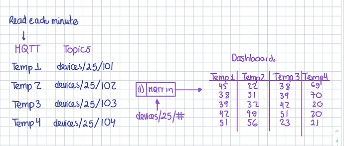
Hello, I am new to Node-red and to the world of forums as well. I am working on a pivot table that shows the last 20 data received by a MQTT IN node. Currently I have generated via HTML a table that is able to add new rows to a table, memorizing the last 20 data received. The problem is that I want to receive data with different TOPICS and that each TOPIC is displayed in a different column. The TOPICS I receive have the form: devices/25/101, devices/25/102,.... devices/25/109, that is, I need 9 columns. The data arrives approximately the same, but their timestamp is not exactly the same. any recommendation?
are these the mqtt topics? Do you know you can use wildcard characters in a topic? In an mqtt-in node, you coud define a topic of 'devices/25/#and messages with the topic 'devices/25/101' and 'devices/25/102' would both be received via thatmqtt-in` node.
Break down your issues into small parts and address each part. Drawing a diagram would be helpful for me (and others) to understand what your data input is and what you are doing with it. If you need to join data from the different mqtt messages, then you might need to use the join node. (see below)
CANNED REPLIES
I recommend watching this playlist: Node-RED Essentials. The videos are done by the developers of node-red. They're nice & short and to the point. You will understand a whole lot more in about 1 hour. A small investment for a lot of gain.
If you want to learn more about MQTT then see this tutorial MQTT Essentials - All Core Concepts Explained
See this article in the cookbook for an example of how to join messages into one object.
thanks for the recommendations. Yes, those are the topics. You have to consider that when using devices/25/# you will also get messages that do not belong to my readings, since I only want to read from 101 to 109, but through that channel there are many more, but actually the filtering part is quite clear. The information I am getting are temperatures. I will attach an image to make it clearer. Also I will check the references you share with me ![]()
You could use ui-table for your task.
- you already have your filtered stream of data from device 101 to 109 (?).
- but there are different timestamps in your data. So you have to define a period in time where you combine the samples. Easiers could be to do
Math.floor(msg.timestamp/1000)to combine all messages received in a second. But there are other ways like starting a time for a certain period of time on the first message and collect all messages received during this time. Then you might want to average or min/max the values if more than one messages for the same topic arrives during this time period - then or better during the timeframe you have to build your table in the runtime (server) where the "new" timestamp is the row index. your data then should look like this
msg.payload=[
  {
    "id" : timestamp,
    "devices/25/101": 45,
    "devices/25/101": 22,
    "devices/25/101": 38,
    "devices/25/101": 69,
  },
  {
    ... and so on
  }
]
- and then you can send this to ui-table
- you can let ui-table do the mapping from your
topicto the column name "Temp1" ...
to make the tabe fully dynamic (only sending new values) you might want to send only the new values to the table via commands (there are many post around this here in the forum). But you still have to keep a copy of your table in the runtime as the dashboard is not always connected and the widget visible. Here the ui-table-handler can help. Maybe start here 2D/vertical UI-Table in Tabulator format? - #5 by Christian-Me
Sorry this may be a bit off-topic. I had a similar requirement to show the latest temperature readings from a set of sensors in my home using a simple dashboard. Then I went on to using a MySQL database.
Recently there was an announcement on this forum about Clarify which you might want to look at as a way of graphically showing your data.
This is what the readings from two of my sensors look like in Clarify. Although I've shown them as two separate series, you can place them on top of each other so you make a comparison.

Incorporating Clarify in my original flow was fairly simple.


