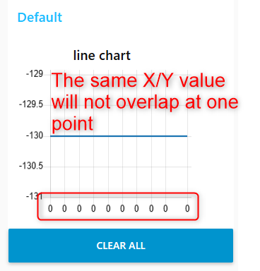
The duplicated X/Y value will not overlap at one point like what we usually do in excel chart, how can I achieve this similar feature like excel chart using chart node?
And how can I set the format of X and Y axis, like the major and minor units, label position, XY axis crosses point,etc like what we do in excel chart?
You are more likely to get a helpful reply if instead of a picture of your data, you post some of your actual data.
Maybe 10 data points seems about right.
I believe you are using the original node-red-dashboard.
If I remember correctly, it is only possible with a "stored data" type chart, where you post a batch of x,y coordinates all at once.